Blood Bowl 2 (Review)

Source: Cashmoneys
Price: £34.99
Where To Get It: Steam

Blood Bowl, the turn based strategy game set in Warhammer’s equivalent of American Football, has returned. Except it never really left, and I’m feeling very conflicted about this release. For context, this review comes from somebody who has been playing the game since Dark Elves Edition of Blood Bowl “1”. Which was the second of four editions of the same game. This, in essence, is an elephant in the room. And I can’t really avoid talking about it.

He has this expression. Forever.

No, no, that’s the *Ogre* in the room, not the elephant! Geez!

At its core, Blood Bowl is about positioning, use of skills, and dice. Lots of dice. Dodging is a dice roll. Passing, blocking, throwing, catching… All dice. Rerolls are a thing you can buy for your team, and they’re important. Beyond that, there’s play styles that each team are suited to. Skaven, for example, play a running game: They’re only okay at passing, but they’re good at dodging away from players marking them, and they can run a long way. Orcs, by contrast, are bashy: They excel at punching things, relatively bad at passing and dodging, and are about average in terms of mobility. It’s relatively easy to learn, but mastering it takes a bit of thought and practice. Your average game takes between 1 and 2 hours, so it is somewhat time consuming.

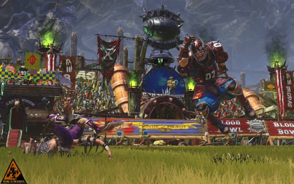
I would like to begin by mentioning that Blood Bowl has a variety of teams, but this is only really true for Blood Bowl: Legendary Edition, and Chaos Edition. 2 is a complete reset, with a new engine, and new design decisions… And funnily enough, this is part of the problem, the elephant in the room. Blood Bowl 2 is undeniably prettier than the previous 4 editions, with meaty animations, a UI where players’ stats and skills are represented by collector’s cards, and some quality sound work. But it’s also a more limited experience than previous editions, in more areas than just the 8 teams (plus one team if you pre-ordered) compared to Chaos Edition’s 23 (More teams are coming, but as DLC.) Not helping is the fact that many of these new or changed features are implemented in odd ways.

I didn't want to be unkind and also show that they have clipping issues.

The animations are undeniably cool… But they pad playtime.

For example, the “Campaign” is somewhat similar to Legendary Edition’s, in that it’s a combination tutorial/challenge mode, with surprise events. But it’s more limited in the sense that you are playing one team (Humans, the generalists) instead of learning core mechanics from multiple teams, and oddly implemented in that the tutorial section (Comprising at least the first two hours of play if you go there first)… Is teaching in ways that experienced Blood Bowl players would scratch their heads at. Part of a match is played before teaching about buying players (With less options than you’d have in a real game, and much worse AI), and then another match goes by (Finally showing you blocking and other important skills) before you can buy “Staff” (Apothecaries, “Fan Factor”, Cheerleaders, and, rivalling in importance to Apothecaries… Rerolls).

Meanwhile, if a new player chooses to hotseat play both sides of a Friendly match, with an experienced Blood Bowl player’s YouTube video open, they’ll get a feel for movement, passing, skills, and the like in… Probably less time than the Campaign does, and for the team they want to play.

Animations, meanwhile, are a feature that experienced players would like to selectively ignore. But the selections are… Touchdowns only, “No animations”, or All animations. So that’s a choice between “Watch running and touchdowns”, “Watch running”, and “Watch running, touchdowns, and every single block that isn’t a push, with a side order of every time you fail a dodge or attempt a pass.” The animation system also appears to have led to less customisation than previous editions of Blood Bowl, with only set colours, no armour changes beyond those gained by levelling up (and some skills/mutations), and a set of heads to choose from as your main customisation option.

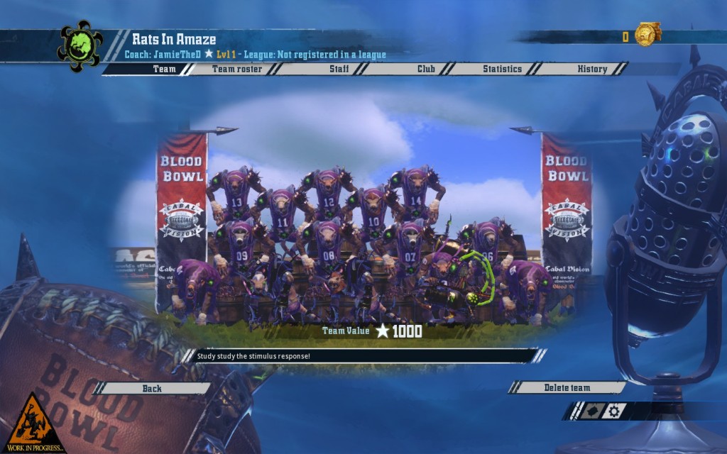
It's psychology puns. Yay!

It is an unofficial “rule” that you must make bad puns when naming your team and its members.

Controls and camera, similarly, will make returning players scratch their head. Previous editions had a fully movable camera with the ability to show player names, player positions, and tackle zones/movement ranges, but Blood Bowl 2… Plays it slightly differently. There are two cameras at a fixed angle, with a fixed zoom arc (Movable, though) marked “Blood Bowl 2 Camera” (Faces toward the opposite left corner of the pitch) and “Blood Bowl 1 Camera” (Faces the opposing endzone). Controls are also in “Blood Bowl 2” and “Blood Bowl 1” flavours, but the latter isn’t quite accurate, as Blood Bowl 1 allowed a player to queue movement, then passing in one go, while Blood Bowl 2… Doesn’t. The difference appears to be “Right click for movement in Blood Bowl 1 Controls”… And that’s it. Passing, as opposed to BB1, is a case of moving, waiting until the move animation is done, then passing.

Some features, also, appear to be missing or imperfectly implemented. Jim Johnson and Bob Bifford, the two commentators, have been placed firmly in both the menu and the Campaign, but their expressions in Campaign mode… Don’t follow nearly the same range as their voice does, and their subtitles have this tendency not to match what they’re actually saying (Sometimes drastically, as in the case of the Halfling Joke. Two bad jokes for the price of one if you have subtitles on, I guess?) You can buy cheerleaders for your team, but will be faced with human cheerleaders every time. Buying rerolls before a team basically involves specifically turning down buying players, then going through the tabs and buying what you want, in the order that you want. And there is an achievement that involves deliberately inflating your Team Value (A dangerous proposition in a League) by having 500K in your bank (A new rule was introduced that means all earnings in your account over 150K count toward your Team Value, you see.)

Just to show how the game looks *most* of the time.

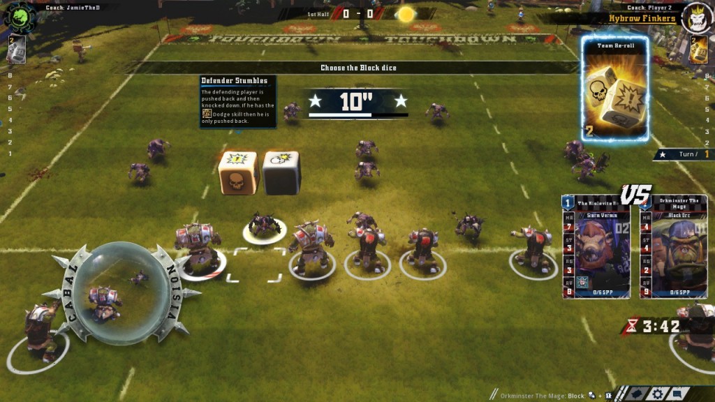
Generally your first action in a Blood Bowl match is to hit someone.

This isn’t to say that there aren’t some new and interesting features. Upgrading your stadium. Coach levels. Sponsors. Aging. And, of course, the newly implemented team, the Bretonnians, whose Blitzers do most of the work, whose Linemen are, as with most Linemen, fodder that you might care about if they levelled up, and whose Blockers are interesting in that their starting skill (Wrestle) means you have to make a deliberate choice of ignoring Wrestle, and thus having a slightly weaker “Blocker” than similarly levelled Blockers of other teams, or making a nonstandard build and ignoring the majority of the Strength skill tree (Which is normally a good thing for Blockers, but the majority of Strength skills don’t synergise well with Wrestle). The preview of what your action will likely do is also nice.

Normally, I’d say this was an interesting game with some odd design decisions and implementations. But the elephant in the room, that all important context that there are four previous games, at least two of which have more teams (Legendary/Chaos Edition), at least one of which has a better tutorial/challenge campaign for its Single Player in terms of teaching and team variety (Legendary Edition), and at least one edition has both a devoted playerbase and a cheaper price tag (Chaos Edition, at £20) means that… I’m not entirely sure I can recommend Blood Bowl 2 at the present time. Which is incredibly awkward for me, as, while I want Blood Bowl to continue selling, the increased shininess… Really doesn’t disguise some awkward design decisions that make it, in its own way, just as clunky as the previous 4 games in the series.

The Mad Welshman coaches many teams, in many universes. He’s going back to the one where he can play the Legendary Khemri Passing Game now. He feels oddly sad that this is so.

Become a Patron!

Maia 0.50 (Early Access Review)

Source: Cashmoneys
Price: £17.98
Where To Get It: Steam
Other Reviews: Early Access 2

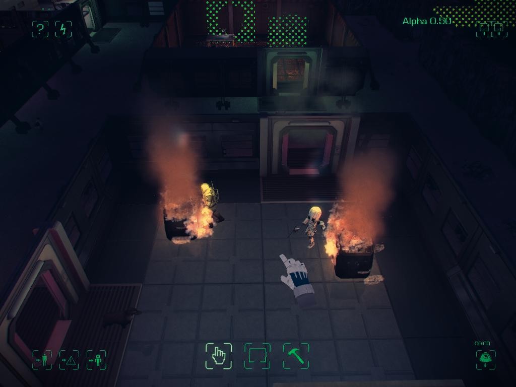
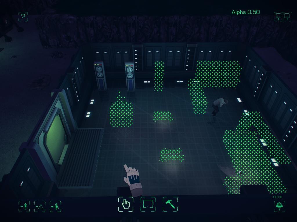
Everything is broken. My atmosphere generators have caught fire, I have people trapped in the living quarters due to a planning mistake, and one of my astronauts is waiting in the airlock for a wingman who will probably starve a little while after Airlock Boy runs out of oxygen. Some of these problems are intended. Some are not. But most of them are hilarious either way.

AAAAAAAAAAAAAAAAA!

AAAAAAAAAAAAAAAAA!

MAIA, a science fiction survival and base management game by Simon Roth and the MAIA team, has had a patch history almost as interesting as Dwarf Fortress. Chickens once flocked to magma vents as soon as a game began. IMPs would, in proper Asimovian fashion, try to do impossible jobs. Cats and dogs would walk on the surface of the incredibly hostile world (Called, funnily enough, Maia), with nary a care in the world that they weren’t breathing oxygen, but an incredibly volatile mix of horrific toxins. But for all that, the core idea has come across quite well, and 0.50 continues the trend.

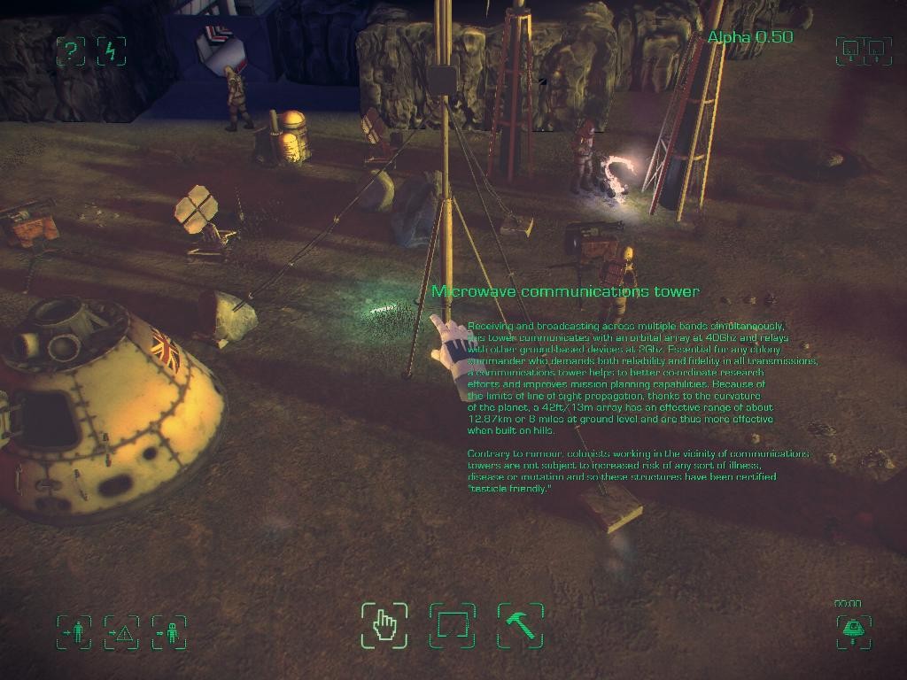
The game’s AI, for example, has gone through some fixing. This is a good thing… And a bad thing for those of us who have been playing somewhat differently beforehand. Before, turrets were a curiosity. Now, they’re a necessity if you want your home to stay powered, as the local megafauna think that your outside buildings are either really good scratching posts, or things they trip over and get annoyed at. But let’s talk about what can be done in the game for a bit.

Essentially, right now, you control a small group of plucky (doomed) british colonists, who have somehow managed to survive long enough to build a small base in a rocky outcropping on the world known as Maia. Or, more accurately, you plan rooms, buildings, and mining operations, vaguely hoping that they’ll do what you want. That’s harder than it sounds. But it’s also more fun and challenging than it sounds.

A little cluttered, but I don't want MegaFauna using my towers as itch-relief.

A little cluttered, but I don’t want MegaFauna using my towers as itch-relief.

For example, you need to leave room for your IMP robots (Yes, the Dungeon Keeper reference is intentional) to be able to expand the base. You have to make sure you don’t open the whole thing to the toxic atmosphere. You have to start from simple needs (Power and Air), working your way up the hierarchy (Air, Food, Sleep, Stimulation), and initiate research into the world that surrounds you. Right now, that process is mostly automated… But already, the first signs of having to ask your colonists to do more work than just putting things up are showing, with Necroscopy. All that is right now is being able to cut apart and study one of the Megafauna of the world, and, once your research level is high enough, build a reactor chamber and dope your water to help stop the colonists going stir crazy (Which… May have side effects), but research also already allows for better energy storage, better food production, bigger oxygen tanks… And a little something that helps save your colonists from endlessly having to repair things.

An intelligent servo-bot, currently equipped with a repair module. These little fellers will happily maintain your atmosphere generators… Right up until they develop a phobia of repairing things!

"I can't take all this BUILDING! BUILDING BUILDING BUILDING, GRAAAGH!" ...Okay, maybe not yet. But it's apparently in the game plan.

“I can’t take all this BUILDING! BUILDING BUILDING BUILDING, GRAAAGH!”
…Okay, maybe not yet. But it’s apparently in the game plan.

You can perhaps already tell, just maybe, that Maia is not going to be a game where things are safe once everything is built. From the beginning, team MAIA has talked of intelligent doors that refuse to co-operate, IMPs with a fear of the dark, things breaking down, things going wrong… And all the while, your colonists communicate with HQ in short messages and procedurally generated haiku. Pretty good ones, actually. It’s a black comedy of a game, which is why I’ve stayed interested throughout the Early Access process so far. The visuals and music pay homage, in their way, to 60s and 70s science fiction, with bulky space suits, tape-reel computers, and alien creatures that look goofy, but are threatening. The UI is quite minimalist (Although it does need a better way to examine completed research, and more clarity on which is LOAD, and which is SAVE), which is good, and the function of things is usually pretty clear, even when it’s currently “NOT YET DEFINED.”

So if you like the thought of a dystopian, understated, science fiction simulator with a fair dose of black comedy, MAIA is definitely one to keep an eye on. But be warned, as is often the case with Early Access games, there are bugs. There are problems. But they are definitely being ironed out, on a fairly regular schedule, and I’m pretty confident, by the time it’s done, that it will be a thing to behold.

Become a Patron!

Going Back: Syndicate

Considering I was going to be reviewing Satellite Reign, this was a no-brainer. But it’s also a no-brainer because it was, in its way, quite interesting. For all that people have compared SR to Syndicate (Released in 1993, by Bullfrog, who also gave us Populous and introduced us to Peter Molyneux), the two are very different experiences.

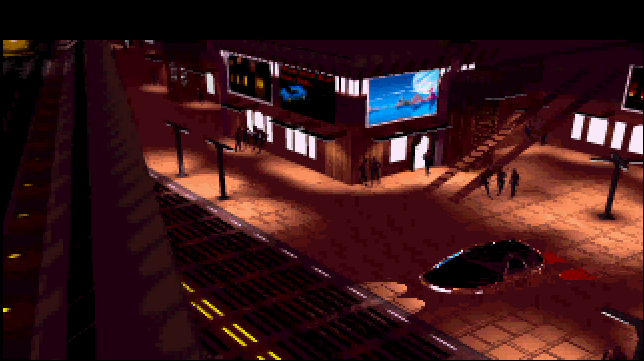
On these dark streets, a civilian is about to undergo a mandatory promotion...

On these dark streets, a civilian is about to undergo a mandatory promotion…

Both, for example, use four team members, who can, with the right equipment, do pretty much anything. They can be replaced. They can be upgraded. They’re facing off against other corporations. The world is grim and gritty. But here, the similarities end. Syndicate, you see, is strictly level based, as opposed to the sprawling open world of Satellite Reign. Skills don’t really exist, and your agents are easily replacable, not because they can be cloned, but because, to the corpsicles of Syndicate, grabbing a joe off the street, brainwashing them, and hooking them up to cybernetics is considered cheaper and more effective.

The goals, also, are similar, but in its way, Syndicate is broader in scope. Each mission is a step along the way to complete global domination, starting in Europe in the main game, then jacking up the difficulty with the additional “American Revolt” missions. And other things make the game easier as well. The Persuadatron, for example.

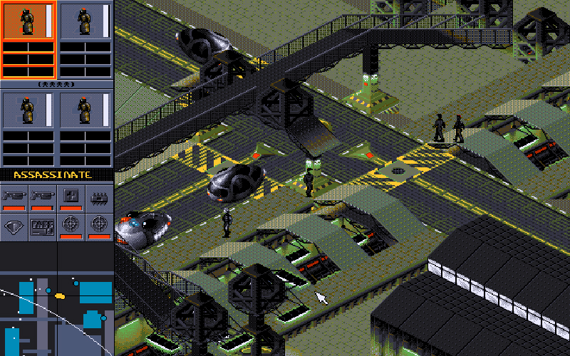
Nothing is safe from a truly determined team of Syndicate Agents.

Nothing is safe from a truly determined team of Syndicate Agents.

The Persuadatron was a wonderful device, although its usefulness declined in later missions. Effectively, you put it on, bumped into a civilian, and they were then yours. Get enough civilians converted, you could convert a police officer. Get enough officers converted, you could even convert enemy agents. Of course, that led to its own flaws, with one possible mission path being “Hoover up everyone on the map before going to the objective”… But it was only one possible mission path. Others would open up to you.

Stealth, for example, was do-able. Difficult, but do-able. Going loud, equally, was an option, and as the game progressed, you could move from destroying people (including the agents of enemy Corps) and civilian vehicles, to destroying entire buildings. Target you want to kill in a building? Right, gauss rifle and flamethrower time! But equally, equipping badly for a mission is a bad idea. Bringing a shotgun to deal with a scientist’s personal bodyguard? Well, that’d be fine, except you’re meant to Persuade the scientists, Agent, not Eliminate them. Access Cards could not only open doors, but convince police that you’re meant to be there (Although not, alas, guards.) And, of course, your agents have performance enhancing/reducing drugs and cyberware, which have various effects (Want to carry two miniguns? Improve your arm mods to hold them, and eye mods to shoot in a tighter pattern)

A busy street, circa 20XX, circa 1993.

A busy street, circa 20XX, circa 1993.

As an older game, the difficulty curve ramps up moderately quickly, and the final mission of the main game involves seven corps working with their kill teams against you in less than ideal conditions for your agents, but, even today, you can see little things that make this a classic. The AI isn’t terribly complicated, but it knew how to use its weapons, it gave the impression of a populated (Albeit not densely) city block, and for all that the mechanics, aesthetics, and music are relatively simple, they’re all geared toward the same experience. The experience of being dystopian enforcers of a terrible New World Order. Bullfrog would return to the theme with the expansion pack, American Revolt, in 1994, Syndicate Wars, in 1996, and, of course, Dungeon Keeper, in 1997.

Become a Patron!

Satellite Reign (Review)

Source: Cashmoneys
Price: £22.99 (£29.99 for Deluxe Edition)
Where To Get It: Steam

‘Satellite Reign is similar to Syndicate.’ I’ve been seeing this phrase a lot, unsurprising, because the game was billed as a spiritual successor to that second game, made by developers who worked on it, and it does, indeed, have similarities. But it’s not a terribly useful phrase. Let me try and do things a little better for you. For extra comparison, I’ve also written a Going Back on Syndicate.

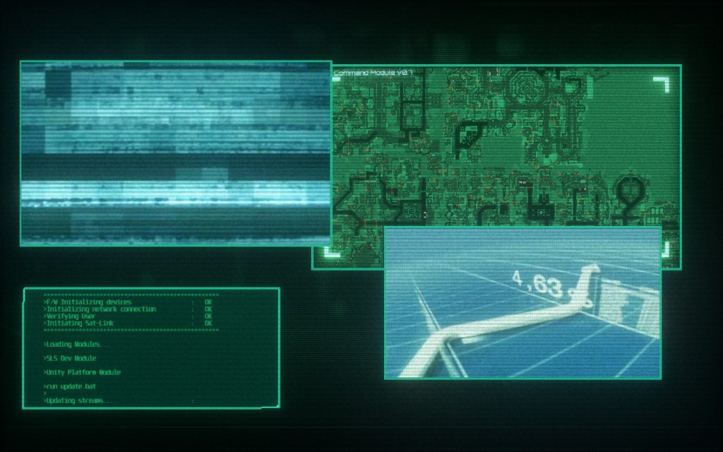
The intro to the game is quite interesting, and quite fitting for a corporate overlord surveying the situation.

The intro to the game is quite interesting, and quite fitting for a corporate overlord surveying the situation.

So, let’s go back to basics: Satellite Reign is a game where four corporate “Specialist Staff” (That’s a nice, corporate way of saying “Wetworks Operatives”, itself a nice way of saying “Professional Killers and Saboteurs”) are sent on various missions to ensure that your corporation is the one that gets to continue doing business. If you guessed this involves murder, assassination, property damage, and general mayhem, you would not only win an imaginary cookie, you’d also win a visit to [insert corp]’s wonderful Human Resources Department… Specifically the Attitude Adjustment centre, because you’ve quite clearly got the wrong idea about how the Glorious Corporation works.

It is, however, somewhat loadscreen heavy. Once the game actually begins, there’s less, but with my setup being less than optimal, three loading screens is a significant time investment once the game begins. And then the fun begins.

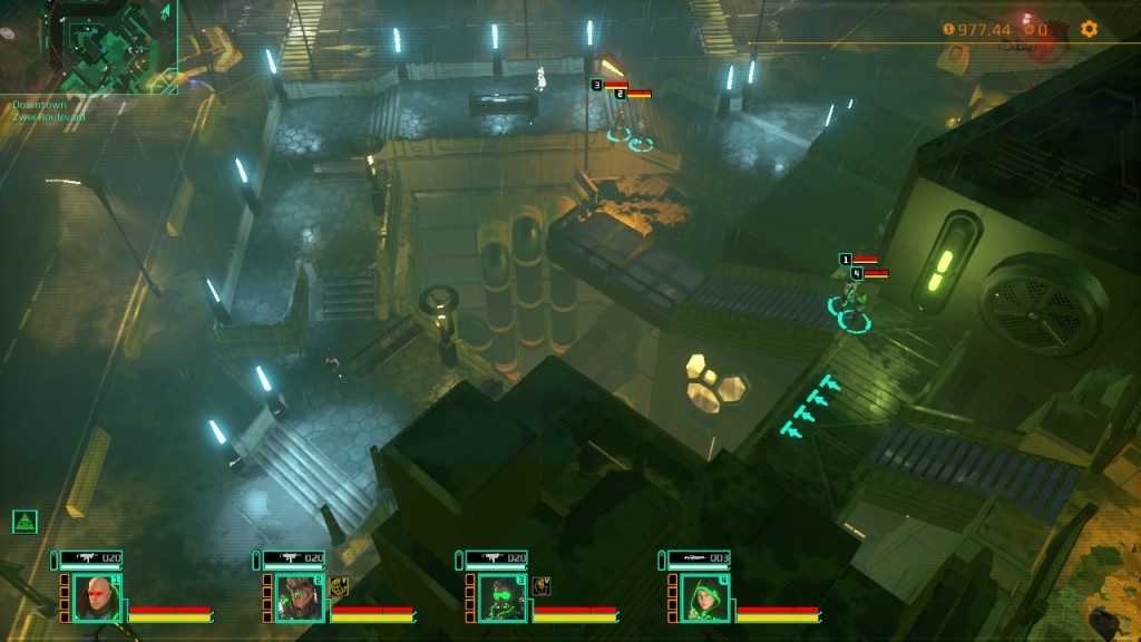
See all those dots in the minimap? People. Many of them more important than you realise at first.

See all those dots in the minimap? People. Many of them more important than you realise at first.

Except… Once you leave the tutorial, the openness of the world works against you. The game, in a sense, resists being played. The camera refuses to move from a certain angle, despite tall buildings getting in the way, and you will be spending a fair amount of time paused in the mission control screen, poring over what you know of the map. It’s also pretty resource intensive, so it’s more important than usual to meet more than the minimum specs, or else you’re going to be waiting longer, and reacting more slowly to situations as they develop.

I have to admit, although I love me a good cyberpunk game (And, importantly, Satellite Reign remains cyberpunk until you get some serious kit. For all that you’re a rival corporation, and clones exist, you’re still only four folks), I’m not so fond of Satellite Reign. The game clearly colour codes and highlights the sorts of things you want to keep an eye on, the music is quite tense, and very fitting, but you’re in an information overload from the word go, and it’s difficult to filter that.

Do I go for ATMs? Do I rob a bank or three? Get researchers? Try and level up my agents by hacking, murdering, sabotaging and hijacking? I don’t knooooooooow!

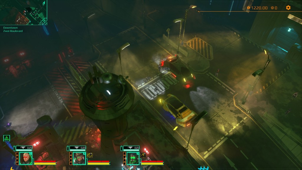
Security is no joke, even at the beginning of the game. Most of the reason I prefer stealth.

Security is no joke, even at the beginning of the game. Most of the reason I prefer stealth.

I do like that there are multiple paths through a situation. For example, the first mission, you can sneak in the back door and avoid two thirds of the security, in and out if you’re quick enough. Or you can go in the back door, gun everyone down, and leave as you came in. Similarly, you can level your agents in interesting ways, and there’s leeway even within their roles. But personally, I’m feeling lost, torn between several directions, and while that sort of fits the mood of the game, it’s not really for me. It’s a game that seems to requires multiple losses to truly master, but, unlike a roguelike, which follows the same philosophy, losing isn’t a case of “straight back in”, but loading screens and the tutorial mission. Or reloading the save.

I also like that there’s a lot going on, in a sense. Civilians, police, drones, cars… They’re all constantly moving, making for a living tapestry, and the dystopian vision is quite clear every time you turn down a side road and see rubble, and the city’s dispossesed (Who you can take advantage of). Alas, I sadly don’t think this game is for me.

If you like open worlds with lots to do, skill options, are good at squad level micro play, and don’t mind a lot of info being thrown at you, then being left to your own devices, this is probably a good game for you. If you don’t feel that real time squad combat and stealthing is your thing, then you’re probably better off with something more focused.

The Mad Welshman sat on his corporate throne, head in his hands. The synthesised voices of his agents rang in his ears, and he thought very hard of the Bahamas HR Centre.

Become a Patron!

Afterlife Empire (Review)

Afterlife Empire, developed by Autobotika, and published by The Fine Young Capitalists, is a sort of expanding tower defence type game, where the afterlife apparently involves scaring the wits out of anyone genre unaware enough to visit (Because Fear = Belief, and Belief = Life/Power for a ghost), and expanding your home, while scaring away troublesome exorcists, policemen, and assorted busybodies (who reduce belief in death threatening ways.) It has some interesting ideas, but… The execution could do with work. A fair bit of work. Let’s begin with the loading screen, and what appears to be one of two pieces of music for this game.

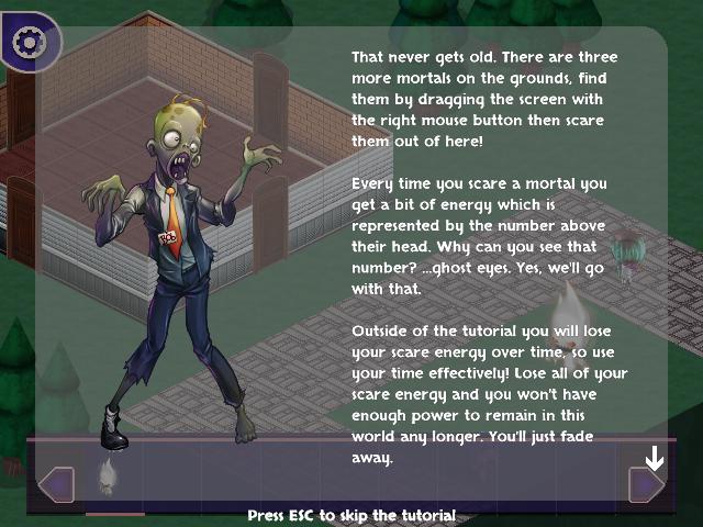
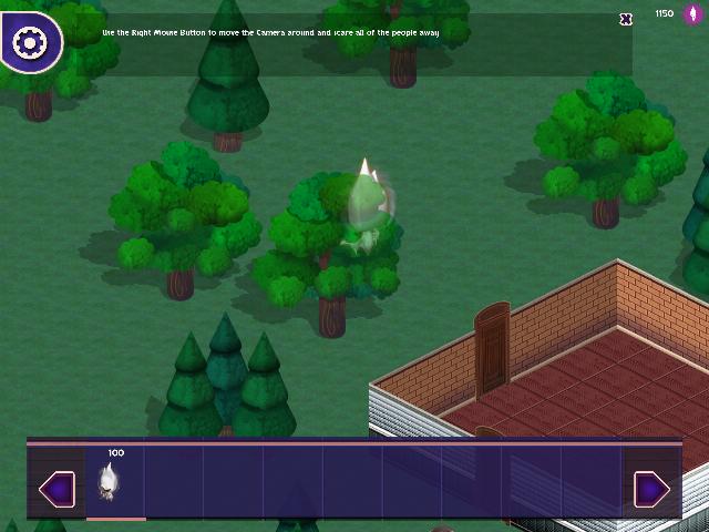
The tutorial messages, while helpful and skippable, also have the chance of you not being able to remind yourself of something you missed.

The tutorial messages, while helpful and skippable, also have the chance of you not being able to remind yourself of something you missed.

The loading screen tips are, for the most part, helpful, but there is one in particular that feels less helpful, and badly worded. “The Authorities notice when people die in your mansion. Yes, even the ugly ones.” Nobody appears particularly ugly, and… Do ghosts even have a preference there? Is “ugly” people fear less useful somehow? Do they have preferences? I couldn’t be sure, because of a core problem. The music needs equalisation, as instruments vie with each other for the top spot, volume wise, in their simple melodies. I turned it down (but not off), because… It vies with the game as well. The warning music does its job better, but… Two short loops for music make me feel… A little hollow while playing. And not in the mood enhancing way.

The UI. Not the UI in general, it’s mostly does its job. I like that I know what threats are coming from roughly where. I’m less fond of the tiny scare indicators… But I’m specifically less fond of the tooltips, or, more accurately, the lack thereof. The game provides little feedback (Except on powers, where it gives you a rough idea of what you do via the tutorial messages), and I cannot tell without a notepad which props are more or less useful for their price, beyond “More expensive = Good”. While, on the one hand, this could accurately simulate a ghost who knows nothing, the tooltips, frustratingly, never really appear. A new player won’t know what a scare trap does without trying one (Does one generate more fear than another? Don’t know for sure. I know what area of effect they have, but it always appears to be “The tile next to the object.”), just as they won’t know with props.

This becomes *less* of an issue when the game begins. But remains an issue which camera rotation would help with.

This becomes *less* of an issue when the game begins. But remains an issue which camera rotation would help with.

The tutorial is mostly fine, but does highlight a couple of problems. For example, camera and object rotation (And, for that matter, moving or deleting objects that are poorly placed). If there is any, I couldn’t detect it. Yet, for all that it’s usefully highlighted that one of the people I need to scare off in the tutorial is behind a tree with a tutorial path, nonetheless, they are behind a tree. Similarly, when placing props, not being able to see them to place them is a mood killer. As is not being able to place them because something I can’t see is obstructing them. For this, I recommend cutaway walls or some form of X-Ray technique. It’s very useful in an isometric game. Being able to scroll back on messages is also a good idea, and an encyclopedia of enemies might give both an incentive to proceed (Currently sort of lacking) and a means of remembering who does what. Sadly, neither of these things currently exist. The medium section, also, has its problems, as I failed to kill her by scaring her twice before she ran off the map, which… Meant she respawned, standing still, at the edge of the map. Thankfully, there was no power cooldown, so I just clicked twice, but… That’s something that should be avoided in tutorials. A tutorial should be a controlled experience.

Aesthetic wise, the models are nice. I can tell a civilian at a glance (Although apparently there are different kinds, and that’s less clear), and immediately tell them apart from an exorcist, a policeman, or any of the other folks who modify the score or threaten me in some manner. They tend to shuffle around quite slowly (A boon in the case of the exorcist, who drains your fear much faster when in the house, cleansing it), but they look fine. So do the tiles, the trees, and the walls. The props, though, I’m less enamoured of.

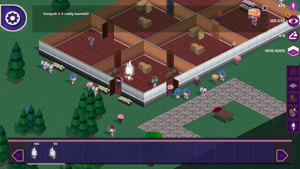
A fairly stable house design. Limitations mean the house isn't going to be very houselike, though.

A fairly stable house design. Limitations mean the house isn’t going to be very houselike, though.

I understand that what we start in is a dingy shack, and that we “gain more powers, props, and traps as you level up”, but I couldn’t find a single prop that was furniture at the beginning. Not even a tattered chair, table, or one of those cheap replicas of the Dogs playing Poker paintings. It’s a disconnect, and an obvious one. It does get better, but that was after the first ten minutes (Counting the tutorial), and the first ten minutes of a game are important. Especially with refunds on less than 2 hours of play now being a thing. Freezing the arrow scroll controls when in building mode also feels like an odd decision.

Finally, we have sound. Not everything makes a sound. Our ghost, in the title, silently mouths/laughs/screams at us (And sometimes laughs eerily when using his first power.) The props make no noise as they spooookily move of their own accord, and while people make sounds, they tend to only be a short, sharp scream before they run away. Those screams tend to wear thin after only a short time.

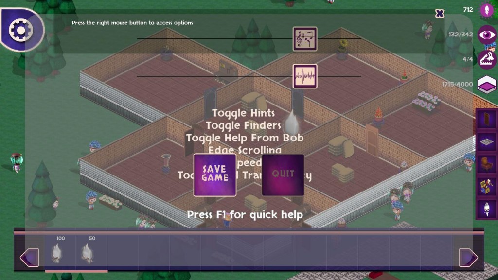
Consistent UI placement is a common first time developer problem. But once noticed, it *can* be fixed.

Consistent UI placement is a common first time developer problem. But once noticed, it *can* be fixed.

And all of this was noted in the first ten minutes of play. I’ve tried to play since then, but a lack of many forms of feedback a game generally contains means that, despite the tutorial explaining the basics, the game feels both incomplete, and an exercise in trial and error. I eventually got the hang of the core concepts, and things slowly get better and more varied, but, in short, it feels slow, dragging, unchallenging once those concepts are mastered, and incomplete. I don’t really feel much incentive to expand, as I can seemingly scare many people off with a single trap centrally placed, repeating this in adjoining rooms to make sure, and I don’t feel much incentive to open more doors to the outside, especially to the back, where it becomes easier for an exorcist to sneak in the back (Despite the handy notification that there are troublesome folks on the map). Loading a save resets the map’s population, but, and I’m guessing this is unintentional, so does hitting escape after you’ve right clicked to remind yourself what a power does (Also setting your power to 1000, which I suspect is due to a missing event flag.)

So that’s Afterlife Empire. I applaud the effort, but feel that the game needs a fair bit of work at the time of review before it could be considered a finished game. I hope those suggestions and pointers help the developers.

Become a Patron!