Robo Instructus (Review)

Source: Cashmoneys
Price: £10
Where To Get It: Steam
Programming puzzle games are, normally, extremely my jam. Teaching the logic behind programming is good, and, while it doesn’t teach actual programming most of the time, it does help understand it better. And that’s nice.

Unfortunately, Robo Instructus doesn’t do a great job, for multiple reasons. Starting with a start interface best described as “Not great.” Okay, fun programmer joke, putting the save profiles in a 1d array. Cool. But when your options at the start are a small icon in the top left of a mostly black screen (even if it is one of the icons that is commonly accepted to be “Menu”), you’ve got some accessiblity problems. Add in the fact that while windowed mode is there, but it’s a resizable window, rather than one with options for common sizes, and it becomes needlessly difficult for streamers to get the right proportions, even with a scaling UI (and UI scale options, which, admittedly, is a thing done right.)
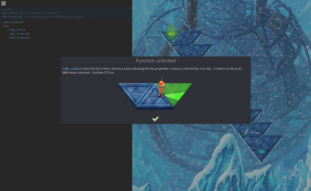
Then, of course, there’s the things the game doesn’t tell you. Some of them are par for the course, and thus not a complaint (such as teaching the various parts piecemeal, so you don’t need to do a thing), but others… Well, for example, the third level taught me, although it took a while for me to realise, that a teleporter in a multiple level area (which is most of them) seems to either not count the teleporter as part of a robot_forward() command, or automatically call that command without a call on teleporting to a new area. Or it’s a bug. Finally, in terms of gripes, entering the program is, in places, needlessly pernickety, specifically on indenting. In most Object Oriented languages, anything contained between { and } (and with each command ending in a ; ) is considered as correct but in Robo Instructus, it needs to be indented correctly, and it only autocorrects to this formatting if you started with the instruction that isn’t indented (loop or if, for example.) Sooo, a lot of gripes here, which isn’t great.
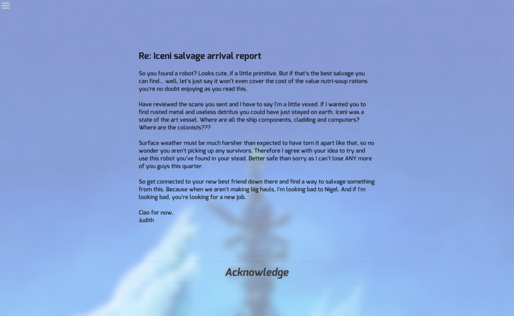
Aesthetically, it’s an odd mix. Most of it, visually, can best be described as “workmanlike” (or, possibly more accurately, a programmer’s visual design), but I’ll admit the actual robot section is visually pleasing, and the music is good.
But, overall? These gripes are certainly not trivial, for the most part, annoyances and accessibility problems that add up to make a programming puzzle game that, for once, I haven’t particularly enjoyed from the get-go.
The Mad Welshman knows enough coding to get him into trouble. Apparently, this trouble now also involves running robots off triangular cliffs.


