Re: Legend (Early Access Review)

Source: Cashmoneys
Price: £15.49
Where To Get It: Steam

As soon as I saw the farm, messy and strewn with rocks and trees, I knew. Or thought I did. “Ohhh boy”, I thought “I’m going to get halfway through this, and my energy will be pretty low.” Nope. I thought “Fishing is going to be my main source of income, because it’s easy.” Not… Quite true.
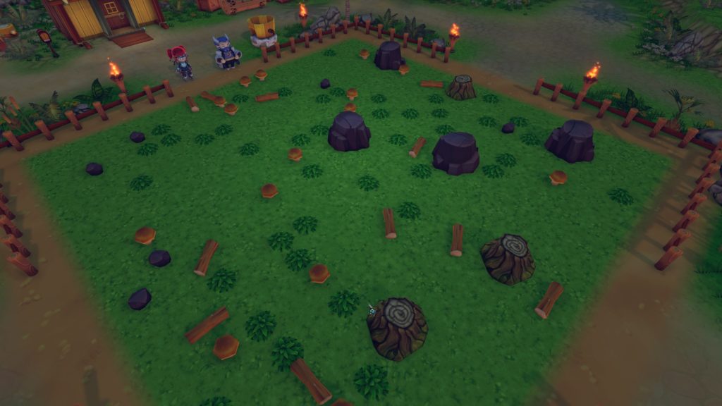
“aaaaaaaaa…” [later] “Oh, wait, that was easy. Nice!”

Essentially, I went in with expectations of a farm-life/adventurer sim in the style of Rune Factory, or Stardew Valley, and, while it is that… It’s also got its own flavour. Some good, some not so good, but averaging out, I feel, to “A’ight.” Which, considering it’s in Early Access (and parts of the review may be out of date by tomorrow, since the devs are updating at a steady clip), still gives it a fair bit of wiggle room.

So, let’s begin with the general idea, for those new to the genre: You, an amnesiac hero(ine), are welcomed into a small, rural community (In this case, on an island, so beaches and palm trees are common), given a farm, and, very quickly, you realise there’s adventure to be had in them thar hills. Or, y’know, you could do a lot of avoiding enemies (running doesn’t take stamina? Don’t you dare change that, devs, it’s wonderful!) to mine stuff you can’t get at home, farming, doing quests for folks, festivals, minigames… And, of course, romancing folks.

I haven’t gotten to that part yet, so I can’t tell if there’s some Good Gay options in there, but it’s all there, it’s mostly enjoyable, and those who’ve played this genre before not only know what to expect, they have some pleasant surprises. Like underwater plants (Trust me, if you’re new to this genre: Folks love more things to farm) and a pet system (And pets can have utility both inside and outside of combat, such as the Draconewt you start with, whose watery breath isn’t just useful in combat… It’s a nice, easy way of watering your crops, too!)
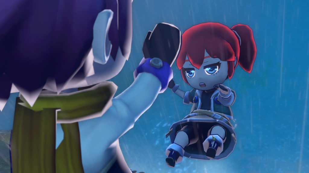
Immediately after character creation, you’re shoved off a cliff by some asshole. I hate it when that happens!

Aesthetically, it’s pleasing, with good, lowish poly character designs, a bright and cheery world, and a mostly clear UX (It took a friend pointing it out during multiplayer that I could add to my pet’s stats, for example.) I didn’t really find the tunes memorable, but that’s more because they fit just fine, and things that fit just fine… Well, you only tend to notice what doesn’t fit so well, generally speaking. Speaking of not fitting so well… Complaints and niggles.

Starting with the base stuff, tutorialising for things like fishing is a bit sparse (It took me a few tries to get the hang of fishing, for example, not helped by… ohboy, a bigger fish just ate the smaller one on my hook, and now I’ve got a bigger fight ahead of me), and not all of the minigames are enjoyable. Smithing immediately comes to mind, a “Hit the coloured bits on the bar” game where said coloured bits are… Rather small. Melee is, honestly, not as useful as the ranged options, especially when it comes to, for example, the first boss, who electrifies himself. And it can be fiddly to pick things up, water, or plant things, since you aren’t fixed to the tiles it uses (Also, if a pet is nearby, you can easily end up leaping on to ride them rather than pick up the thing your pet is standing over, necessitating leading said pet away. Every time.)
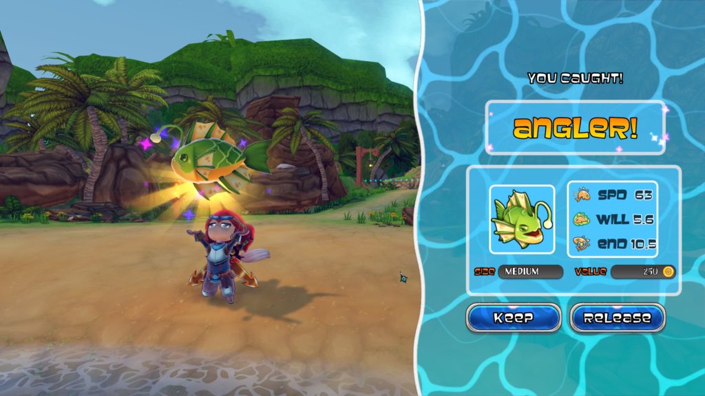
Yessssssss!

Finally on the crit, there’s multiplayer. It’s a relatively recent addition, so I certainly don’t mind the bugs, knowing that the community is pretty good at reporting them, and the devs, as I’ve noted, update pretty rapidly at the present time. I don’t even mind the lack of any sort of pausing, because synced pausing is unfun for the other player, and any other method would be a bloody nightmare. But the method of starting a co-op session is poorly explained, requiring you to copy the host’s Steam ID (the numerical one the game gives you, not your profile name or account name), and then pasting that in to connect (3 players can join a host, sharing a farm, and… The sales bin. Which, considering myself and my multiplayer partner have yet to find a means of expanding this, isn’t the best of times.)

But this is still relatively early days, the game is pretty solid overall, and, even now, I would recommend this to fans of this genre wot Harvest Moon, Rune Factory, and Stardew Valley belong to, the… Farmer-Adventurer RPG Lifesim? Not quite sure. Anyway, it’s reasonable right now, and certainly shows promise.

The Mad Welshman actually quite likes the humble farmer-adventurer. Sure, they can be massive jerks, but they’re massive jerks who put food on his table.

Become a Patron!

Pyromind

Source: Review Copy
Price: £2.99
Where To Get It: Steam

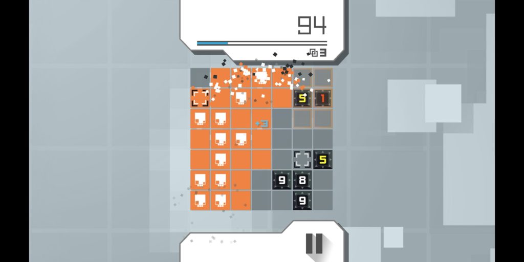
Pyromind, in its own words, is a turn based, but also real time action puzzler, in which you are a “Mind” , in a minefield (A… Mindfield? Your groans sustain me), trying to defuse bombs before they go off, reaching a higher and higher score, with more difficult elements, every time you do so. There are two kinds of mines, but there only needs to be two kinds of mines, because a Pobomb (1 square radius) or a chain of them can kill you just as easily as a Limonka (Cross effect across the entire field) or its chain can. Your only saving grace? You can cross from one side of the field to the other.

WHOOPS!

So… That, and the fact you can earn minds (slowly, oh so slowly at first) with their own special abilities (you start with none, obviously) is pretty much the core of things. There’s a time attack mode, a multiplayer battle mode (alas, I can’t say much about that… Not much of a multiplayer guy), and a campaign in the battle arena mode, essentially a CPU vs Player version of the multiplayer mode.

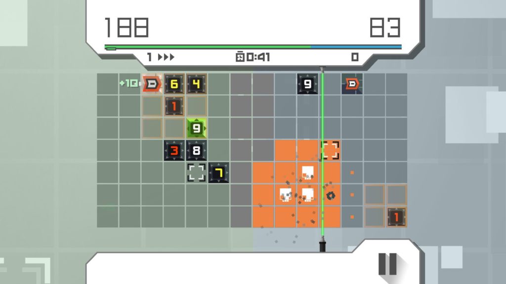
Alas, while single player modes earn gems for new characters, the Battle Arena does not, although the idea is fun: Essentially, the more points a player has over their opponent, the quicker a screen splitting laser moves toward the opponent, and horizontal screen movement isn’t allowed, only vertical.

So, simple to describe, and indeed learn, and not difficult to master, just requires keeping a sharp eye on where bombs are. Still ramps up the difficulty quickly, and I do wish difficulty was selectable once you’d cleared more than one difficulty, but this isn’t really a big flaw. A middling flaw, really.

It’s a variation on the sudden death of other puzzle action games, but I like its touches.

Finally, we have the aesthetic. Everthing except the menu is relatively clear, there’s a fair amount of good music, both tense and charming, and its clean, vector style appeals. As mentioned, the menu could do with more clarity, rather than going fully stylistic as it has (Options and credits are currently the arrow in the top right, tooltip for what the hell something is in the top left.) But, apart from the flaws described, this is a solid title, with an interesting core mechanic, and I’m having fun with it.

The Mad Welshman hates Limonkas. They may have become his newest worst enemy.

Become a Patron!

Age of Wonders: Planetfall (Review)

Source: Hard parted with Cashmoneys. Worth it though.
Price: £41.99 (Look, there’s DLCs and a Season pass…)
Where to Get It: Steam

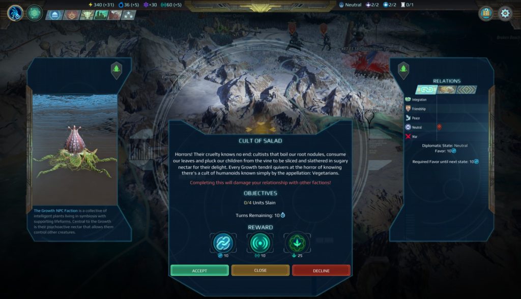
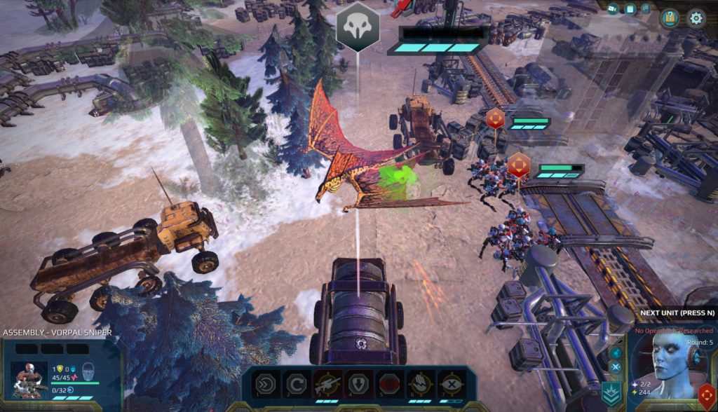
Space Opera is, in a way, a high fantasy all of its own. Want space elves? You can have space elves. Want space dwarves? Sure, no prob. Want a monolithic evil empire? Well, we all have those days. So Age of Wonders: Planetfall is not, strictly speaking, that big a leap from the fantasy shenanigans of previous games. Spells are now Tactical Operations, roving monsters are often NPC factions (Not all of which have a player faction equivalent), and overall? There’s a lot of interesting changes here, all of which seem to improve that AoW experience.

I get the distinct feeling we’re naming them, rather than using their names…

For those who don’t get the fuss about Age of Wonders, it’s a long running 4X franchise which has boasted many factions, asymmetric gameplay elements in later instalments, and some cool worlds of high fantasy. Well, now it’s science fiction. Turn based, with a hex based combat system when you get into it with units, and… Well, let’s talk systems.

As noted, there’s a lot of changes, but the two biggest, to my mind, are the Mod system for units, which extends the utility of units, especially Tier I units, quite a lot, and allows a fair amount of customisation, and the ability to research both your military and social researches at the same time, which… Really streamlines play, and I like that! In addition, factions and classes further mix things up both in the unit and research side of things (Species who choose the Voidtech class, for example, get Void Walkers, beings who can clone themselves before a seemingly unwinnable fight, and if they die? Well… Their clone is now them, because they were time travelling, and you had the bonus of doing damage to a creature outside of your current strength)

There’s many enemies, always enemies. But they will fall before the superior meld of biology… And technology

The system of base building has also been rejigged, and I also quite like this. Before this, it was done in a slightly more traditional 4X manner, with building cities, expanding them, and the main difference was in Outposts (to extend your territory without building another city) and Watchtowers (Extend the vision range of whoever owns them.) In Planetfall, it’s a collection of territories, and expansion is through exploiting a sector within range (preferably connected), and then building an exploitation on that point. Forward Bases can pre-emptively claim a territory, although anyone who wants to either destroy that or take that claim for their own can certainly try, so defending forward bases is… An interesting dynamic, since the game doesn’t generally encourage hordes of units, overall.

It’s somewhat refreshing, after the hullabaloo (enjoyable hullabaloo, but hullabaloo nonetheless) of Age of Wonders, to see the turns just… Glide by, relatively speaking. And it helps that, aesthetically, Planetfall is very much on point. The UI remains the same, and is mostly readable and well organised (occasionally, there’s a button or two that confuses a little, but it’s easy to learn), the music is fitting and gets the mood going along with things, and the worlds are, again, clear about what’s what. There is also hotseat, always a favourite of mine, for anything up to 12 players (Which is a fair bit more than the current number of factions, but the existence of a DLC Season Pass implies, as with Age of Wonders 3, that more is planned.)

I do enjoy a good warrior woman. Almost as much as my queer readers do.

So… I don’t really have any gripes about Age of Wonders: Planetfall. Some folks might get turned on by the extra login (as they might have done with Age of Wonders 3), but many a 4X or Grand Strategy player already has a Paradox account, so… Overall, it gets a recommendation for 4X players, with the only advice for those new to AoW being “Save often, but especially before fights, so you can learn how it all works without as much frustration.”

The Mad Welshman is torn between factions. So he spends most of his time with Planetfall banging his toys together and making “pew pew!” noises in Hotseat. He absolutely will not apologise for this. More 4X’s need hotseat.

Become a Patron!

Crystal Crisis

Source: Cashmoneys
Price: £15.49
Where To Get It: Steam

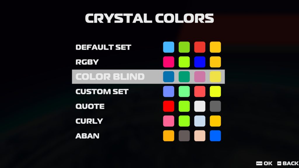
Right, gonna get this part out of the way right now: While I’ve suggested fixes to the developer, at the time of writing, the colourblind support for Crystal Crisis is spotty at best, and the best option is to go into Extras (not Options, Extras), select custom colour scheme, pick colours that seem to work for you, and test them in Practice mode. I have requested further comment from the developer after the steam thread I gave this critique (and advice) disappeared, but so far, Nicalis has not responded, and I shall update the review when they do, or if this changes.

The original colour schemes. Three use green and yellow, with similar values. The colourblind set has different light values, but this only actually helps one or two types of colourblindness.

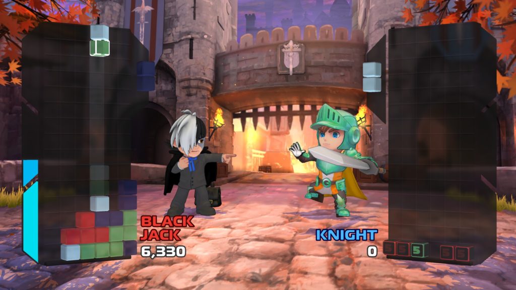
So, now that that particular beef is out of the way, the rest of the game is… Alright. Essentially, a 1P vs CPU game of dropping rotatable pairs of blocks, making patterns, and then popping them with the corresponding coloured gems that sometimes drop, in order to both drop blocks that can’t be interacted with for 5 drops (generally speaking), and to build up meter for the special abilities of your chosen characters (For example, Curly can either destroy rows on her own board, or turn rows of her opponents‘ board into the aforementioned unusable blocks.)

There is a story mode, although it honestly didn’t grab me that much (Essentially, a series of fights in which you choose which character you’ll play, and then get an ending depending on your path), while the game’s replayability depends on how much you like this sort of game (I’m alright with the various tile dropping and tile matching type deals, so I expect I’ll be coming back every now and again.) Finally, there is an Arcade mode, a decent (if slow) tutorial, a practice mode where the AI doesn’t fight back, and an Online mode that… Well, while I don’t normally comment on online modes, I have been seeing a fair amount of “Online is a ghost town” type threads out in the world. So playing with a friend online is probably your best bet.

As noted previously, it’s probably best to use your own colour scheme if you’re colour blind.

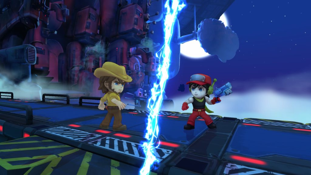
Finally on the mechanical end, we’ve got a mostly solid, unlockable character roster, which includes both Nicalis characters, and, interestingly, some of the cast of Osamu Tezuka’s works, such as Black Jack and Astro Boy. I do love me some Tezuka characters, so it earns a few points with me for that.

Aesthetically… Well, the menus aren’t bad, with a little bit of character to them, the characters definitely aren’t bad, well modelled and animated, the stages, similarly, are nicely modelled, and the blocks are, apart from the aforementioned colour blindness issue, and the somewhat inconsistent nature of their lighting (Furthering the colourblindness issue at times)… Well, they’re blocks, and stars, and you know the difference between a block, and the various special things. The sound is good, the music’s good.

Story mode is alright, just as the rest is. But don’t expect a deep plot.

If it weren’t for the colourblindness problems, I would heartily recommend this. But, here’s the thing: Colourblindness is common. The ways to deal with colourblindness in video games are, equally, well known and commonly passed around in most gamedev circles these days. So to see problems like this, where three of the default colour schemes have green and yellow of similar light values (A big problem), and the colourblind one has pink and purple (Which even non colour blind people can have problems with), with the aforementioned inconsistent lighting further confusing things, I can, at best, merely not recommend it to colourblind folk. Because even when a game does what it says on the tin overall, this definitely is a blunder.

The Mad Welshman refers you to the previous review for education on some techniques folks use to be more colourblind friendly.

Become a Patron!

Fantasy Strike (Review)

Source: Cashmoneys
Price: £23.79 (Soundtrack £6.79)
Where To Get It: Steam

Fighting games are sometimes difficult to learn. Sometimes, they’re also difficult to master. But sometimes, as in Fantasy Strike, they’re mainly difficult to master. Which I appreciate, even if a tutorial before you can even change the window settings is not something I appreciate. Still, let’s talk Fantasy Strike.

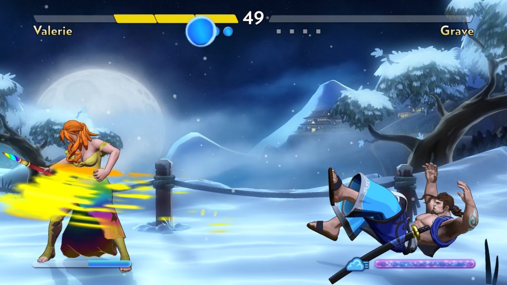
“…You’re already painted.”

The philosophy behind Fantasy Strike’s fighting shenanigans is twofold: Firstly, to make a more accessible fighting game. But secondly, the game is all about David Sirlin’s favourite part of fighting games: Yomi.

It’s got multiple potential meanings, even in fighting games, but, essentially, the idea is that high level play involves reading your opponent well, so that you can adapt your strategies on the fly, be that conditioning your opponent into certain reactions (that you then punish with a different moveset), or simply knowing that an opponent likes a certain pattern, then punishing them for using it (It can go many ways, as you can see.) So, how does it do this? Well, multiple ways.

Firstly, there are a total of six buttons: One for light, one for heavy, two for specials, one for throwing, one for jump, and one for super moves. Also there is no crouching. Okay, that’s a relatively simple set up, especially since many characters don’t really have the need for both specials (although directional inputs change a fair few moves, as do, obviously, jumps.) There’s also a more limited health bar that gets chipped away if you block three attacks consecutively (some moves do double damage, such as Midori’s Dragon Throw, but most either deal one, or combo, so blocking it is effectively one damage, or two for not blocking.) It’s still somewhat twitchy, requiring good reactions and not button mashing to win the day, but that is, honestly, not bad. Enemies also flash various colours for invincibility frames (white), throws (blue), and special throws requiring a jump prompt to escape (green.) That still requires good reactions, but it is helpful.

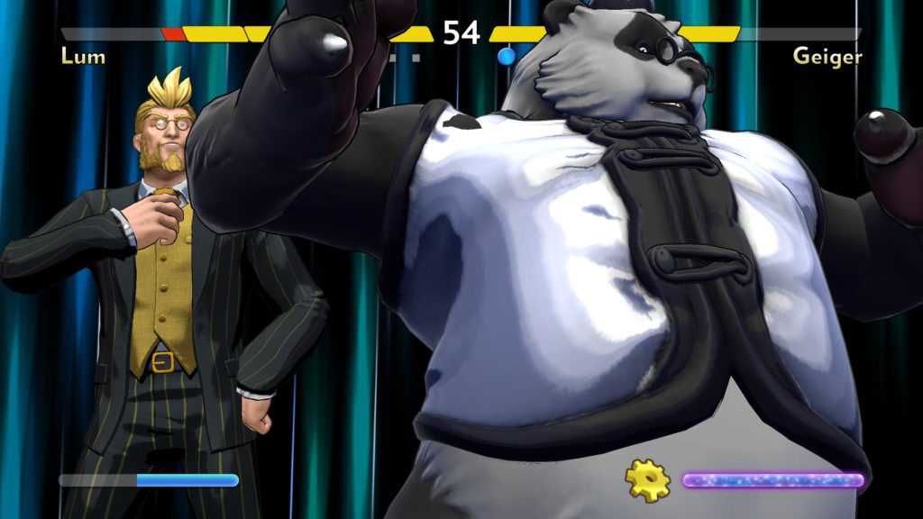
Geiger, having a watch that controls time, counters and specials by… Being an asshole, essentially.

Secondly, beyond the things that you normally do with the concept of Yomi (pattern punishes, baiting, jump cancels, etcetera), there is the concept of the Yomi Counter. Somebody wants to throw you, and normally this is tough to counter, but in Fantasy Strike, the way you counter it is by… Doing absolutely nothing. Not moving, not punching… Just very briefly letting go of the controls. In practice, this is something that still requires mastering the specific reaction needs of Fantasy Strike, but the mechanical theory, at least, is clever.

Finally, the game lets you know what kind of character you’re playing, and, like other fighting games, allows you to see the moveset. “Wild Card”, alas, is a needlessly nebulous term, as the two fighters in this category, DeGrey and Lum, still have overlap with other categories. Lum is a sort of zoner in practice with random items as his special, while DeGrey is a sort of meld of grappler (slow-ish, but hard hitting), and “doll” fighter, with his ghost friend being a ranged grapple. But the other categories of zoner (specialises in controlling the battlefield in some fashion, and making areas of the battlefield dangerous. By the way, no crouch means projectiles are more dangerous), rushdown (relying on getting in someone’s face and comboing them with mixups (different attacks to different areas) to murderise them), and grappler (You hit hard, are slow, and mostly rely on throws) make sense. The majority category, by the way, are zoners, giving you some idea of the priorities here.

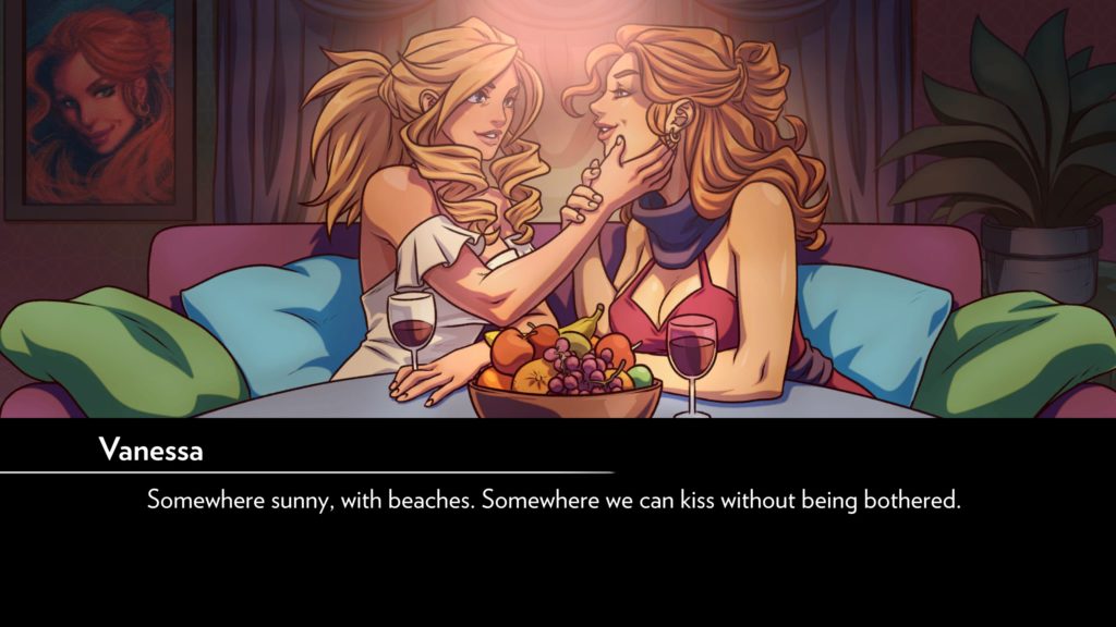
SIIIIGH. On the one hand, feels. On the other, in retrospect, the fact this lady is dragged off by oppressive government, then never mentioned again is bad.

Aesthetically, the game is honestly not bad at all. The characters are interesting visually, and you get a rough idea of what they can do by their look, the stages are lovely, and the music, while a little generic at times, is fitting and doesn’t steal the limelight. The voicework, on the other hand, is variable. Yes, I get that Valerie is a “Manic Painter”, but that isn’t always full ham, buds. And she is full ham. Which is a shame, because she’s my personal favourite. Similarly, the writing of Arcade Mode is… Well, it’s a little like earlyish fighting games (we’re talking Darkstalkers era more than original Stret Fighter), in that the plots are mostly silly, and told via beginning and end cutscenes. Although Valerie’s does start on a dark note, as her lady love is carted away by the oppressive government of the world that… Doesn’t really get that prominent a story role, to be honest? So, while there’s some queer rep, the cast is, honestly, pretty white as far as it goes, so it doesn’t really win any points for diverse representation overall.

I’ve already mentioned my main gripe (the tutorial being right at the beginning, rather than, say, a prompt before playing your first game that then allows you to change your options before play), and I will also mention that online requires a separate signup (Something I know some people aren’t a big fan of), but, overall? It isn’t a bad game, although I will say that the limited character roster is, considering the price, also a potential turn off. Finally, I’ll mention that yes, pro players will still kick your ass until you master things, with it being more to do with pattern recognition and timing than that and a hefty moveset. Otherwise, it honestly does most of what it sets out to do, isn’t a bad fighting game, and I found myself having an okay time with it, despite being normally bad and frustrated at fighting games.

The Mad Welshman dislikes explaining a lot, but, with fighting games, it’s kiiiinda necessary. There’s a lot of terms that only exist in fighting games.

Become a Patron!