Necronator: Dead Wrong (Early Access Review)

Source: Review Copy
Price: £14.99
Where To Get It: Steam

For all that I am not the biggest fan of tower defense games, I do respect a game that respects my time. And Necronator, being a tower defense roguelike, is a game that respects my time. And has a sense of humour. And, so far, only a few flaws.
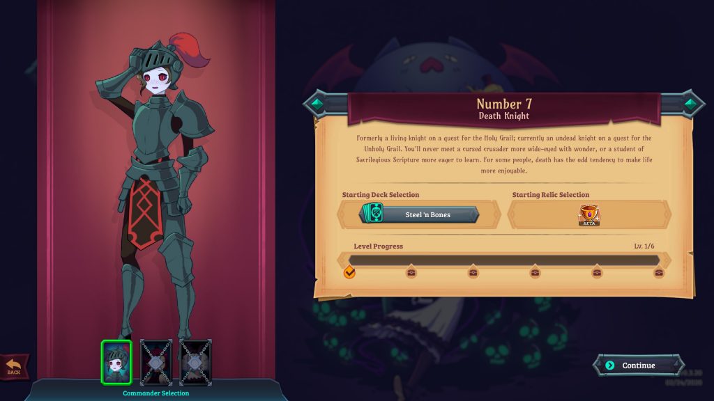
Ah, the fresh… The freshly exhumed face of a new Overlord in training!

If you’ve never played one of these, the deal in this one is relatively simple. You summon enemies from your own “tower” (a crystal sphere, in this case), they go toward the enemy settlements or along the path you choose for them (by flipping signs), and the enemy does the same from their castle. Why a crystal ball and a castle?

Well, because you’re an evil overlord. Well, an evil overlord in training. And each time you defeat a settlement, be it an actual battle, a shop, an event, or a rest point, you move onto the next, down a branching map until… The boss. Gaining more servants along the way, that you cast.
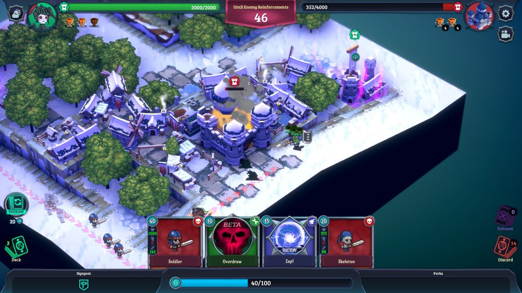
Muahahahahaa…

There’s more to it than that, of course, mana, how getting minor settlements from the enemy speeds up your mana production, and makes defending a lane a little easier, how if you’re not quick enough to ruin an opponent, they reinforce, and the fight gets harder the longer it drags on… It’s a deckbuilder too.

Anyway, yes, battles are, overall, short. They get longer, as the sectors drag on, but for the first hour or so of play, you’ll be hard pressed to find one that lasts longer than five minutes. And I respect that. It’s pretty frantic, it looks pretty nice, and a rotatable view means that things can obscure the path you’re looking at, but it’s never more than a keyboard press away, and dragging units onto the field can be done anywhere, so this is a pretty good deal.
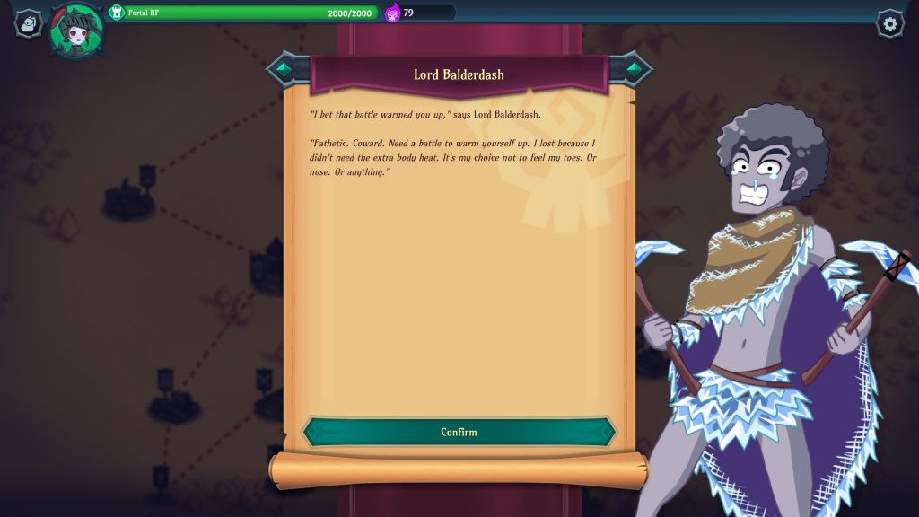
Pffft. Giving this guy the cold shoulder. Repeatedly.

Actually, wait. Giving him a cold shoulder’s actually a good thing, for an undead. It’s not like you have a warm shoulder!

Helps that it aesthetically looks pretty good, with some nice music, a good pixelly feel mixing well with cel-shaded art… My main criticism, aesthetically, is that some things don’t seem to get sound cues, so you have to trust, for example, that enrages are proccing, and that the status symbols over a unit are small unless you zoom in… Which you don’t, generally speaking, want to do.

Overall, though, it feels frantic and challenging without actually being twitchy, it’s got an interesting deck mix, a good aesthetic, it respects your time… It’s a promising start for Necronator, and I look forward to seeing where it’s going.

The Mad Welshman salutes his fellow Overlords. Soon, brethren, soon, we shall face… The Finals!

Become a Patron!

Hidden Through Time (Review)

Source: Review Copy
Price: £5.99
Where To Get It: Steam

Hidden object games, when they’re purely hidden object games, are normally extremely my jam, not least because they seem like a bit of a lost art.

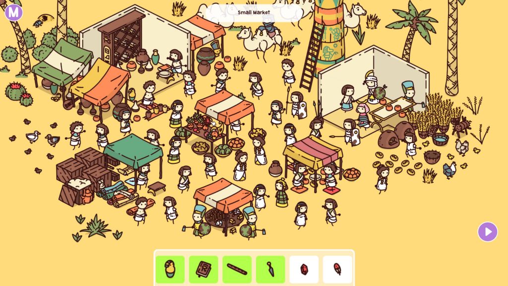
Only a gem, and a feather left. Ohhh, Horus is gonna be annoyed if I don’t find his feather…

Hidden Through Time, while it definitely has its good points… Also misses the point enough times that although I’ve completed it, I find myself with mixed feelings. And some eyestrain.

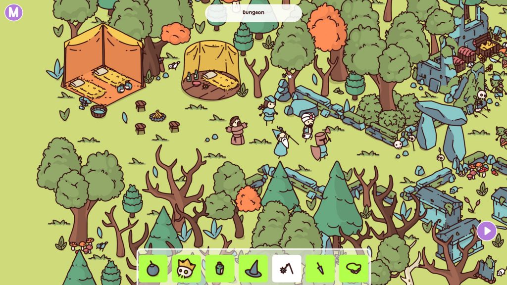
Let’s get the obvious, glaring flaw out of the way right now: There are a fair few objects and people… Who are more than 75% obscured, or hidden in colour identical (or nearly identical) areas. Yes, developers. You want people to have a hardish time, explore your lovingly crafted scenes to find those objects… But if it’s more than 25% obscured, especially if, for example, it’s a thin god-damn thing to start with (Hi, nearly every instance of the mace I saw!), it’s going to irritate people when they find it, even if it is the only instance of the object around. The mace, as the most irritating example I remember, could have been put out in the open. There’s enough visual confusion that it would still be missed on a cursory pass, believe me. Otherwise, that full view of the object in the hints, regardless of what clue you give? Useless to me, or any other player. I got those through sheer bloody mindedness. And no, the outlines don’t actually help with the smaller items. In the case of the smallest items, it makes them harder to identify.

AAAAARGH, NO, PLEASE DON’T. IT’S TINY ENOUGH AS IS!

Rant over. Now let’s get on with nice things. Aesthetically, it’s quite nice. The clue boxes themselves are clear, there’s a nice, simplistic style, which, with the exception of the small, fiddly objects, works for it… And there’s a fairly easy to learn editor, allowing you to set your own objectives and clues, and for others to play those online, nice! It is somewhat irritating that some objects you’d consider rather common, like skeletons (Let’s face it, skeletons in games are really common) are restricted to the age they’re first found in, but that’s, honestly, a minor niggle in the face of things. Music wise, it doesn’t wear out its welcome, although it’s not really memorable stuff.

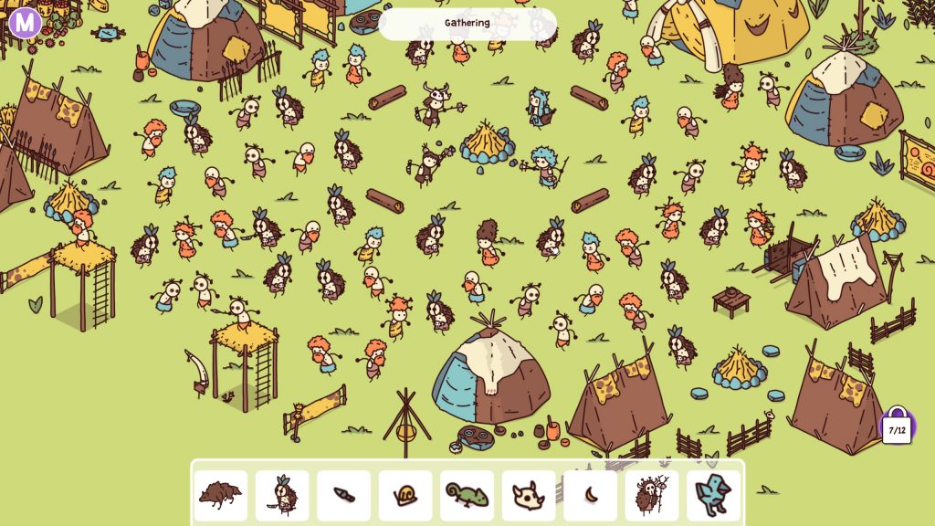
Scenario wise, I do somewhat like the story mode’s stories, for the most part. The stone age stuff is very reminiscent of both the Flintstones and old children’s puzzle books, which would also sometimes have things like “What if a zoo, but stone age?” , or little touches like the builders in the egyptian setting leaving their tools back at the workplace, or dropping them, or accidentally breaking the pillar they’ve built… These are nice touches, and they definitely helped bring things back from irritation with the negative aspects of the design, to the more positive end of things.

Mmm, well do I remember the tribal moshpit. Rock banging solo went on forever, though!

So, overall, Hidden Through Time is flawed, but it’s still a game that doesn’t outstay its welcome, that allows replayability through creation, has at least an accessible UX (Alas, a lack of colourblindness support, and the aforementioned eyestrain inducement of finding the tinier, skinnier things loses this one accessibility points), and is, overall, a hidden object game to definitely try. You’ll find out pretty quickly if this one’s a turn-off for you.

The Mad Welshman has found everything. Except his mind.

Become a Patron!

Lewd Leaf Land: Maple Tea Ecstasy (NSFW Review)

Source: Cashmoneys
Price: $4.20 (Approximately £3.50, with the option to donate.)
Where To Get It: Itch.IO

Content Warning: This is an adult only platformer.

(more…)

Become a Patron!

Murder By Numbers (Review)

Source: Cashmoneys
Price: £11.99 (Soundtrack £6.99)
Where To Get It: Steam

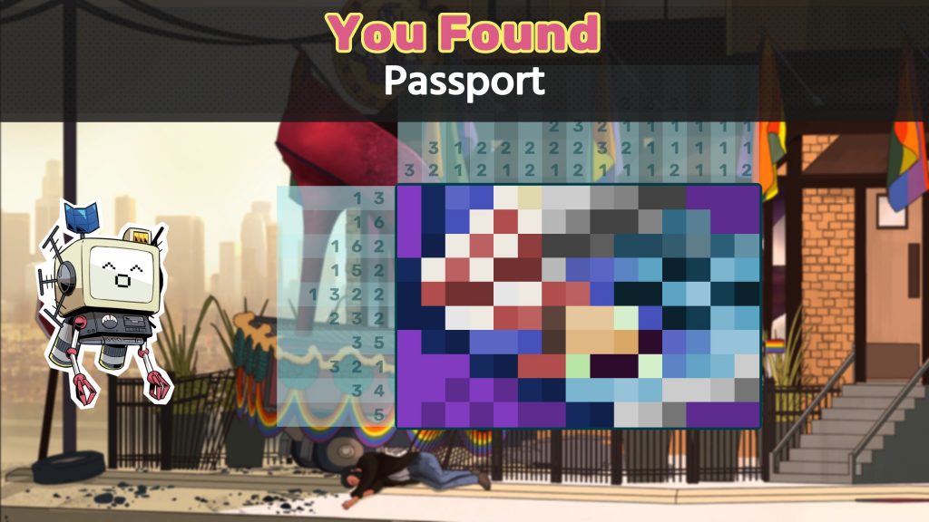
Murder By Numbers is a great Picross Murder Mystery Visual Novel… In which, oddly enough, the Picross is the weakest part. Not terrible, by any means… But it is missing some quality of life stuff that somewhat baffles. But let’s talk about the good, first, since, as mentioned, the Picross part isn’t awful.

This is, er… It’s… I’ll get back to you… (It’s a phone receiver. But the coloured version is only somewhat clearer)

The good is… A lot of the rest. Let me start by saying that this is the first game in a long while I’ve encountered who actually understands what makes a good Saturday Morning style theme. And the rest of the music is great, slipping into its mood, and, just as importantly, humorously cutting off a triumphant theme when whoops… Moment ruined. It’s a little touch, but it’s a good one.

Then there’s the rest of the aesthetic. Big, clear icons, with the eye being led to the two less obtrusive ones. Large sans serif fonts. White borders around the characters, adding a note of differentation between the styles of the foreground and background, that helps cut down on any minor style dissonance… It’s good work, being both visually appealing and clear.

Becky. Being a badass.

And the writing. For example, I hated Becky at first. She’s a diva with a temper, and she seems oblivious to the feelings of those around her as she storms and lashes about. But she gets nuance. I started to empathise. The characters each get their spotlight, potential motives for characters dying becomes clear, and the murderers… Well, I can perfectly understand why comparisons to Phoenix Wright: Ace Attorney have been made. When the killer loses it… They lose it. And it’s your guide to when you’re on the right track, although the clues do connect the dots well, even toward the red herring paths you’re meant to go down, before the real culprit is found. Nice touch, that, and it shows the developers know their murder mysteries, because I couldn’t find wasted foreshadowing or hinting. What I’m getting at is, it’s well written, and I love that.

That… Yes, case in point.

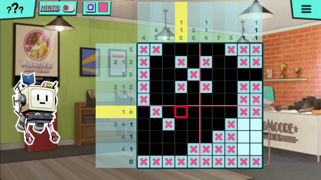
So… The Picross element. If this were great, it would be the cherry on the cake, considering it was a core advertising element. And it isn’t, to make this clear, bad, although snobs of this genre of the puzzle like myself may feel uncomfortable with it. And it is, apart from finished sprites that sometimes seem less than clear, mostly to do with little things we’ve come to expect. Like being held within a row or column if we’re moving down that column. Or a restart puzzle button in easy reach. Or maybes being turned into either crosses or pixels, instead of just being erased. Little things that merely make it… Alright, verging on good. Thankfully, they’re things that are fixable, for the most part. And they do, to be fair, ease you in. Although in the later cases, it can merely look like they’re easing you in, instead posing you a devious one in less space than you’d think you can be devious. Save before you investigate, and after each puzzle. You’ll thank yourself later.

The characters get so expressive! Also… NEEEEEERD!

It is a shame that a core element isn’t great, but, as noted, these are fixable problems, and the rest of the game is otherwise great. As such, it gets a recommendation, with the caveat that, until the aforementioned Picross Problems (heh) are sorted, folks like me who play a lot of such games are going to be grinding their teeth.

The Mad Welshman played the theme tune no less than thirty times in a row while writing this.

Become a Patron!

Besiege (Review)

Source: Cashmoneys
Price: £6.99
Where To Get It: Steam

Way back when it entered Early Access, Besiege was a darling of streamers who loved contraption games. In a sense, I can see why they liked it. In another, it’s… Not the friendliest of games. But I can definitely see the appeal.

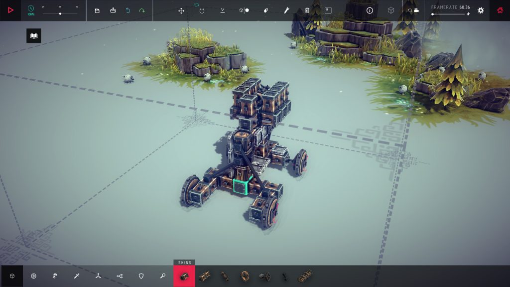
An attempt at building a rocket launcher. This failed.

Okay, so, the unfriendliness is a good start, because, honestly, this is going to be the biggest turn off. UX wise, the menu options are tiny. And, apparently, UI scaling was at its biggest level when I ran it, so… Yeah, that needs a rework, folks. You can do bigger than that. Indeed, only by zooming into the planet menu was I able to see where the heck I was meant to go for the first world. Secondly… Building, and the tutorialisation thereof.

I get that it’s a toolbox to play with, and that experimenting is at least some of the fun, really I do. But how, pray tell, do I stop a bomb exploding instead of launching it? I don’t know. How do I aim a rocket well? I don’t know. How do I give my poor siege engine four wheel drive? This, I had to look up. Turns out you can rebind keys on individual parts. It ain’t the friendliest. You need boomy things to kersplode rock or brick. This, at least, I got.

Boom. Playing with bombs is rather difficult. I still haven’t worked out how to do it.

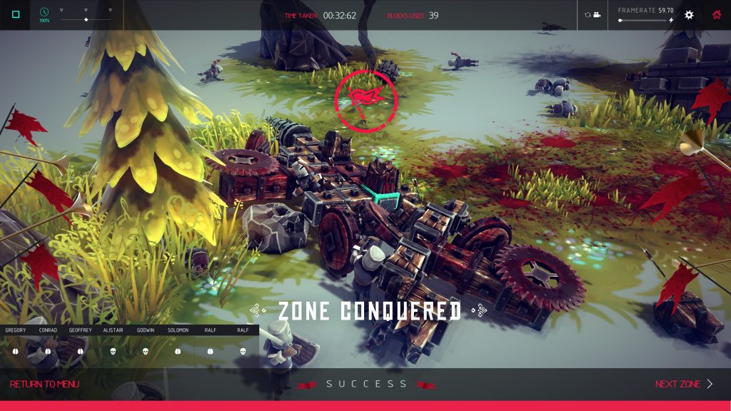
And I will admit that finding an unexpected solution to an early puzzle was amusing and interesting. You can see it pictured below. Well, the aftermath, anyway. Basically, bomb on top, what was meant to be a hinged holder for the bomb, with a piston to launch said bomb toward the obelisk I was meant to destroy. On the downside, the hinge tilted back, as it was meant to… And the entire machine exploded. On the upside, the machine did not, in this particular case, have to survive to do the job, as the burning, flying parts of my machine formed a giant, impromptu shotgun blast, and blew the obelisk to smithereens.

I don’t really see it catching on, though. Bit of an expensive solution for a medieval civilisation, that.

VICTORIOUS! What do you mean, is it sustainable? PFAH!

But I’ll also admit that some levels were just plain fun. Kill 70% of a group of knights and archers? Well, I added a few saw blades to the sides of my poorly steering machine (remember how I said I wanted to know how to 4WD that puppy? Well, I hadn’t learned it by that point. By the end of the fight, one of my wheels had fallen off, but the knights foolishly leapt forward, and were torn to shreds. The archers had been eviscerated just as they managed to shoot off one of my wheels. Somehow. With arrows.

Aesthetically, its low poly look is appealing, as is the calm, relaxing, and ambient tunes that form the background of… Well, blowing shit up, stealing things with grabbers, building improbable machines, and generally causing objective based chaos. But it’s very much a niche sort of game, and the unfriendliness of it isn’t… Well, it isn’t making a friend of me, for sure. Still, it’s relatively cheap, it’s got a lot of levels to it, and you can, if you really work at it, make some utterly ridiculous machines. So it’s got that going for it.

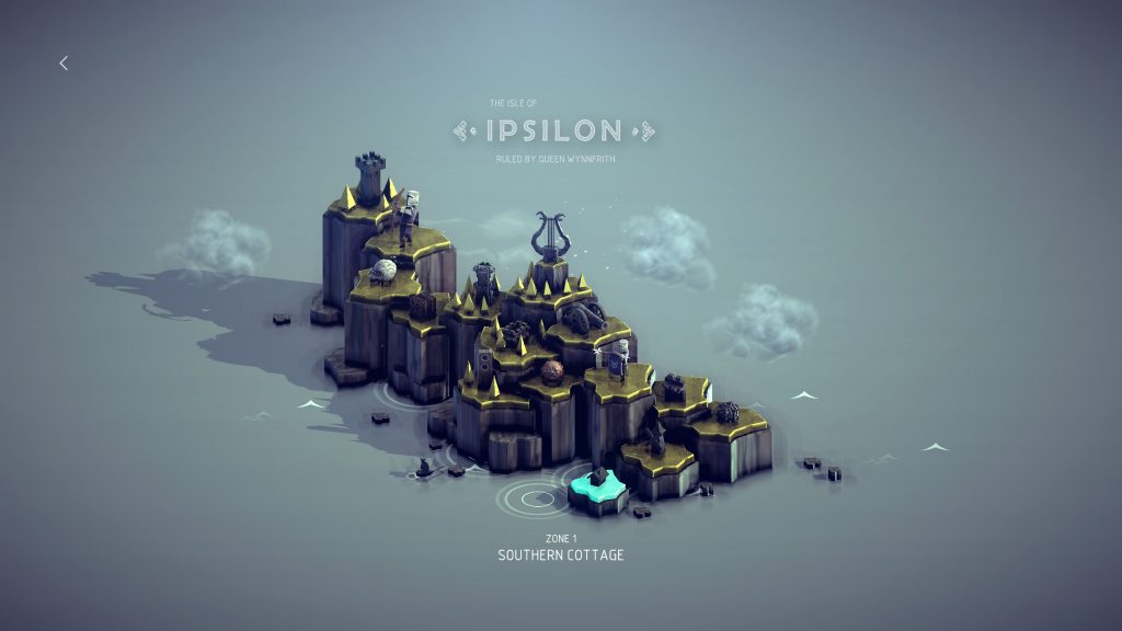
Obligatory worldmap shot!

The Mad Welshman, honestly, just wants to see his machines burn. That’s the best part.

Become a Patron!