DUSK: Episode 3 (Review)

Source: Cashmoneys
Price: £15 (£23.79 for all bells and whistles, £7.19 for soundtrack, graphic novel, and Intruder Edition upgrade)
Where To Get It: Steam
Other Reviews: Episodes 1 and 2

After a wee while, DUSK Episode 3 has released, and the game is now… Complete. A love letter to the late 90s 3d shooter boom, DUSK is somewhat twitchy, sometimes stealthy, and sometimes has THE DARK MAZES OF ULTIMATE ANNOYANCE, but, most of the time, it’s over the top, shooty fun.
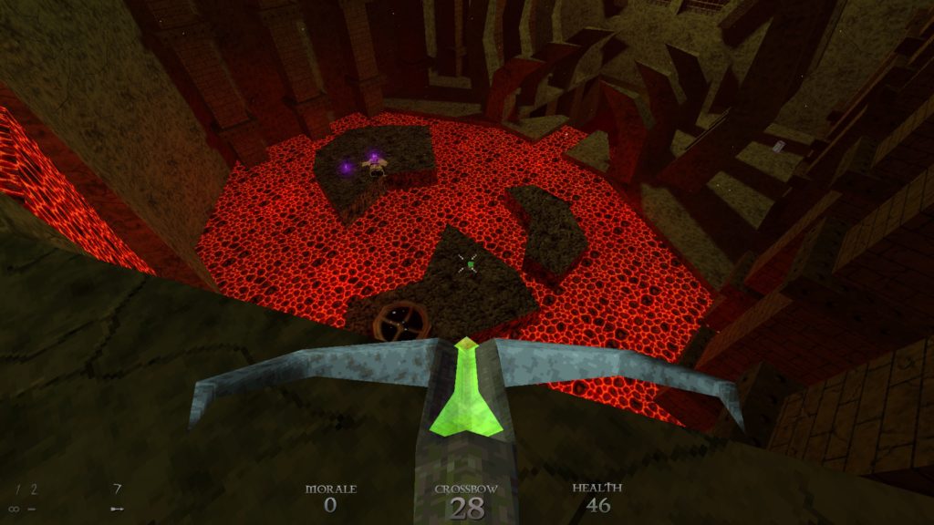
Oh hellll no…

I’d already covered Episodes 1 and 2 previously, and Episode 3… Well, it continues the same trends. The same love letter to 90s 3d shooters, with fast movement, varied enemies, and memorable weapons. The same bizarre nostalgia tingle from the chunky whirring of a hard drive (Present not just in the loading screen, but heard every now and again in the rare quiet portions of the game.)

In this particular case, more of the same is… Pretty good, overall. More heavy, atmospheric tunes to lay on the pressure. The Sword, a melee weapon that does heavy damage, is a silent kill for unaware enemies (Video games, eh?), and can, with skill and Morale (the game’s armour equivalent) block. More imaginative setpieces using the low-poly visuals combined with some more modern techniques to create memorable moments.
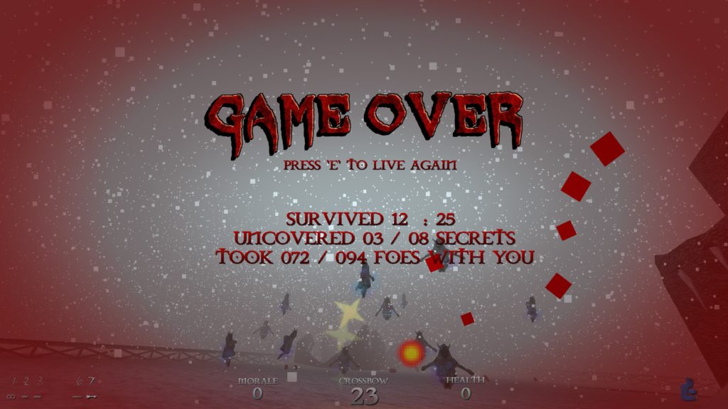
I was at 20 health when this ambush triggered, and died taking screenshots for you. You’re welcome.

Of course, it’s not all roses. Being a 90s style 3d shooter, the run speed is… A thing, and I found myself rapidly disoriented with what would normally be a safe strategy of “circle strafe while trying to hit things.” Climbing is necessary in certain portions, and, while it’s nice that you can’t have a Dead Man Walking situation, climbing also gets finicky pretty easily (If you didn’t land facing the wall, holding the walk button may not work in the intended manner.) The most dangerous situations are not, as you might expect, bosses, but large groups of mid-tier enemies (such as the frozen church in level 2.) And, of course, being a 90s style shooter, secrets aren’t only badges of pride, but some can give you that much needed leg up… And, considering how the health and armour can bounce back and forth in a level, “Much needed” is very much the right phrasing. The physics objects, similarly, can be finicky. Yes, it’s funny that soap instantly kills a filthy enemy (Evil, as it turns out, is weak to Hygiene), but damn if that soap can sometimes be a git to handle…
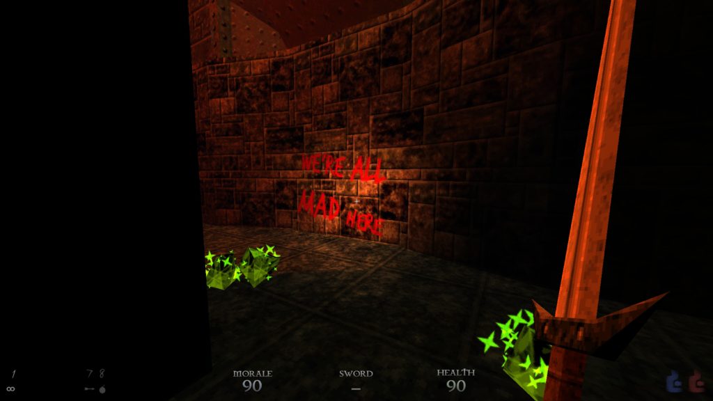
The Crystals of Madness are another interesting facet of DUSK. Weaponised “Make enemies attack each other” gasbombs, in a nutshell.

Still, DUSK, as a whole, does a lot of things well. It tickles the nostalgia gland, while also adding more modern touches that make life a little easier. It takes advantage of being story light to concentrate on making its areas evocative and interesting, and while the flaws are there, and I wouldn’t recommend this to anyone unfond of twitchy shooters (or the easily frustrated), it does exactly what it sets out to do with style. It feels good to see the crossbow gib not just the enemy directly in front of me, but several of its friends. It felt tense as hell to see a multi-tiered river of lava, despite the fact the encounters along it weren’t that tough, because it sold the tension. In a way, it’s a bit like its grungy world: A little battered in places, but feeling tight, tense, and… Unreal.

Okay, I should probably go to pun jail… Again… For that one. But still, DUSK is mostly fun and interesting, and that’s cool.

The Mad Welshman refuses to apologise for his puns.

Become a Patron!

Infinite Adventures (Review)

Source: Cashmoneys
Price: £19.49
Where To Get It: Steam

“You don’t have to fight over me” cries Rufus the Mendicant, as saucily as he can. And every time he does, I quietly wish for the sweet release of death. Welcome to Infinite Adventures, a game which is currently the closest thing to Etrian Odyssey on the PC right now (giving and taking some things), and, despite being a relatively solid game, it’s a somewhat painful experience in an aesthetic sense. Especially if you have anyone in the party with a “Flirty” voice.

You know… Like Rufus, default starting Mendicant.

“Ha! I think that enemy got… The point!”

Okay, that’s not the best start, so let’s explain what I mean gameplay wise. Infinite Adventures is a dungeon crawler, step based, automapping, based around a single, fairly long dungeon, and the nearby town which bases its economy almost entirely on your questing. As with its inspiration, chests are floating boxes, there are harvest points for produce, minerals, and animal goods, and, not-at-all secretly, the dungeon hides a DEEP SECRET. There is also a story, through which our amnesiac protagonist finds themselves awakening from a coma, forming an adventuring guild, and finds out this DEEP SECRET after many travails. Everything is turn based, and there are classes, skill-trees, and items galore, with tactical thought going into most of your moves.

Sounds cool, yeah? Even better, on the normal and easy (Story) difficulties, you can turn random encounters off for a time, although that’s mostly useful for being able to gather items safely, rather than finish dungeons.

But, here’s the thing. Just as a game can be pretty as heck, but have poorly thought out or tedious gameplay, so too can the reverse be true: A game can have solid gameplay, and have inconsistent or poorly chosen aesthetics. Both are equally a turn-off, and, naturally, most games that have both never see the critical light of day. In the case of Infinite Adventures, it’s the aesthetic that’s the turn-off.

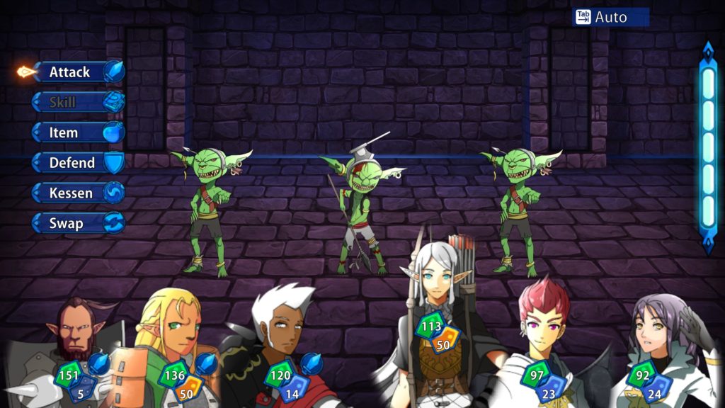
Like Etrian Odyssey, it’s cel-shaded anime characters, over painted backgrounds, with workmanlike UI, with low-poly dungeons. Problem being… It’s nowhere near as cohesive.

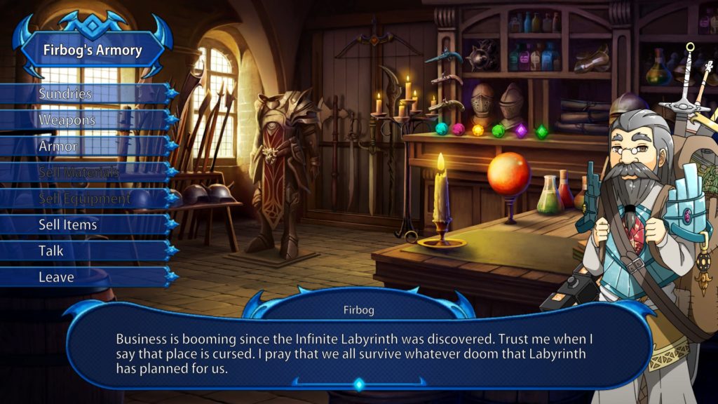
Block puzzles move the blocks at a meaty pace of 3 frames a tile… Over about a second. Richly painted landscapes and rooms outside the dungeons contrast with cel-shaded characters, contrasting with a workmanlike interface (Itself having problems like colour choices, transparency interfering with text, and insufficient outlining), contrasting with low to mid-poly 3d dungeons. Voices range from “Adequate” to “Kill the ‘Flirty’ Characters On Sight.” The writing has the general plot beats of an Etrian Odyssey game, but is a blunt instrument with some awkward tonal shifts. Aesthetic consistency… Just plain doesn’t exist here.

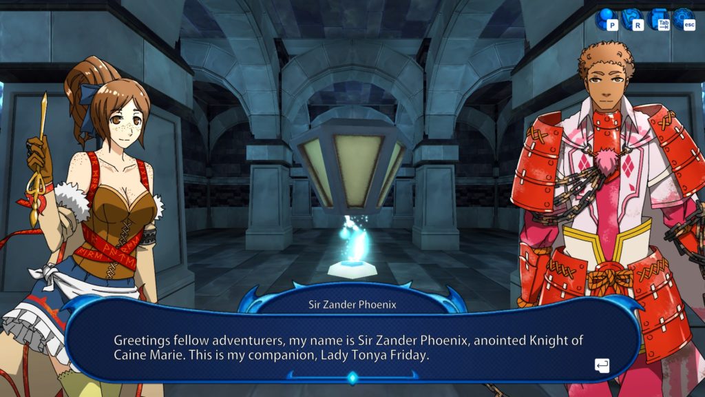
And this, put bluntly, is a big problem. Not because the game is mechanically bad, or unplayable. It’s using tried and true mechanics, and while it takes some features people were fond of in its inspiration away, it gives others back. No, it’s because quite a few text-boxes hurt the eyes to read portions of, or because of that godawful “Flirty” voice (The “Absent-Minded” one is almost as bad), or because several different artstyles, each fighting for their place, distract from the gameplay, overpower it, and because the writing can’t save that.

This is perhaps the first time where I can’t recommend a game, not because it’s mechanically bad, but because it’s aesthetically painful. And that makes me sad, even if it’s an object lesson that no, you really can’t let go of one or the other.

It should be noted that comparisons to Etrian Odyssey are made, not just because of game similarity, but *plot* similarity.

The Mad Welshman is not a 4K 60FPS Always Photoreal kinda vaudevillain. However, consistency is a big sticking point.

Become a Patron!

Return of the Obra-Dinn (Review)

Source: Cashmoneys
Price: £15.49
Where To Get It: Steam

It says a lot, either about my own media consumption or the Obra-Dinn, that nary an eyebrow was raised at its sharp turn into the more supernatural. I was too busy worrying about how to identify the crewmen, and whether what was sticking out of them was swords… Or spikes shot from demon crustaceans.

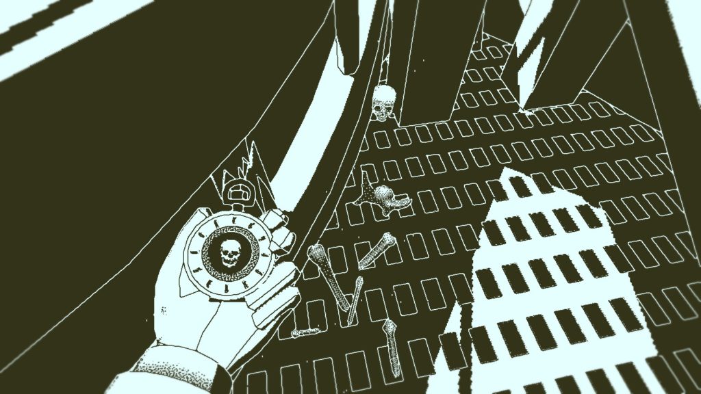
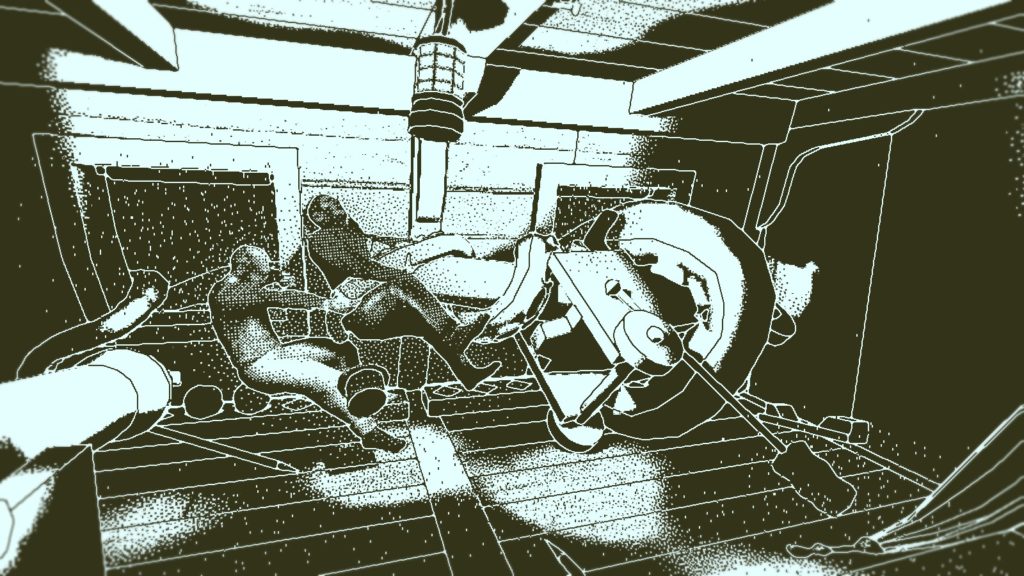
Sometimes… There just isn’t that much of a corpse to see… Eep. o.O

Just another day in 1800s insurance, using my Memento Mortem watch to wince at the gruesome deaths of almost an entire ship of people, then ticking off boxes like “Was Murdered By A Grue” or “Mutiny Related Causes (Not Covered By Policy, Fine Their Estate For Criminal Charges).”

The Return of the Obra-Dinn is, in essence, a mystery game, in which you, the unnamed insurance agent with a watch that can relive the last moments of the dead, attempt to discern precisely what went on during the ill-fated voyage of the Obra-Dinn. And you do it by reliving the story of the Obra-Dinn (Tragic and foolish as it is), one death at a time. From these final moments, and a couple of clues (Such as uniforms, the objects people hold, the language they speak in, and who works where, to take some examples), you have to piece together not only who is who, but who did what to who, and how many, if any, survived.

Okay, you get a big clue in that respect from the beginning, which can trip you up later if you forget it, but still… There’s approximately 50 crew, and at first, it seems a daunting task. Then, as you build up more information, context, and clues, it becomes easier, until late in the game, where it becomes hard again because the clues are more subtle. Fortunately, once you know the fates of three people, they’re locked in, although it’s important to note that it doesn’t change any misidentifications you made elsewhere (That one tripped me up very late in the game.) It’s a subtle kind of interactivity, while it can be a little annoying in the late game until you realise you can use the bodies revealed in a scene, in the scene, to teleport between parts of the chapter. But, overall, it’s a clever one. How did this man die? Well, it’s a little unclear, isn’t it? But… Goodness me, that’s bright. It could be, you know, that giant tentacle, but why is this bit so bright?

I mean, bad enough he’s so far up, but the actual *cause* of death could be… A couplea things, yeah…

Oh.

Ohhhhh. [scribblescribblescribble]

Aesthetically, the game has an amazing 1-bit shader, which is to say, everything is either a colour (defaulting to Apple Macintosh green), or white. It’s a lovely effect, and it works well with the game’s mostly ambient noise. Once you’re in the thick of things, however, nautical or dramatic music can happen, which is nice, but more often, it’s a soundscape, crafted to both give clues, and obscure those clues under as much information as they can get. It’s well done.

As noted, if you’re looking for the “best” ending, where you get the full story, it can get a little irritating, as the clues become more subtle to folks’ identities as time goes on, and, honestly, I’m not really sure why the chapter that’s locked off is the one locked off, as it’s fairly easy to deduce the root cause behind a lot of the misery, even by the mid-game, and anyone familiar with nautical horror and myth would have already predicted it. Still, there’s more than enough interesting mystery to go around, and the Return of the Obra-Dinn is recommended for both aesthetic reasons, and for a well put together mystery.

Not pictured: A whole bundle of screaming, shouting, shattering wood, things thumped about, and, hidden, the guy who *actually* died here.

The Mad Welshman appreciates games that use a clever idea for their mystery solving. So that definitely helped.

Become a Patron!

Hot Lava! (Early Access Review)

Source: Cashmoneys
Price: £7.19
Where To Get It: Steam

Saying the words “First Person Platforming” is, in the majority of cases, a phrase to make one shudder. It’s rarely replied to politely, and, while there have been good games with first person platforming and movement elements, they’re rare enough that, for the most part, they don’t go down well.

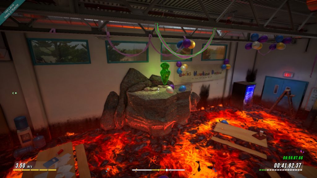
Not pictured: The fifteen other attempts to get the sub 5 minute star, the buckets of sweat dumped over me, the grunts of EFFORT and the Body English. Also that this is a still of the middle of a series of jumps that take about a second, maybe a second and a half.

So it’s perhaps a good start for me to say that the most shudderworthy part of Hot Lava, a game that entirely revolves around first person platforming, was its attempt at a Saturday Morning Cartoon theme, and the lampshady humour about SatAm writing. Also the really thin poles, but we’ll get to those.

From what I can tell, the story of the game, such as it is, is that you’re a child with a highly active imagination (Who, as in my childhood, seems to be going through an “Imaginary self” phase), who is playing “The Floor Is Lava” , that game where the whole point isn’t to touch the carpet or flooring, because if you do… If you doooo… You’re sooooo dead. Because the floor is lava!

Now add in a score mechanic, collectibles, fake loot boxes bought with in-game currency, character customisation of your Action-Man jointed avatars, time-trial leaderboards, a pogo stick for some challenges, and a whole host of tricks and traps that could conceivably be how a child would imagine the danker and hidden parts of the school (like the ventilation being filled with deadly fans and crusher traps), and you have Hot Lava in its present, Early Access state.

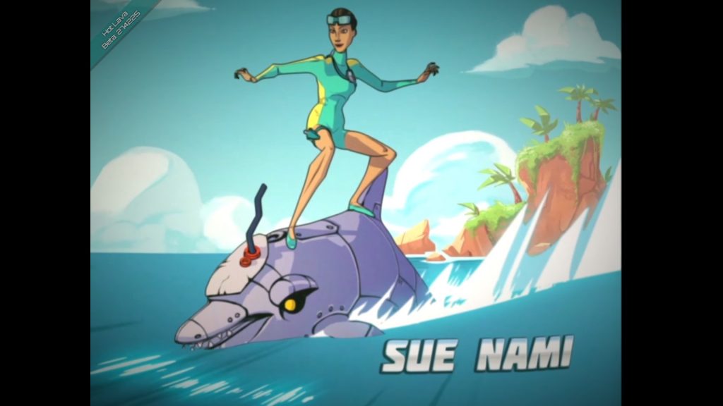
Guess who gets the Boy Aquaman(TM) Short End of the Stick? #GiveSueNamiAChanceHackWriters

Aesthetically and accessiblity wise, insofar as a game about, basically, speedrunning a first person platforming level is pretty good. I never outright failed to notice something I could (in theory) jump to, there’s a checkpoint marker that is, unfortunately, not often all that useful, but it is there, and clear to boot, I had no problems with menu options or colourblindness issues, and things that can be swung from or grappled are highlighted well. The controls are, at their basic level, pretty simple: Tap space to jump, WASD to move, you control your jump mainly by mouse direction, rather than strafing, and you automatically grab anything that you can grab and have successfully reached.

Of course, for the “Pros” (ARGH) , there are tricks like perfect jump timing, a variation on Quake Bunny Hopping (If you jump, and both strafe and turn in a direction, then jump with the right rhythm, alternating directions, your momentum increases. A lot), and other such shenanigans. Oh, and a hidden comic and golden pin somewhere in the level, further cementing that one of the inspirations here (Beyond the child-to-tween-hood of a 30-40 something) is the Tony Hawks series. Or maybe Dave Mirra Pro BMX…

Scratch that, I have very unfond memories of playing the latter. In any case, the game, overall, feels alright, and you quickly get into the rhythm, except for the times you’re lost (The game relies on replay, so that’s less of a sin than you’d think), the times the way forward is awkward (Such as in the Ventilation Tunnels Of Crushing and Fanblades) , and… Thin rods that you have to jump on. The first person equivalent of “Pixel perfect platforming”, I despise them so, and am grateful that their somewhat easier to deal with cousin, Thin Rods You Can Jump On And Run Across, don’t have a tightrope or grind balance mechanic to – that is not a suggestion, Klei Entertainment… koff… Just to clarify.

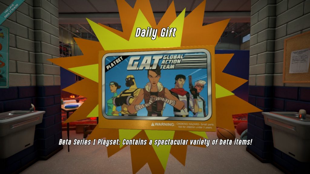
Unlike either 80s playsets or loot boxes, the playsets of Hot Lava don’t ask for your blood, soul, money, or grandparents. All you need is to play. Plaaaaay. Plaaaaaaaaaaaayyyyyy!

As much as it feels odd to say this, Hot Lava… Looks promising. And this, funnily enough, is why I didn’t delay this review until the second area (Billed for about a week after the review hits) arrived… Because, even at this early stage, it’s oddly fun. With the exception of the SatAm theme… Sorry, folks, I know some SatAm themes were abominable, but that’s no excuse, dammit!

The Mad Welshman, overall, recommends this. The lava has told him it will eat all his favourite socks if he doesn’t. Joke’s on the lava, he likes the game anyway, and never mastered the art of wearing matching pairs.

Become a Patron!

OVERLOAD (Review)

Source: Cashmoneys
Price: £23.79
Where To Get It: Steam
Other Reviews: Early Access

Normally, I try to avoid making references to other games in reviews, not least because it can introduce expectations that shouldn’t be there (see the Moonlighter review from earlier today), but, in the case of Overload, Revival’s 6 Degrees of Freedom shooter… It’s Descent.

“M’lud, if I could draw your attention to Exhibit A…”

For anyone young enough to not know why this is a big deal, Descent’s big selling point was the aforementioned 6 Degrees of Freedom. Want to float upwards and downwards, strafe sideways (that’s 2) , but also rotate in all three axes and move forwards and backwards in a science-fiction setting of robots gone wrong, and your mission to rescue the victims of what would eventually turn out to be both an alien invasion and Evil Corporation Shenanigans? Descent, and its two sequels had you covered, refining the formula.

Overload, funnily enough, refines it further. Although this is less surprising when you consider that the two Revival founders, Matt Toschlog and Mike Kulas, three of the original trilogy’s musicians, Dan Wentz, Allister Brimble, and Jerry Berlongieri, and more have been involved heavily in the development. They’ve had time to think about this. So… What’s the result like?

Undeniably fun and tense, is the very short answer. Last time I looked at it, I mentioned that the refinements to the formula are, for the most part, more to do with level design and quality of life than, for example, major rejiggings. Multiple difficulty modes, with the nice touch that challenge leaderboards are separated by their difficulty. Looking at the map pauses, and, considering the general gameplay loop, this is a godsend, and, while the maps are indeed mazelike, I never found myself truly, hopelessly lost like I did in the original games. Although, equally to its credit, I’ve felt ambushed, claustrophobic, and tense, aided by the often casually oppressive sounding music, the almost-screams and growls of the Automatic Operators. Logs being short and sweet, upgrades, secrets… It’s an interesting mix of the more traditional and the modern, and it works.

Particle effects can, on the one hand, obscure what’s going on. On the *other* , it makes this Auto-Op about four or five times scarier, even after it’s dead.

Good example: This is a game that has monster closets, in the traditional sense of the phrase (Secret places that open on triggers, usually once you’ve done something, to reveal… SURPRISE ENEMIES, HAHAHAHAHA) , and… I don’t mind. You know you’ve done monster closets right when they feel natural… And, just as nice, they have an actual, narrative reason to be there. I won’t spoil it, but the overall idea is that a set of colonies around Saturn have gone dark, and, carried in your slower than light craft, you have to work out why robots have gone bad, why colonists have been reassigned, and why the hell the company’s founder, Gabriel Kantor, seems so certain he can burn his bridges and unleash death and destruction for a set of colonies that are nowhere near self-sufficience. It’s similar enough to the plot of the original Descent (hell, it even has references to the Evil Corporation of the original games, the Post Terran Mining Corporation), but the differences, and the explorations therein, short as they have to be due to constraints, pleases me.

In short, this is not only an excellent addition to the 6 Degrees of Freedom Shooter subgenre, it’s also an excellent Descent game, and well worth a look. Oh, and there’s a free level editor too.

The mood in these tunnels can be described with phrases like “Somewhat tense”, segueing quickly into “AHH DIE DIE DIE PLEASE DIE”

Yes, The Mad Welshman freely admits the possibility of rose-tinted goggles. He also admits the possibility that it’s just fun as hell to blow up robots in space.

Become a Patron!