Cloudpunk (Review)

Source: Cashmoneys
Price: £16.99 (£24.98 for game and soundtrack, soundtrack £7.99)
Where To Get It: Steam

The City. We all know The City. It’s a dark place, always raining, always cloudy… Or is that smoggy? Yeah, it’s smoggy… Ramen’s your go to vending food, the lights are neon, and the streets are grimy and filled with refuse, both human and otherwise. Welcome to this version of The City. Welcome to Cloudpunk.
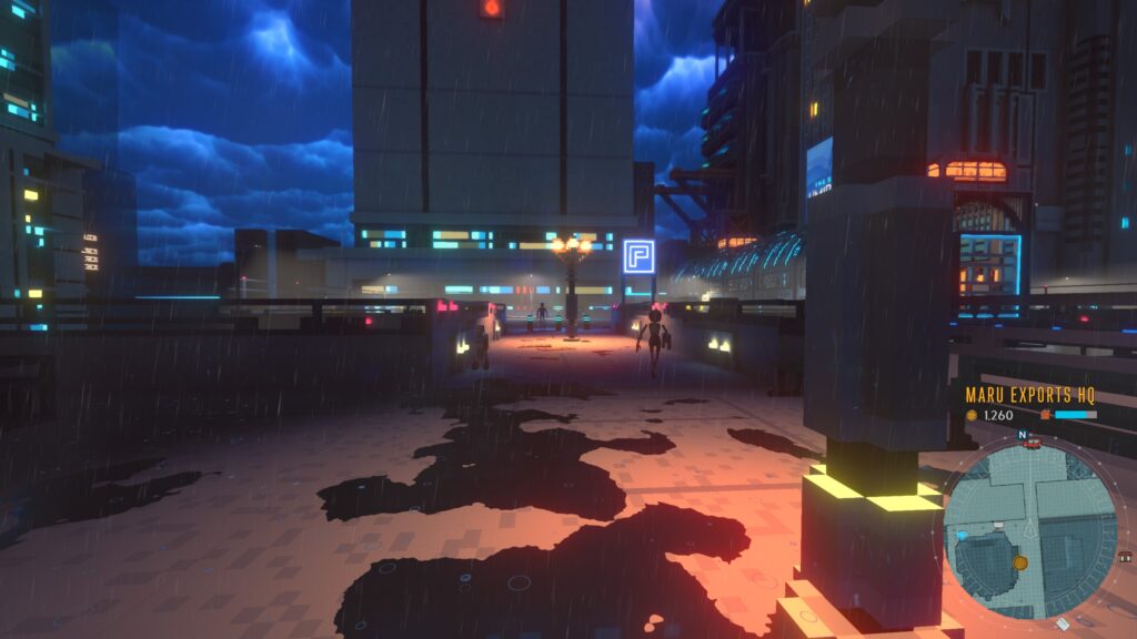
And this is one of the nicer portions…

But what is Cloudpunk? Essentially, it’s a narrative delivery service game, set in a dystopian future city with high tech… And low life. You’re a worker for the Cloudpunk service, a service that doesn’t want its drivers to be known as Cloudpunk. You keep hearing the word CORA, and can’t pin down what that means. And within your first hour, you’ve either delivered a highly suspicious package (or haven’t), talked to a variety of people, and met your neighbour, the android Evelin, whose close friend locked away memories in her mind, and is decrypting them (like you, not wanting Corporate Security’s attention) by… Punchcards.

No, the memories aren’t on the punchcards, that’d be silly. But the encryption key to her memories is.
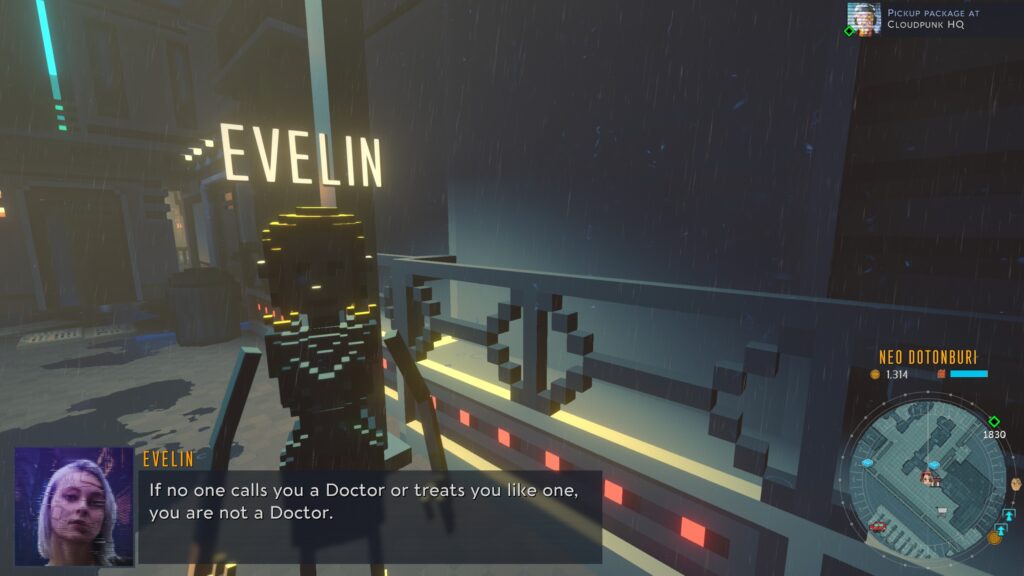
Evelin has many problems in her life. This is but one.

And so, you fly through the world, in your hovercar, walking round places, picking things up, delivering things that you’re meant to deliver after picking things up, and, after a point, just… Exploring. Looking around. This is your first night, and most drivers apparently don’t survive their first night. So why not enjoy yourself, talk to people, get a feel for the city first, eh?

And there’s a fair bit to it. Not only is there the main story, with its sometimes wonky voice acting (mostly pretty good, though), its almost surreal cyberpunk setting (and yes, this counts as cyberpunk, you are Little People, and even living is a rebellion), and its people. An Engineer for the city, the city that’s falling apart, but only he knows what’s up. Red street signs blinking three times is bad. Also blue signs in general. Aaaand orange, yellow, green… Purple’s the worst though. If you see purple, you’re fucked already… Well, according to him, anyway. And he’s just one example.
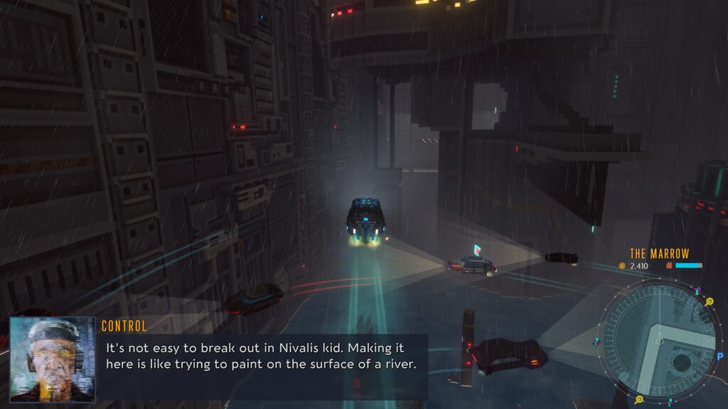
The Marrow, as you can guess, has been sucked dry by the ghouls.

Aesthetically, this game is pretty good. It uses voxel art (that’s cubes instead of dots) pretty well, the music ambient, synthy, and very fitting, and the soundscape… Police fly by, hovercars and trucks (called HOVAS, collectively) whibbleywhoo over the place, and the rain… Nearly always… The rain.

I don’t really have bad things to say, to be honest, but if a game mostly about exploring in your car and on foot, about keeping the gas going, keeping your HOVA repaired, and exploring the story isn’t for you, then it isn’t for you. If it is, Cloudpunk’s a pretty solid example of an exploration game with narrative, not just story.

…And I do love me narrative…

Become a Patron!

Deck of Ashes (Review)

Source: Cashmoneys
Price: £15.49 (£5.19 each for OST and Print-Ready Posters, £7.19 each for expanded art book and unique character skins)
Where To Get It: Steam

Other Reviews: Early Access

Deck of Ashes is, to me, an odd one. It’s not often we deal with Grimdark (where the darkness almost seems so dark as to be comical, except… When it’s not.) A world where Death’s Curse has been unleashed by 3 fools and an evil jester who misled them. And now… A mysterious man leads all four back, to meet their fates.

Except it’s never that easy, is it?

Bah, you shall have the food in your mouth turn to ash, asshole.

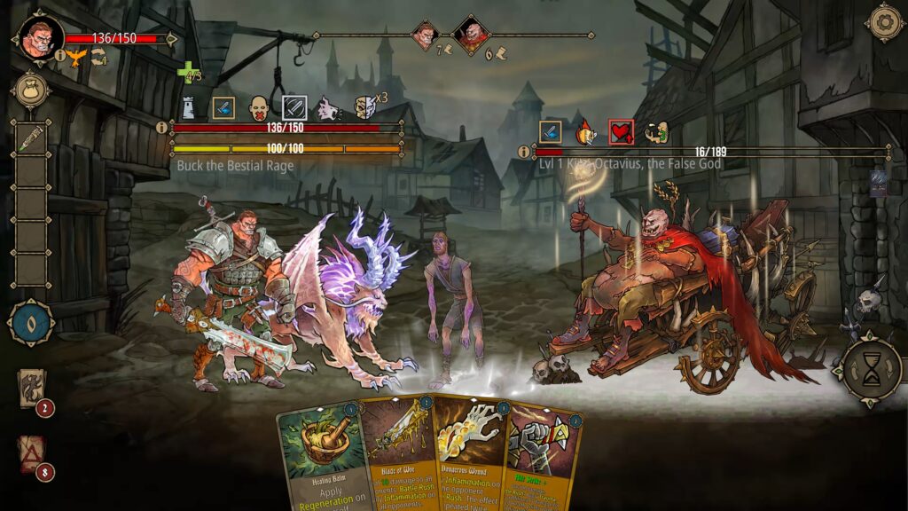
Deck of Ashes is one of those card combat, turn based roguelike dealios, in which our four protagonists, each with their own unique gimmick, fight their way to Lady Death, unlocking cards for their deck along the way, along with useful items.

The deck part is important, because your deck… Has a direct effect on your health. No, no free reshuffles for you, boyo, every time you run out of cards, you have to spend 10 health points, to get 5 random cards back in. You can upgrade this to either 8 random cards or five selected cards, but the cost remains pretty much the same: Health, for cards back.

Buck’s friend Charon, when unable to lend their strength to Buck, gets mean.

And this, funnily enough, is both a help and a hindrance to all characters. Lucia’s fire magic, for example, is damaging to herself, so ending fights quickly is a must. Buck doesn’t want some of his cards back, because while they’re in the Ash deck, as the discard pile is known, some of them give him special abilities. So if one or more goes out… Whoops, there they go, and you only get one chance of putting all ash cards… In your hand… Back into the Ash pile to do their thing.

Similarly, everyone has a story, and the grimdark is strong with this one, as every single one of the characters has some kind of dark past, although the most relatable is Buck, who is highly empathetic, and wants to save his friend. Least relatable is Magnus the Jester, who is a manipulative, hateful asshole through and through, using his powers of manipulation not to solve his problem (people dismiss him and despise him for his deformity), but to ruin things, and even at the time we join him, after he unleashed the Ash Curse, nope, he wants to become a new god. Asshole. Suffice to say, nobody’s end seems happy, because grimdark.

That’s right. Go back to the hateful, small little fool you are, Magnus.

Despite the whole “Your mileage may vary on grimdark” thing, aesthetically, it’s pretty pleasing overall. Good art style (even if the loading screens are in a different style, they still show the characters well), solid music, with threatening bass lines and violins quavering at the violence (not actually, but this is the mood they were going for), and… Ah, yeah, we do have one problem: Although most of the tooltips, menus, etcetera are clear and readable, there is one very odd exception: The resource trade menu… Which is tiny. Not only is it hard to read, it’s hard to select, and I don’t know why this is.

Still, overall, there’s some interesting tactics here, an interesting take on the roguelike card battling type genre, and even though I’m not particularly a fan of grimdark, I do appreciate that the story is pretty well presented for what it is. So, overall, a recommendation.

Er, fix the menu though, folks, eh?

The Mad Welshman appreciates a good experiment. He’s less fond of all the screaming and gore during one, though…

Become a Patron!

Conglomerate 451 (Review)

Source: Review Copy
Price: £16.99
Where To Get It: Steam
Previous Reviews: Early Access

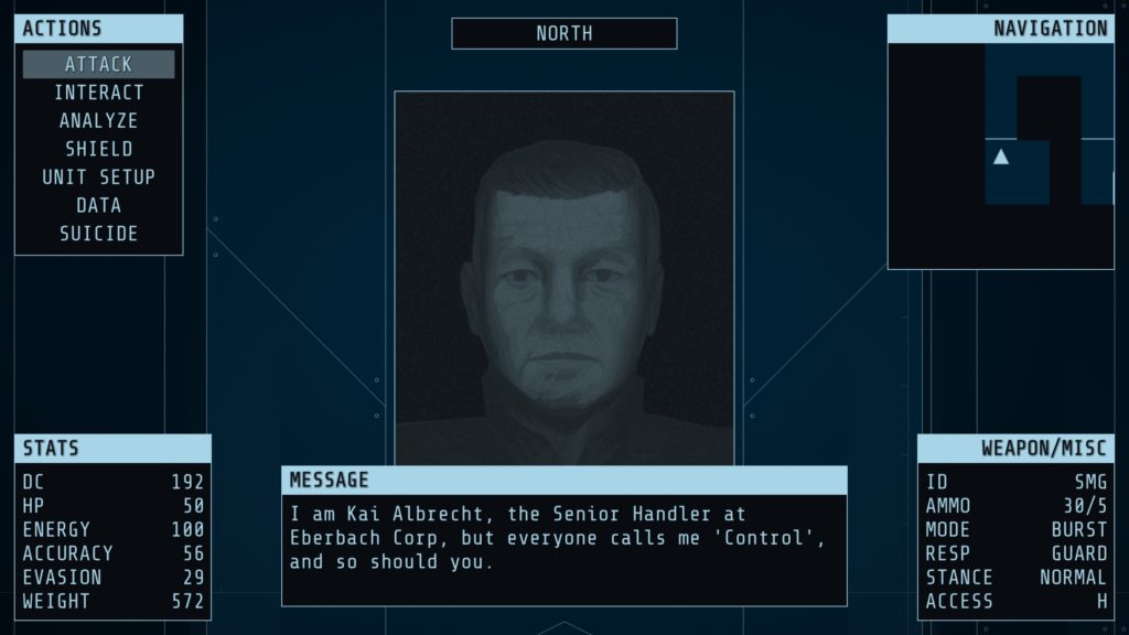
It is the far future. And you’ve got a job ahead of you, commander. Because you’re the head of a private agency (not a corporation, honestly, really!) who has been tasked with dealing with the criminal influence of four cacklingly evil corporations, on behalf of the government. In sector 451 of the city of Conglomerate, and yes, they did call it that. So… It’s cyber, but not punk. Still.

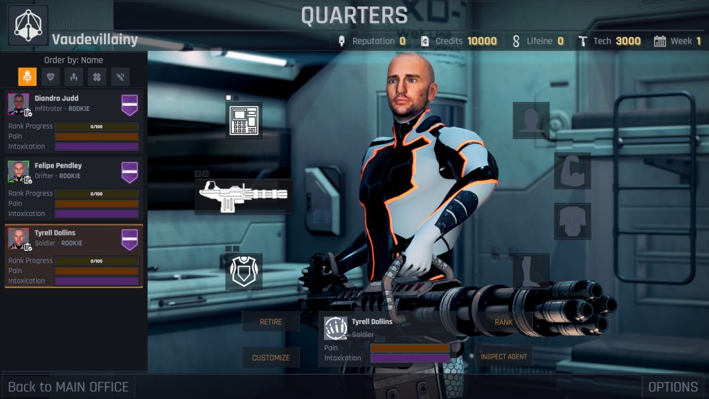
Two “Good Boys” (Spoiler: Not Good Boys At All) and a very angry man kitted out like a personal tank. Oh, and a bomb.

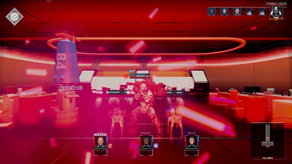
So yes, this is one of those step based RPGs (first person, move a tile at a time, moving costs time but turning or looking around doesn’t, effectively turn based), with random loot, random enemy placement, a pool of maps, a research tree… It seems like a lot, but what it boils down to is: You do missions, which are usually kill a thing, kill lots of things, or find a thing. And doing these things breaks the influence of one of the four corporations who are openly criminal in the sense of drug dealing, slavery, and the like. Them’s your basics.

So… Last time I reviewed this, I said it was mostly solid, pretty promising, with a few things that needed work. That opinion has, apart from the whole “It’s released” thing, not really changed all that much. Because it still has issues. It’s just that they’re now mostly in terms of writing and accessiblity, rather than one of the two minigames being tedious as hell (the hacking has changed to be something a little more quickfire than “Click on some text when you see it”), and the money part of the game’s economy not being great (unlocking the in-mission benefits like “Can always ambush enemies if they don’t see you” costs money now. Which I’m fine with.) Not changed, however, is the fact that the bigass gun which looks like it can chew a room to shreds has a range of… 9 meters.

Yup. This thing still only has a range of 9m, single shot. Who the heck knows why…

Now… Even if you have white writing, folks, it’s going to be nigh illegible with a moving background, or something of even roughly the same value. That’s an accessibility issue, for which there is no option to fix. Dark red health on a dark brown background? That’s hard to read, so… Colourblindness issue, no option to fix. These are both two examples of how the game could work on its accessibility (a third being UX/Text scaling.) And then… The writing/barks. I’m not expecting Great American Novel, folks. What I do expect, however, is not to be very tired of the AI’s yakking two minutes into a mission. Yes, I get she was built by bad people to help you do bad things to bad people. I got that in the first two voicelines about how gleeful she gets about murder.

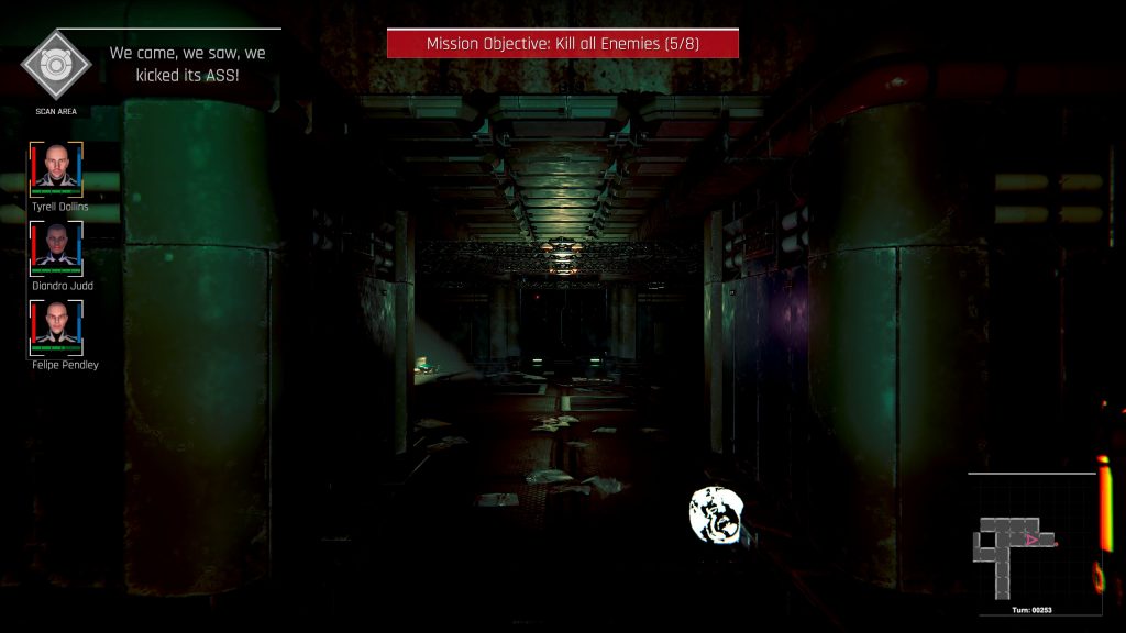
What I’m less fond of is references, without a hint of self awareness. Ah yes, my training mission was a “Kobayashi Maru” type. Mmmhm. Why yes, AI, we did come, we did see, we did kick its ass… But both of these references are almost as old as I am. And no, there is no option to turn off these barks, which… Sorry, developers, they’re not well written, and in one case (SPU chips, which add a little to stats), it doesn’t even make sense. Copper and some wires, but maybe it will be useful? I… AI? Have you been trained? At all?

Okay, okay, lemme try one. “You fell for one of the classic blunders! The most famous of which is ‘Never get involved in a land war in Asia’, but only slightly less well known is this: Never make an 80s reference when a critic plays the game! Aha, ahahaha [dies]”

So, in terms of aesthetics, it’s alright. There’s some good enemy designs, the world maps are interesting and aptly get the feel across, the sound isn’t bad, and the visuals for attacks are kinda cool in places. In terms of gameplay, it’s a little grindy, but otherwise, I’m actually down for a limited set of map layouts, partly because you know vaguely what to expect. Improvements have been made in some areas… It’s still got jank, but… I’d still recommend it somewhat for fans of step-based RPGs, because it ain’t bad.

But it could definitely work on its accessibility.

The Mad Welshman would offer their services as a dystopia writing consultant, but… Well, not much point.

Become a Patron!

Der Geisterturm (Review)

Source: Review Copy
Price: £11.39 (£16.58 for game+soundtrack, £4.67 soundtrack)
Where To Get It: Steam

Der Geisterturm (The Ghost Tower) is a sequel, or maybe parallel game, to Das Geisterschiff, which I’d reviewed previously. As a member of Eberbach Corporation’s combat corps, you… Are told that you’re dead. And if you want a second chance at life, congrats, you have to get up a tower full of droids ordered to murder you a second time.

Cacklingly evil corporations. Go figure. Now, Das Geisterschiff was tough. Der Geisterturm? Is murderously tough. As in: I have yet to get to the second level tough. And there comes a time when you have to resolve to see if you can beat a thing later, and say that you currently cannot.

“By the way, we’ve put you in a death tower for unspecified reasons. It was in the small print of your contract.”

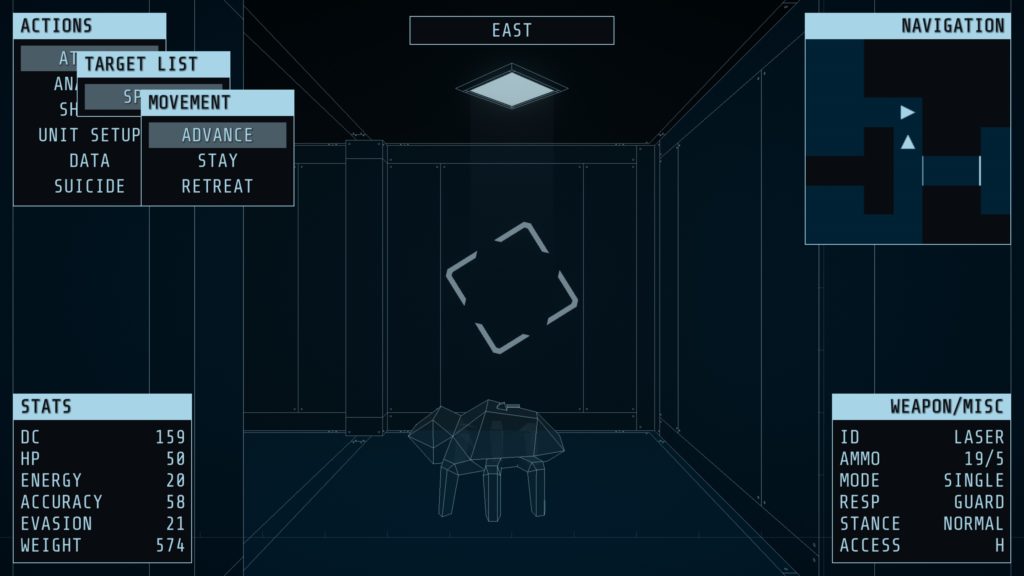
Now, it should be noted that individual enemies are generally not that tough. And that you have a shield, albeit one with limited energy (and another option we’ll get to later, for its extremely situational usefulness.) And indeed, you have a lot of options, that you need to switch between if you want to do the best job you can. And even combat stances and ram responses, that can set how you react to ramming (a valid tactic, when something or someone is lighter than you.) Changing your stance and ram responses, turning, and turning your shield on or off appear to be instantaneous. Switching weapons, moving, and waiting, however, is not. And we’ll get into why that makes the difficulty curve sharp in a moment.

But first, improvements! They are, for the most part, small, but they exist! Everything is blue now, rather than a somewhat disconcerting red. Items have visible representation (although sometimes tiny visible representation, like keycards), cutting down on “Where the hell is the thing?” … Somewhat! It’s still got that low poly aesthetic, with unidentified bots as wireframe cubes, but… We’ll also get into that.

This time, I have the upper hand. This time.

So… Der Geisterturm inherits some of the problems of its predecessor, and manages to make some new ones, alas, making the buy-in that much more difficult. For example, once an enemy has been identified, it should stay identified… But it does not. And, considering there are two basic enemies in both the tutorial and the first level, with only the latter allowing visual confirmation without analysis, this is kind of important. And now… Hiding and switching weapons. Yes, we definitely need to talk about those.

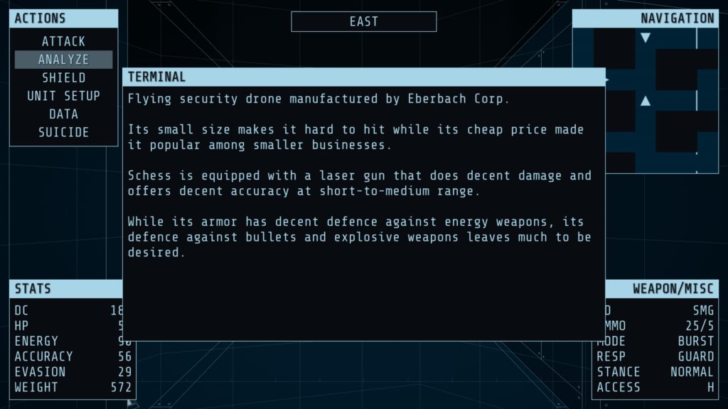
Hiding is, for the most part, useless. Enemies have an audio range, but generally speaking, this is big enough that your one for one movement doesn’t actually allow for getting far enough out of audio range (or sight range) to wait out their searching. As to switching weapons, well… Some enemies have vulnerability to bullets, others to lasers, others to explosives… You have limited ammo for each… And the first level’s encounters? Appear to almost exclusively consist of one drone that is weak to lasers. And another that’s weak to bullets and ramming. They appear in pairs, one of each type. And, as mentioned, switching weapons takes a turn, and they always appear in patterns that, if you concentrate on one, or run to lure the bigger one into range, you will likely take at least some damage from the other.

Every time you analyze an enemy to remind yourself of its weaknesses, three or four pages of this will turn up. Not the biggest fan of this.

Still no larger map, so get out those mapping tools, folks, no in-game options and key rebinding, which is doubly annoying because the game forgets it’s meant to be in windowed mode the moment you start a game…

Basically, I’d like to recommend Der Geisterturm, because it has an interesting aesthetic, a dark world, and a fair bit of atmosphere, but… While I could recommend Das Geisterschiff with the qualification that it’s hard, Der Geisterturm feels… Well, it feels much less fair. And maybe that’s intended. But it’s a turn off for me. I don’t particularly miss the days of the hard as balls wireframe first person RPGs like Wizardry 2, you see.

The Mad Welshman is an Old, it’s true. But he does not look kindly upon the past of computer games overall, except what we can learn from it.

Become a Patron!

Divination (Review)

Source: Cashmoneys
Price: £1.69 (£3.36 Collector’s Edition, £2.09 for artbook, soundtrack, other extras)
Where To Get It: Steam
Other Reviews: Itch release

Content Warning: This game has themes of self harm and suicide, and a depiction of suicide. As such, the review has been age gated, and this content warning has been added to the original review.

(more…)

Become a Patron!