Warhammer Quest 2: The End Times (Review)

Source: Cashmoneys
Price: £17.99
Where To Get It: Steam

Warhammer Quest has always been an odd one, for me, even among the many, many adaptations and games Games Workshop has put out over the years. A series they supported fairly well (From its earliest days as Hero Quest, to Advanced Hero Quest, to Warhammer Quest), it showed an aspect of the setting you’d think they’d have dealt more with, outside of some of the fiction, the groggy Fantasy Roleplay, and… I suppose Talisman counts: Adventurers.
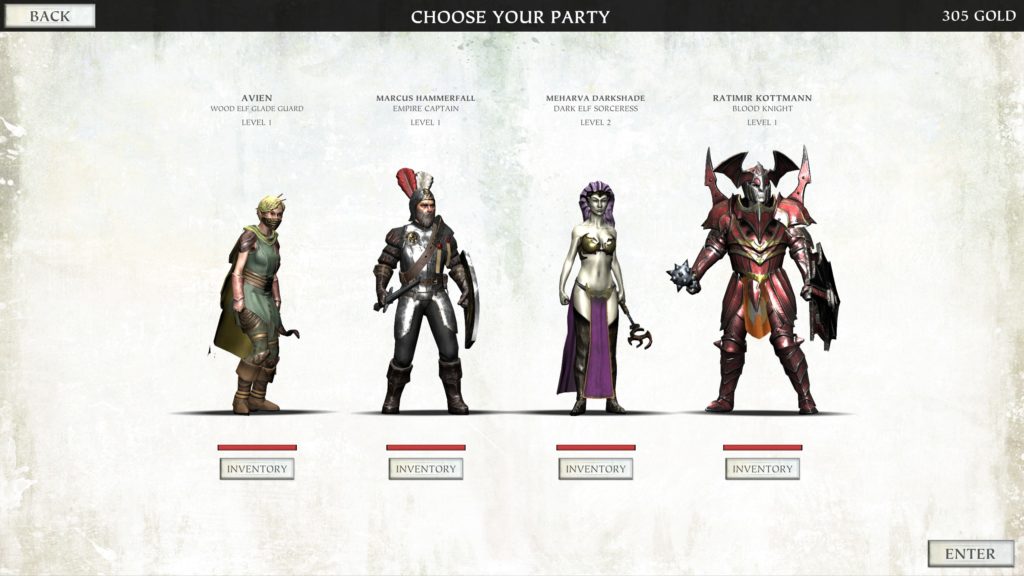
Pictured: Perhaps the least likely group of adventurers. Three out of these four would normally, in the Warhams universe, kill each other on sight… But hey, these are the END TIMES…

I mean, you’d think Games Workshop would understand the appeal. But despite a fair amount of support, Warhammer Quest is one of the lesser lights of the studio. And the times it’s been adapted, it’s been relatively faithful.

Funnily enough, this is another one of those times where that’s precisely the problem. Because Warhammer Quest is a game that loves its random encounter tables. More specifically, hot damn it loves it ambushes. To the point where, very early in the game (approximately the fourth story mission), I was travelling from the dungeon to a town, got ambushed by around 12 Beastmen along the way, killed a few, and… Then got the text that presaged the ambush getting more ambushy with 5 more Beastmen. Considering one of my two heroes allowed for the ambush was downed the round before this happened, I noped the hell out. INJURY: Thankfully no permanent damage.
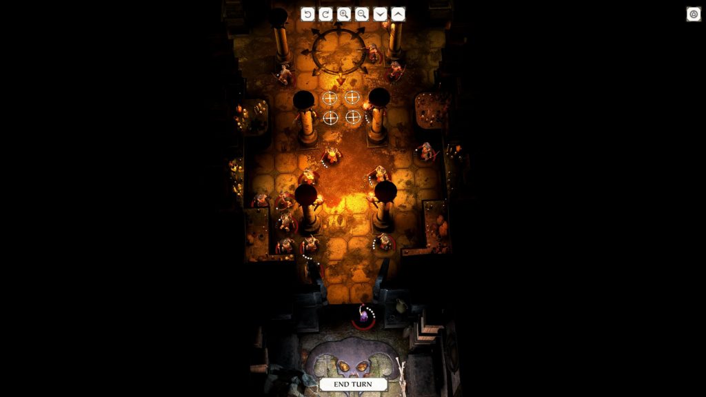
NOPE. NOPE NOPE NOPE. NOPE! NOPE!

Yes, if one of your characters gets downed during a quest, there is a chance they will get injured, although this can be repaired by… Levelling up. Healing items are relatively rare, and take time to use. Taking time means more turns for the dreaded AMBUSH. More turns for ranged enemies to plink away at you. And meanwhile, a lot of things are beyond your price range, from better heroes, to better equipment. It does get sort of easier by the end of the first act, but characters will get downed, and the game seems to take glee in arranging this. Yes, I know, games don’t have feelings. But that is the feeling I ascribe to it. It does help that often, side quests have vastly better rewards than main quests, but that… Doesn’t exactly help, considering the main quests are what you’re incentivised to do…

Still, you may note a 2 there, and while Warhammer Quest 2 inherits some of the problems of its predecessor (The aforementioned Ambush fetish, level design which means you’re often choosing between party cohesion before the next door, and the chance of MORE AMBUSH, expensive gear that makes the early game feel a lot more punishing, partly perhaps from its mobile, microtransactiony roots, mostly from the random tables Warhammer Quest was well known for), it would be disingenuous to say that there hasn’t been improvement and change.
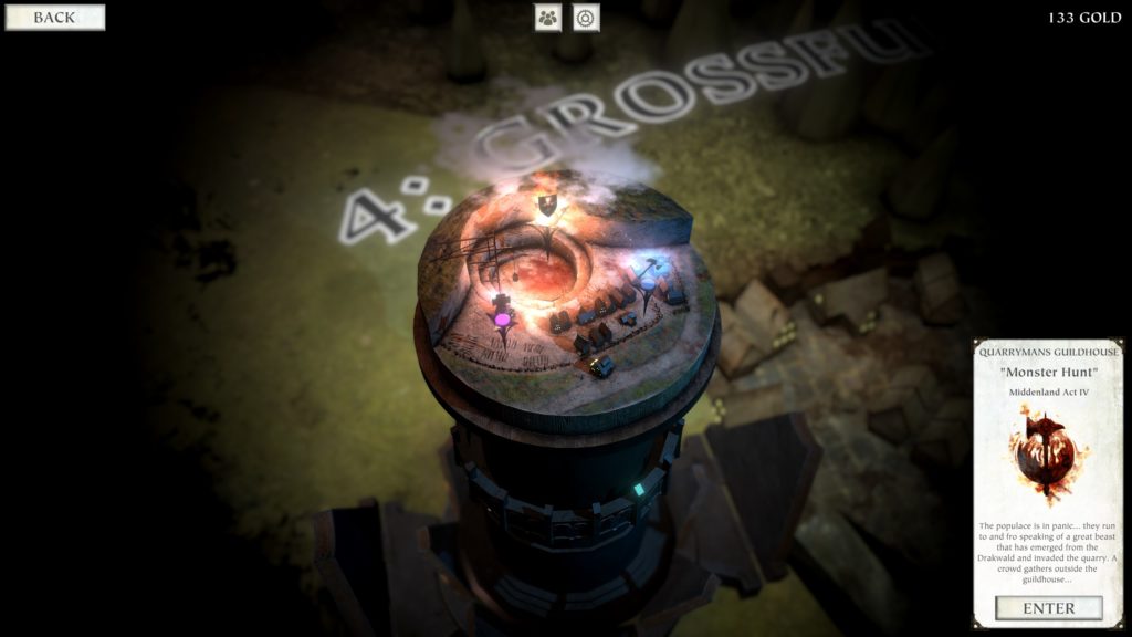
“So, er, DM, what the heck’s this shield thing?”
“Here, here’s a card explaining exactly what it is. It’s your quest marker.”
“OHHHHH…”

For example, while there are still some control frustrations (occasionally clicking a space instead of ending your turn, having to remember that the game thinks you’re looking at an enemy instead of shooting it again if you’ve shot it with a ranged attack, then don’t mouse away before clicking again), the UI is a little more clear, and a little more visually interesting… Although the Town UI has taken a slight dip from “Functional” to “Stylistic, but less functional.” Camera movement is a definite improvement, although walls obstinately refuse to get out of the way, meaning that you’re mostly going to be looking downward anyway, and, setting wise, putting the game in Warhammer’s End Times period (When Archaon, Chaos Lord, royally screws things up) helps explain why such very disparate adventurers are banding together. A Dark Elf Witch of Naggaroth, one of your first two characters, is, at any other time, perhaps the worst choice of travelling companion. Once it gets going (about halfway through Act 1), it does feel easier, and, as a result, your group feels more powerful, but ambushes remain at best an irritation or delay, and, at worst, a very unwelcome addition to an already dangerous fight. Finally, not every town has every facility, and this starts being felt once you have to deal with long travels (and thus, random events) every time you want to level someone up, but a town doesn’t have the right facilities.
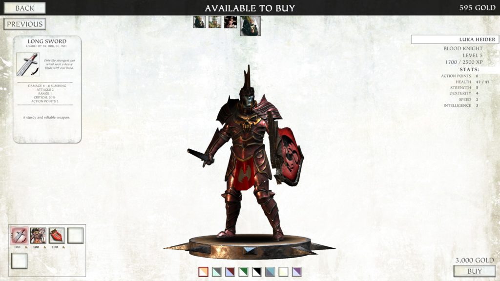
Those dual colour sets along the bottom are your only not-kit customisations. Them’s the rules, I don’t make ’em.

Model wise, some are better than others (It does seem women get the shorter end of the stick, both in terms of how many women characters there are, and the relative quality of models), but all are at least okay, with the caveat that customisation choices are very limited, and only the first weapon equipped seems to affect visible representation (Armour does vis-rep.) The music’s alright, with some tense violin led numbers, and other, dramatic choral pieces, and the world’s stylisation does give it more character than the previous outing, looking somewhat like a tabletop map, complete with layered bits of terrain.

In the end, while Warhammer Quest 2 gets friendlier a little quicker than its predecessor, enjoyment very much depends on how well you deal with the dominance of the random encounter elements of the game. It’s definitely an improvement, and I can see myself playing it in short stints, but, sooner or later, an annoying ambush happens, or the game drops poor plot rewards once too often, and I peace out.

It is the End Times of the Warhammer universe. Brother fights against brother, the vile publishers seek to bleed the Empire dry. In this dark fantasy world, there is only… Game Reviews.

Become a Patron!

Scythe: Digital Edition (Review)

Source: Cashmoneys
Price: £15.49
Where To Get It: Steam
Other Reviews: Early Access

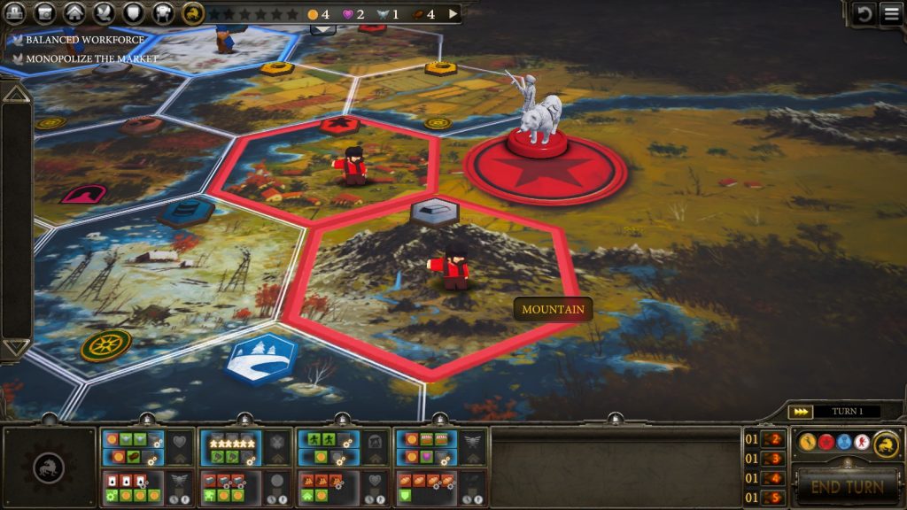
Scythe is one of those games where, for all that it added in the three all too brief months since I last looked at it, I can’t really recommend it without qualifications. Specifically, that it is definitely still better with friends, multiplayer or no… And that the Rusviet faction still causes colour issues, at two of the three distances you would normally look at them (Essentially, only up close are the workers easily visible.) Small text remains small, small icons remain small. Still some accessibility issues.

Spot the Rusviet Workers (DISCLAIMER: Difficulty *still* determined by colour blindness type)

Knowing this, let’s do a brief recap. Scythe is a boardgame set in an alternate history where a strange factory is at the core of a landgrab power struggle between six russian themed factions, where, unless you have the option to turn score previews off, you’re wondering whether ending the game is really a good idea, because there are multiple factors at play that mean the person to end the game (Getting six stars for various objectives)… May not actually be the winner.

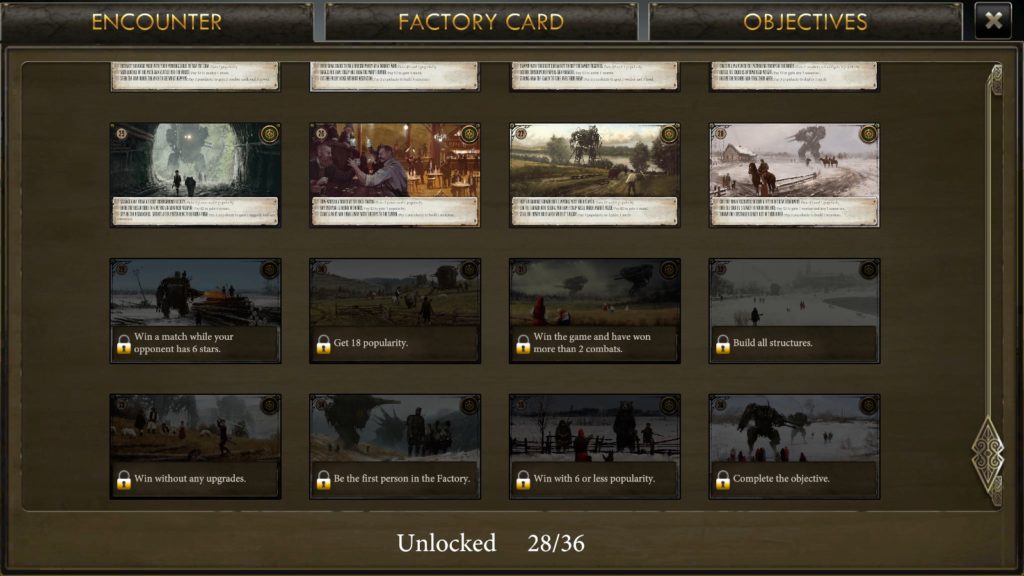
Maybe one player has courted Popularity so well that their score multiplier takes them to first place. Maybe their winning several fights has boosted them slightly beyond you. It adapts its boardgame style very well visually, the card art is gorgeous, the music is great, and it now has both multiplayer and an extra reason to keep playing (some extra cards for play are now locked behind completing objectives in games.)

But none of this, unfortunately, gets around the fact that it still has those accessibility issues. Its addition of multiplayer was definitely a step forward, but it’s the only complaint of mine about it that was really addressed. And, as such, while it is an interesting game, I can’t really give a whole hearted recommendation. Nor, because it still has its interest, and definite fun from the diplomacy, and uncertainty that comes from playing with others, can I thumb it down.

There is, perhaps, a minor assumption here. An *understandable* assumption… But an assumption nonetheless…

The Mad Welshman is slightly amused it’s taken 3 years to get to the point where he hasn’t much to add on release.

Become a Patron!

Endless Road (Review)

Source: Cashmoneys
Price: £7.99
Where To Get It: Steam

Endless Road could probably be considered at least interesting, if its translation had worked a little better, or its information flow… But alas, neither are true, and it’s this core issue that really prevents it from being as fun or interesting as it maybe could be.

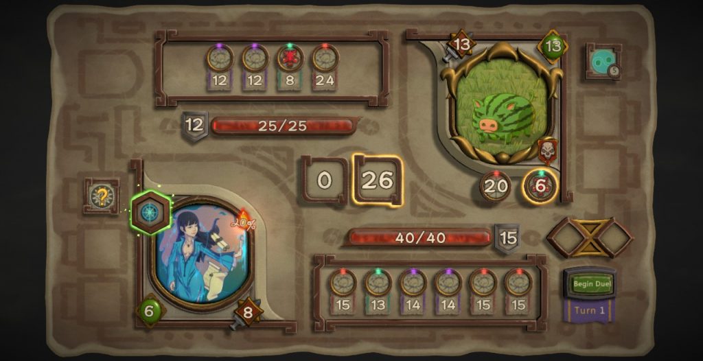
There are many pigs in the early levels. They’re all cute, and often deadly.

Endless Rogue is one of those incremental RPGs, where death nonetheless earns you stuff (or at least unlocks), set on a road that may branch, and branch, but will inevitably lead to a boss, and the next part of this… Endless Road. Along the way, you fight monsters, get random events, items to help you survive, and make tradeoffs. It’s largely fairly simple, and there’s a lot of tooltips, but…

See, I can get the sentiment here, roughly speaking… But it really doesn’t flow well..

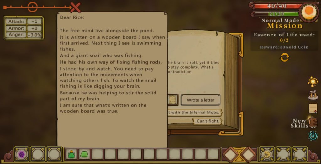
…Here’s where that whole “Not great translation” plays in. Some skills and elements (Whether yours or the enemy’s) are either untranslated, or missing, which doesn’t exactly help, and, as a result, there’s a lot of cards whose synergy really isn’t clear. Why, pray tell, would I want my enemy to have 100 attack points in a turn? What ability would make that worth certainly taking damage? Do the traps really apply to me? Large swathes of abilities are unclear, and so, through confusion, I’m just not playing as well as I should. Said translation also makes the letters, which appear to be to our character from somebody called Rice, miss their mark, which, at a guess, is meant to be wistful and soulful, as our heroine goes further and further from home, but keeps finding these letters?

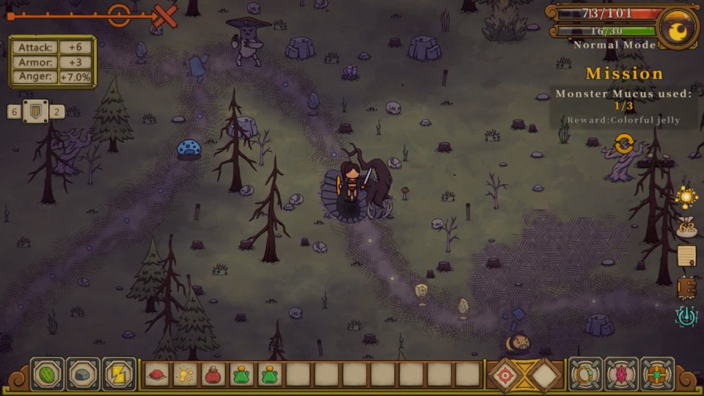
Any which way, it’s certainly playable, as there are still abilities clear enough to use, and a lot of it is about managing your various resources. In the board aspect of the game, moving forward takes SP (Stamina Points, I’m guessing), so you need items or events to replenish this, lest bad events become more and more common (They’re moderately common already.) Meanwhile, you’re trading health, stamina, and gold for various improvements and abilities, using items to gain that health, and occasionally getting into fights, where the goal, each turn, is to score more points with your cards than the opponent does with theirs. Simple enough, except that’s then complicated by abilities. Some enemies, for example, punish close point values, others large differences, and cards can do various things as well, and so those tooltips (mouse over an ability or card) become quite important. Escape is, unless you have a certain item (Monster Mucus) impossible, and besides… Some of them drop sweet, sweet loot.

Every area made of lovingly hand drawn bits? My jam.

It looks pretty nice, to the point where I feel very sad about attacking some low level monsters (I’M SO SORRY, BANDIT-PIG-SAN, BUT I MUST DO THIS), and can recognise, roughly, what abilities a monster has by their visuals and repeated play. But while it’s certainly playable, and it’s not resource intensive, those translation issues take away a lot of the potential fun and mood.

Which is, if we’re being honest, a crying shame.

The Mad Welshman reminds you that if you want to gain an international audience, please translate responsibly.

Become a Patron!

Posthuman: Sanctuary (Early Access Review)

Source: Cashmoneys
Price: £12.39
Where To Get It: Steam
Version Reviewed: Second Update (2/8/18)
Other Reviews: Early Access 2

The post mutation landscape is one hell of a place, alright. A wide open world, filled with all sorts of folk. Death is pretty much certain, and if it isn’t from violence, it’s from losing all hope in a world where old Homo Sap has been replaced by Homo Instert-Here-As-Many-Times-As-Necessary.

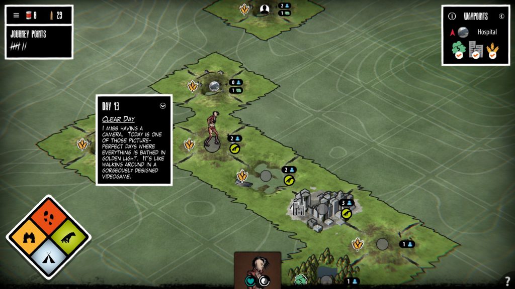
The contour lines are a nice touch, visually speaking, and I like the clarity.

Welcome to Posthuman: Sanctuary, a not-quite adaptation of the survival board game of the same name. Although, at the present stage, the major shift from the board game, a story mode, is not available. Still, there’s survival mode, and, right now? That’s a fairly replayable doozy, with a few quibbles.

The overall idea is that you’re trying to get to three specific waypoints on the map, eventually reaching the fabled Sanctuary. However, to get there, not only do you have to unlock those waypoints by visiting certain tile types (Forests, Mountains, Rural Areas, and Cities) in a specific order before you get to them, you have to deal with hunger, morale, the loyalty of any fellow survivors you meet along the way, mutants… And the possibility you’ll mutate yourself (At which point you’ll no longer be welcome in this strictly human sanctuary.) Not having had the foresight to scan the surroundings yourself (and with Google Maps long gone), you don’t actually know much of what’s beyond your safezone, beyond the existence of the waypoints, and certain survivors.

Add in weather, the fact you take one action a day (out of Scouting, Moving, Foraging, and Camping), and it costs food per day, combat, and events, and… Well, good luck!

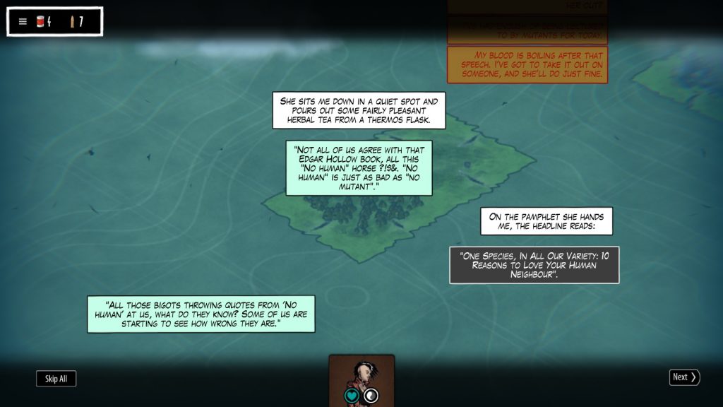
A fine example: Karl Marx murdered me just a turn or two after this picture. Turns out the Kommune are badasses.

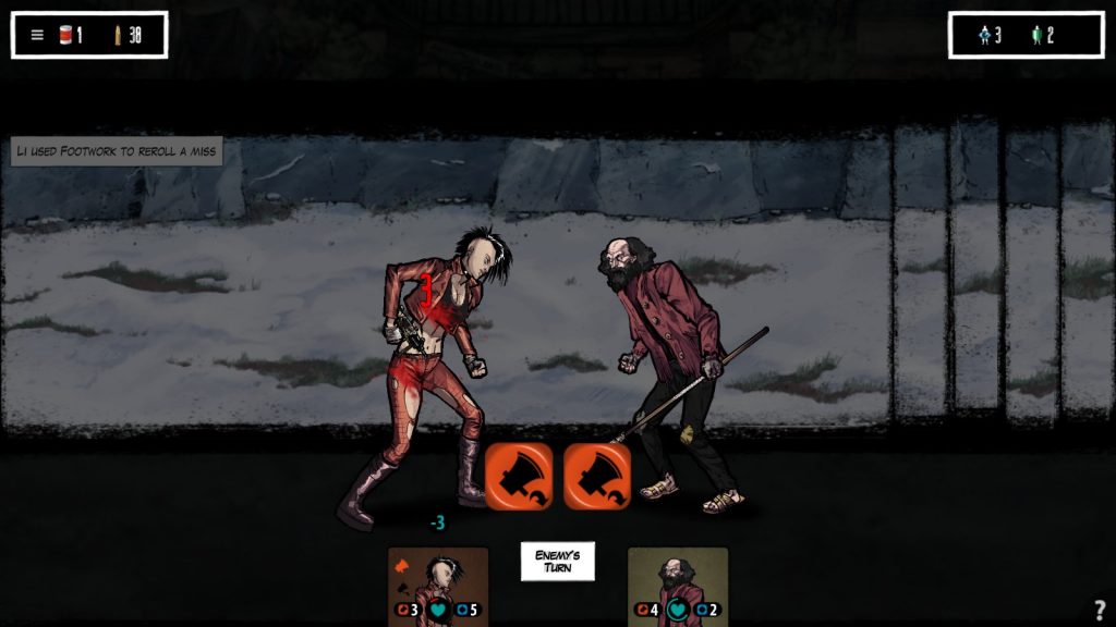
Aesthetically, the game is currently fairly good visually, with a clear, comic like style, and musically alright, with tracks that aren’t intrusive, but fit their mood quite well. The UI’s pretty clear, although it must be said that it would be nice, certainly, to know how many survival points I have to my next character unlock.

It would also be a good time to point out that hitting the options at the start, minimalist as they currently are, would be a good idea due to the simple virtue of noticing that there are R Rated events, and turning them off if you don’t like that idea. They may well be on the level of “I slept with this person, and it felt good” , but I can understand that’s not for everyone, and the game has enough to deal with as it is. Funnily enough, post apocalyptic settings are not nice places to be, so I’ve dealt with lynch mobs, cannibals, mutant haters and human haters alike, and a bundle of other not nice folks.

Apart from that, and my other niggle that once you select an event, you can’t seem to unselect it (which has been rather trying when I misclicked) , the game, honestly, feels alright at the present stage. Combat is easy to understand, the board portion is easy to understand, and I haven’t felt dicked over any more than I would expect in a board game, in a post apocalyptic setting, where life is kinda rough. It’s nice to see a clear UI, and explanations of events easily accessible, the events are interesting, the world seems interesting, and I look forward to seeing more.

On the one hand, shades of grey, fairly nice. On the other, it’s basically Mutants/Humans right now, which… Well, that’s an approach that has its issues.

The Mad Welshman would probably be a bad survivor. An okay tyrant, sure… But a bad survivor.

Become a Patron!

Scythe: Digital Edition (Early Access Review)

Source: Cashmoneys
Price: £15.49
Where To Get It: Steam
Version Reviewed: Hotfix 0.56.
Other Reviews: Release

Right now, Scythe: Digital Edition is pretty much what it says on the tin: A digital adaptation of a strategy and resource management board game. Which, accurate as it is, doesn’t really explain why I’m conflicted about it. So let’s get into how “Does what it says on the tin” isn’t, in this case, entirely a compliment at the present time.

Scythe is, at its most basic level, a competitive game in which six russian styled factions rush to achieve supremacy by… Ah, wait, intricacy has reared its intriguing, yet sometimes ugly head already, because no, getting 6 objectives doesn’t win the game, it merely ends it. What matters is a combination of power, popularity, resources, and territory, with multipliers for high popularity and building things over the tunnels that honeycomb the hexagonal, rural arena in which the six factions battle. And, in a normal game where you aren’t shown the score count, that’s a combined battle you’re not really sure you’ll win unless you’re heavily keeping track.

Spot the Rusviet Workers (DISCLAIMER: Difficulty determined by colour blindness type)

So, on the upside, the option to keep track and see this (Score Preview) does exist. For hotseat and single player, anyway. On the downside, this information pretty much requires you hover over the tooltips to remind yourself of the less common symbols. The… Rather small symbols. And the sometimes small text. Which is something else to squint at, as well as Rusviet workers on some of the backgro-

Look, I’m basically saying, rather clumsily, that this game could have done with some accessibility options planned from the start. While there is an option to change the colour of the map, this only actually applies when you’re zoomed out, which, not gonna lie, isn’t a view I tend to use, especially considering that the pretty faithful recreation of the models, the unpainted plastic mechs and heroes in six flavours, and the wooden, blocky workers, is visually appealing when colour issues aren’t making the latter (Arguably more important units than your mechs and heroes) somewhat hard to distinguish.

The event cards are evocative, albeit uncommon features. And some factions, the villains, get to pick more than once here!

The game is currently hotseat, with the option of bots, and, despite its cool boardgame aesthetic, and music with Russian instruments, this… Isn’t serving it too well. It’s definitely a game you want to play with friends, with the uncertainty, the diplomacy, and the nervous planning. As it is, the uncertainty over whether getting that sixth star is the best idea right now only exists when you deliberately avoid the option to remove that veil, and the diplomacy… Well, this is one of the few times I’d say hotseat makes a strategy game, tabletop adaptation or otherwise, less exciting.

It has a cool world, alas, mostly seen in the rulesbook (an outside PDF link), and hinted at in the game. It’s got a good aesthetic. But, at the current time, it’s a good example of how sometimes, you need a human face or two attached to a game to make it what it is. It’s definitely worth a go, and it’s definitely a faithful adaptation of an interesting game… But it’s a faithful adaptation of a game whose interest comes from the dual uncertainty of hidden scores and potentially irrational actors.

The AI victors, who would not have *been* victors if I hadn’t picked on myself. Alas, I didn’t win, I didn’t win, and I would have won if I hadn’t attacked myself.

The Mad Welshman, being a moustache twirler, is a rational actor. Death rays are perfectly logical and sensible time and money expenditures.

Become a Patron!