Conglomerate 451 (Review)

Source: Review Copy
Price: £16.99
Where To Get It: Steam
Previous Reviews: Early Access
It is the far future. And you’ve got a job ahead of you, commander. Because you’re the head of a private agency (not a corporation, honestly, really!) who has been tasked with dealing with the criminal influence of four cacklingly evil corporations, on behalf of the government. In sector 451 of the city of Conglomerate, and yes, they did call it that. So… It’s cyber, but not punk. Still.

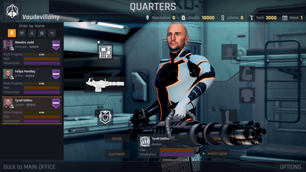
So yes, this is one of those step based RPGs (first person, move a tile at a time, moving costs time but turning or looking around doesn’t, effectively turn based), with random loot, random enemy placement, a pool of maps, a research tree… It seems like a lot, but what it boils down to is: You do missions, which are usually kill a thing, kill lots of things, or find a thing. And doing these things breaks the influence of one of the four corporations who are openly criminal in the sense of drug dealing, slavery, and the like. Them’s your basics.
So… Last time I reviewed this, I said it was mostly solid, pretty promising, with a few things that needed work. That opinion has, apart from the whole “It’s released” thing, not really changed all that much. Because it still has issues. It’s just that they’re now mostly in terms of writing and accessiblity, rather than one of the two minigames being tedious as hell (the hacking has changed to be something a little more quickfire than “Click on some text when you see it”), and the money part of the game’s economy not being great (unlocking the in-mission benefits like “Can always ambush enemies if they don’t see you” costs money now. Which I’m fine with.) Not changed, however, is the fact that the bigass gun which looks like it can chew a room to shreds has a range of… 9 meters.

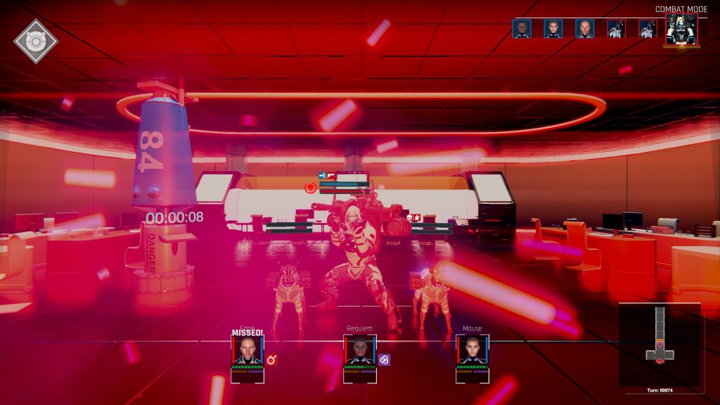
Now… Even if you have white writing, folks, it’s going to be nigh illegible with a moving background, or something of even roughly the same value. That’s an accessibility issue, for which there is no option to fix. Dark red health on a dark brown background? That’s hard to read, so… Colourblindness issue, no option to fix. These are both two examples of how the game could work on its accessibility (a third being UX/Text scaling.) And then… The writing/barks. I’m not expecting Great American Novel, folks. What I do expect, however, is not to be very tired of the AI’s yakking two minutes into a mission. Yes, I get she was built by bad people to help you do bad things to bad people. I got that in the first two voicelines about how gleeful she gets about murder.
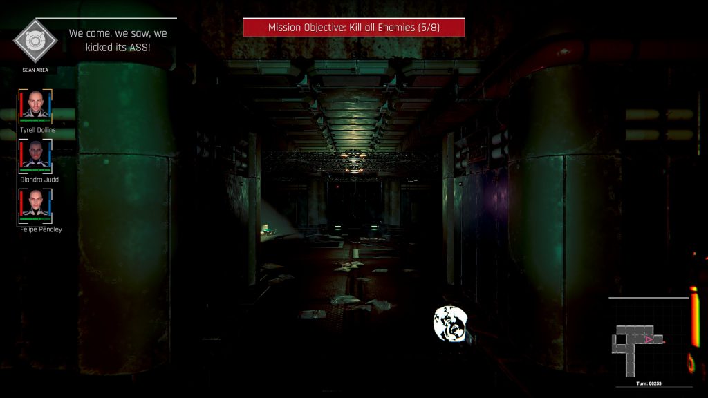
What I’m less fond of is references, without a hint of self awareness. Ah yes, my training mission was a “Kobayashi Maru” type. Mmmhm. Why yes, AI, we did come, we did see, we did kick its ass… But both of these references are almost as old as I am. And no, there is no option to turn off these barks, which… Sorry, developers, they’re not well written, and in one case (SPU chips, which add a little to stats), it doesn’t even make sense. Copper and some wires, but maybe it will be useful? I… AI? Have you been trained? At all?

So, in terms of aesthetics, it’s alright. There’s some good enemy designs, the world maps are interesting and aptly get the feel across, the sound isn’t bad, and the visuals for attacks are kinda cool in places. In terms of gameplay, it’s a little grindy, but otherwise, I’m actually down for a limited set of map layouts, partly because you know vaguely what to expect. Improvements have been made in some areas… It’s still got jank, but… I’d still recommend it somewhat for fans of step-based RPGs, because it ain’t bad.
But it could definitely work on its accessibility.
The Mad Welshman would offer their services as a dystopia writing consultant, but… Well, not much point.
