Nexomon (Early Access Review)

Source: Cashmoneys
Price: £7.19
Where To Get It: Steam
Aaargh. Aaaargh. Sometimes, I hate Windows 10. Hey, is your app too blurry, why don’t we, why don’t we, why don’t we Stop Tabbing Out Win10, it’s not blurry! (To fix this, turn display change notifications the hell off)

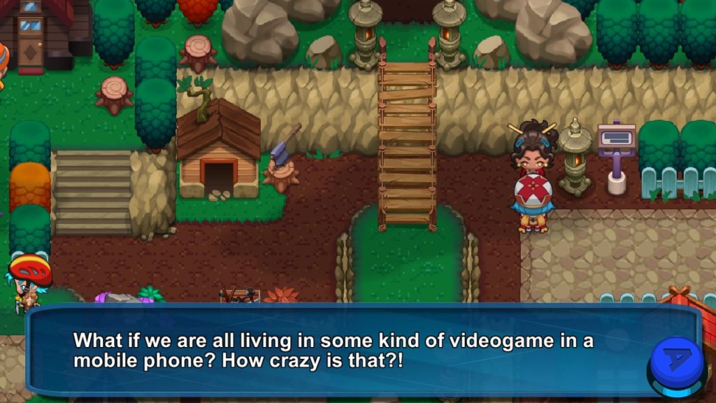
Anyway, yes, Nexomon starts in full screen mode, and it seems to be a little while before you can actually get into the options. Have options on the main screen, folks, because otherwise you have, for example, the game’s volume blaring until the into cutscenes are over (one of which, for some reason, is unskippable.) And yes, I had that experience, and yes, it was a bad start to the game for me. And then another bad experience, with a fourth wall breaking joke that was less funny than the developers thought it was (Which has, so far, happened about eight or nine times), and perhaps the most obvious foreshadowing that the…
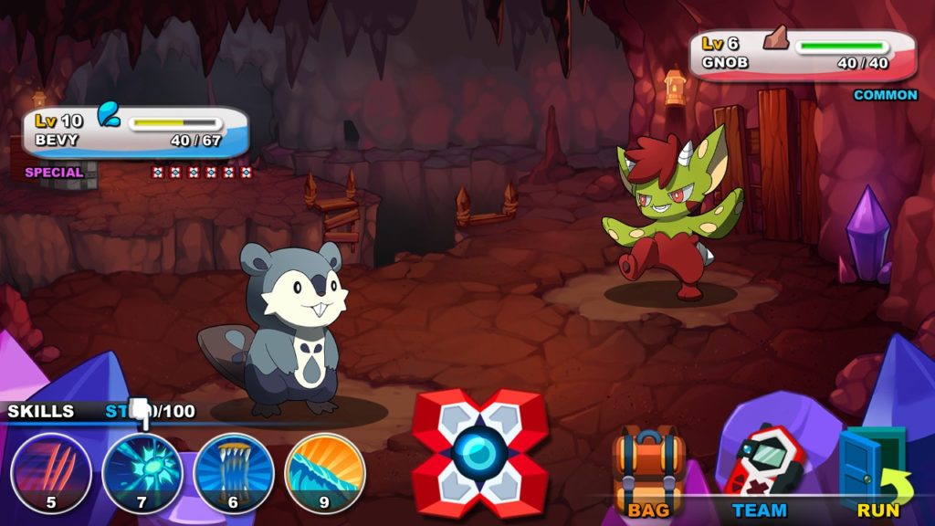
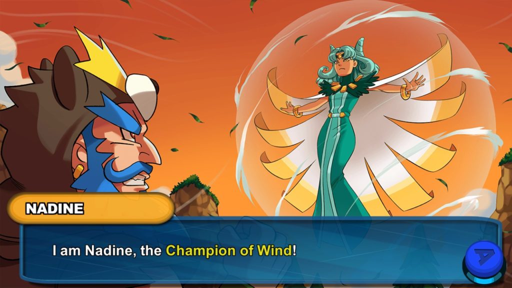
Wait, the Gym Leaders in this Pokemon-alike are part of Team Evil? I… Hrm. Anyways, yes, this is one of the Pokemon style games that have been cropping up this past year, and it’s… A very mixed bag. On the one hand, it’s visually pleasing, with lots of cool designs. The animations work pretty well, and the music pleases, even through the acknowledgement that the musical stings and the like have very similar motifs to the Pokemon franchise. At least the shopkeeper is a cat called Ron. That’s nice. And the battles, if you know what your moves actually do, is good.

But I did say it was a mixed bag, and most of this is in the writing, some things that may or may not irritate, the aforementioned lack of an options menu until you’re in the game, and status effects are, for the most part, single turn effects. That’s right. Single turn. Oh yeah, and if you’re wanting a team of a single Nexomon, you’re outta luck, because only one can be captured, and if you try to capture another, you’re wasting Nexotraps, the Pokeballs of this game. In one case, where the “captured” icon didn’t show up in the top right, I wasted three before I said “soddit!” and finished it off. And then I went back and, sure enough… Already captured, 750 coins worth of Nexotraps lost to the ether.

Now, there are, indeed, 300 Nexomon in the game. And many of them are packed into a very tight space. As in, I was finding different Nexomon, including different rare ones, in different screens of a route. And, since there doesn’t appear to be much in the way of quick routes (You’d think they’d give you running shoes after the second gym, but no, it’s apparently somewhere in the third gym), it’s a slow trudge, and…
Well, it’s at this point that I talk about what this is: It’s a port of a mobile game, and it shows. It shows in the lack of move descriptions in battle, and the UX. It shows in how minimal the database and move descriptions are (beyond their energy cost, which may or may not reflect how powerful the move actually is.) And it shows in being more grindy than your default Pokemon experience. Since the writing isn’t all that great, and considering all of this, I would definitely understand if you were turned off, or at best non-committal, since, even when reviewing it, I had to take breaks out of, basically, irritation at how slow it was going. It had a feature where you could switch between moves you’d learned, but… Not enough to save it.

And, after the second gym, and the knowledge that I was going to have to grind more to beat the first trainer battle after it, I checked out. There are some good designs here, and, like Disc Creatures, it has the feature of allowing you to pick between your moves, but the game itself? Is a tedious slog with some distinctly hammy and awful writing in places, especially when it breaks the fourth wall.
The Mad Welshman would like to remind spiritual successor types: Please fully understand why a thing is good. Thank you for your time.
