Infinite Adventures (Review)

Source: Cashmoneys
Price: £19.49
Where To Get It: Steam
“You don’t have to fight over me” cries Rufus the Mendicant, as saucily as he can. And every time he does, I quietly wish for the sweet release of death. Welcome to Infinite Adventures, a game which is currently the closest thing to Etrian Odyssey on the PC right now (giving and taking some things), and, despite being a relatively solid game, it’s a somewhat painful experience in an aesthetic sense. Especially if you have anyone in the party with a “Flirty” voice.
You know… Like Rufus, default starting Mendicant.

“Ha! I think that enemy got… The point!”
Okay, that’s not the best start, so let’s explain what I mean gameplay wise. Infinite Adventures is a dungeon crawler, step based, automapping, based around a single, fairly long dungeon, and the nearby town which bases its economy almost entirely on your questing. As with its inspiration, chests are floating boxes, there are harvest points for produce, minerals, and animal goods, and, not-at-all secretly, the dungeon hides a DEEP SECRET. There is also a story, through which our amnesiac protagonist finds themselves awakening from a coma, forming an adventuring guild, and finds out this DEEP SECRET after many travails. Everything is turn based, and there are classes, skill-trees, and items galore, with tactical thought going into most of your moves.
Sounds cool, yeah? Even better, on the normal and easy (Story) difficulties, you can turn random encounters off for a time, although that’s mostly useful for being able to gather items safely, rather than finish dungeons.
But, here’s the thing. Just as a game can be pretty as heck, but have poorly thought out or tedious gameplay, so too can the reverse be true: A game can have solid gameplay, and have inconsistent or poorly chosen aesthetics. Both are equally a turn-off, and, naturally, most games that have both never see the critical light of day. In the case of Infinite Adventures, it’s the aesthetic that’s the turn-off.

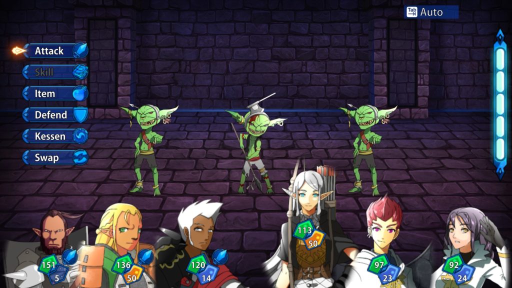
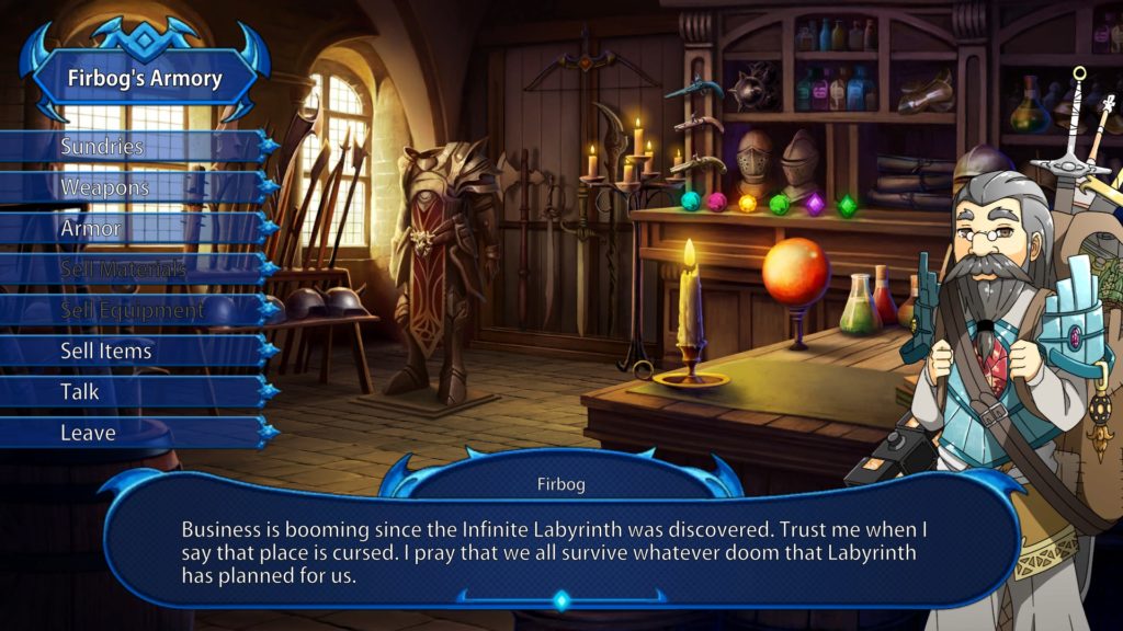
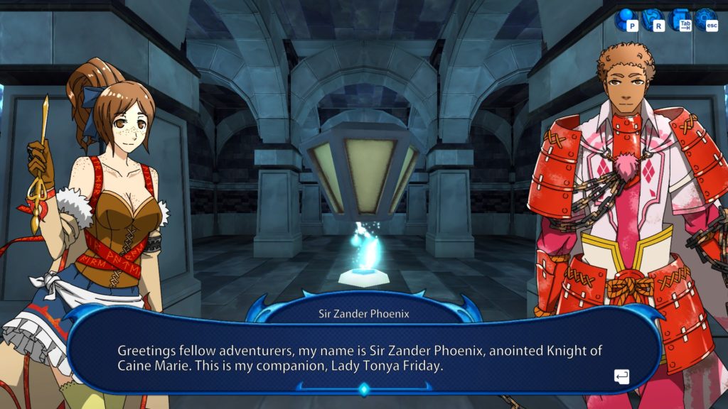
Like Etrian Odyssey, it’s cel-shaded anime characters, over painted backgrounds, with workmanlike UI, with low-poly dungeons. Problem being… It’s nowhere near as cohesive.
Block puzzles move the blocks at a meaty pace of 3 frames a tile… Over about a second. Richly painted landscapes and rooms outside the dungeons contrast with cel-shaded characters, contrasting with a workmanlike interface (Itself having problems like colour choices, transparency interfering with text, and insufficient outlining), contrasting with low to mid-poly 3d dungeons. Voices range from “Adequate” to “Kill the ‘Flirty’ Characters On Sight.” The writing has the general plot beats of an Etrian Odyssey game, but is a blunt instrument with some awkward tonal shifts. Aesthetic consistency… Just plain doesn’t exist here.
And this, put bluntly, is a big problem. Not because the game is mechanically bad, or unplayable. It’s using tried and true mechanics, and while it takes some features people were fond of in its inspiration away, it gives others back. No, it’s because quite a few text-boxes hurt the eyes to read portions of, or because of that godawful “Flirty” voice (The “Absent-Minded” one is almost as bad), or because several different artstyles, each fighting for their place, distract from the gameplay, overpower it, and because the writing can’t save that.
This is perhaps the first time where I can’t recommend a game, not because it’s mechanically bad, but because it’s aesthetically painful. And that makes me sad, even if it’s an object lesson that no, you really can’t let go of one or the other.

It should be noted that comparisons to Etrian Odyssey are made, not just because of game similarity, but *plot* similarity.
The Mad Welshman is not a 4K 60FPS Always Photoreal kinda vaudevillain. However, consistency is a big sticking point.
