WORLD OF HORROR (Early Access Review)
Source: Cashmoneys
Price: PWYW (Developer Patreon also an option)
Where To Get It: Itch.IO
When the first thing a friend asks me on showing them a shot of the game is “Was this programmed in HyperCard?” , I know that, on an aesthetic level, WORLD OF HORROR, a short investigative adventure game inspired by early Mac games and the horrific art of Junji Ito, is definitely working as intended. And, considering the game’s short and sweet as well at the present stage of its development? The stars are seemingly aligned.

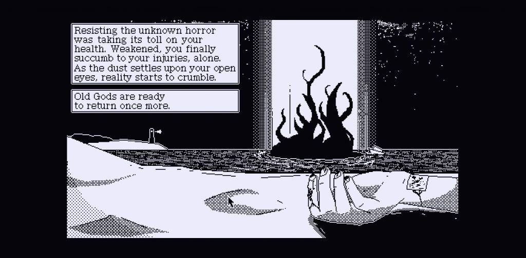
…Alas, not, generally speaking, in my favour. Oh well, nobody said stopping reality from breaking was easy!
Backing up a bit, WORLD OF HORROR (caps intended) is currently in a demo stage, showing off the three main methods of play (Single area, timed investigation; home/progressive investigation; location/day based investigation.) It’s a game in which high school students of Horror Japan (The city of OOO, In the year 19XX) are the only hope of even delaying eldritch horror based apocalypse, often based on urban myths, such as Red Coat or Bloody Mary, or on J-Horror themes, like a festival of sacrifice and the like.
While each playstyle is different, some things remain the same throughout. Combat is brutal, as, y’know, students versus ancient evils, ghosts, witches and killers rarely ends well. Items and spells, while useful, are always double edged swords. And each case can be completed (for good or for ill) in around ten to twenty minutes. As such, while the game is difficult, it’s short enough that I genuinely don’t mind that I’ve either died horribly or ushered in the apocalypse in all but one of my runs so far. Not everything is clear in the game (the DOOM meter, for example, doesn’t seem to do much right now), but again, short runs let me get used to things like quickly checking my inventory, and experimenting with buttons to see what they do (The 1 and 2 are important with the first case, as is checking your storage!)

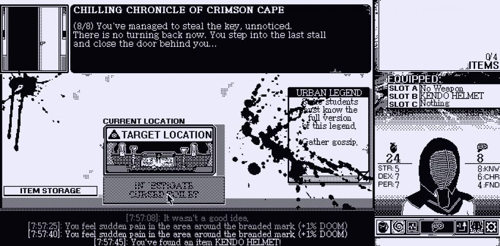
See, on the one hand, exploring school in a Kendo Helmet looks silly. On the *other* , it’s protection. More important than my fashion sense.
So, while there’s not currently a lot of game in WORLD OF HORROR, what there is is quick, relatively easy to get into despite some minor unfriendlinesses in the UI, and it plays to its retro-aesthetic strengths well, with eerie chiptunes, clever 1-bit art (Not necessarily black and white, as the title card allows you to change between a variety of dark/colour palettes… I went with a nice, soothing cyan), and, overall? I found myself wanting to see more of this strange, bloody world.
More. So much more…

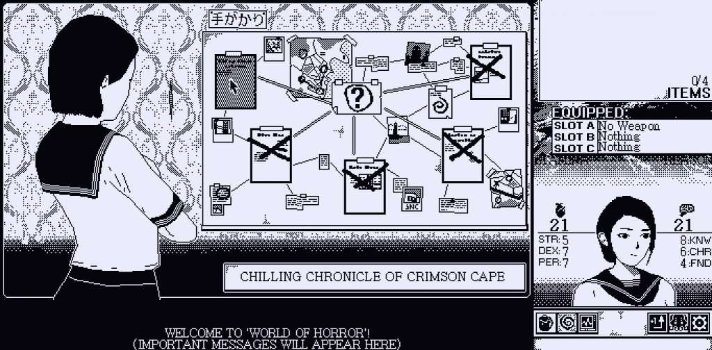
Hopefully a portent of things to come, but the main UI changes according to need.
The Mad Welshman is IN.
