One Finger Death Punch 2 (Review)

Source: Cashmoneys
Price: £5.79
Where To Get It: Steam

One Finger Death Punch 2 is, on the one hand, more of the same with more pizzazz, or, depending on your viewpoint, more distractions that may screw you up at high speeds. On another level, it’s the survival of memes from a long way back (Bad martial arts movie dubs and stickman fights, cats love to get up in your business while you’re doing important things.)
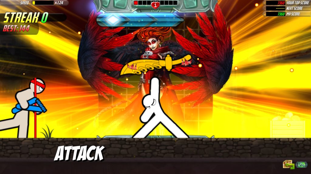
The Ringed Golden Sword remains an awesome way of telling you that you sucked.

On another, more basic level, it’s a game where, as in OFDP1, you fight using ooonly the left and right mouse buttons, waiting for your opportunity to gorily beat the shit out of a horde of stickmen of various levels of health who want to hurt you, without clicking too early (Miss, slow down, get hit) or late (Get hit, damn, that hurt.) And, inevitably, get caught out by some subtlety or other to that system, whether that’s not getting the semi-expected “Nobody close, nearest punching bag selected for a brutal out-of-range walloping”, or taking out multiple opponents at once (A boon at times, a curse in others.)
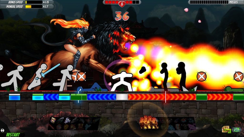
For example, there isn’t actually a lot to unpack here. But it sure does look like there is, doesn’t it?

It’s fun enough that I don’t even mind that one of those “more of” is “More business in the UI to distract you if you weren’t focusing entirely on fighting using only the left and right mouse buttons.” Skills are easily more distracting, twitch functionality means that emotes fly across the screen, and the map, while beautiful, is also a little less clear.

But… Here’s the thing. That distraction, which would gain a thumbs down or a disapproving tut elsewhere, works with One Finger Death Punch 2 because part of the challenge is that the game is trying to distract you. And it works narratively because it’s essentially that bit in a martial arts movie where tons of people swarm a lone individual. Of course distraction is an element, and as such, you feel like a badass when you win.

It helps that, even if you lose, a few of the nice things about One Finger Death Punch (and sequel) come into play. Losing slows the game’s speed down. Winning speeds it up. So, in essence, it self corrects its difficulty. For the masochistic among us, the difficulty can also be manually corrected now, so… Wow. And, of course, if you reach the highest tier of Survival, you once again meet Luca the cat, determined to distract you further as cats do when you’re doing something important on a computer. Ahh, joy.
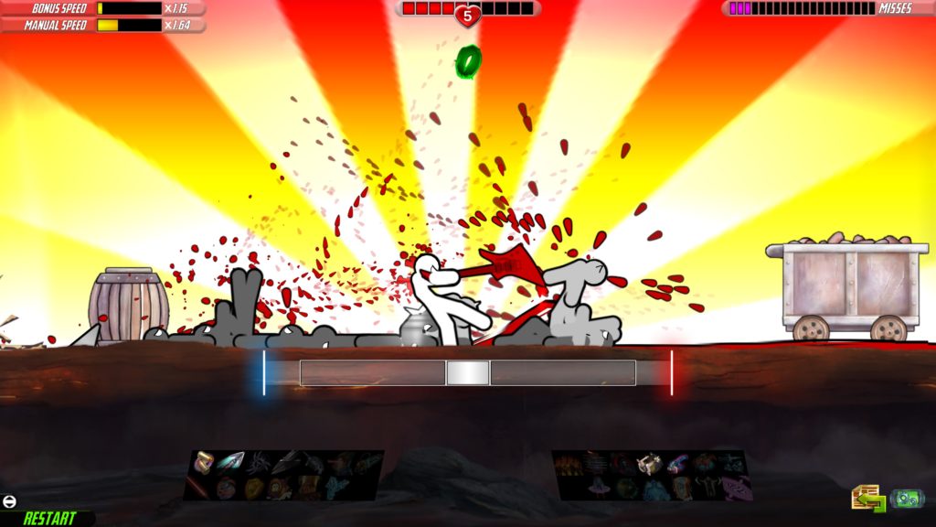
BASS DROP, ASSHOLE!

I’m actually going to wrap up here, because firstly, what you see is pretty much what you get: Punching, splashy effects, maps, survival, etcetera… But also because, sure, I could describe One Finger Death Punch 2 in terms of adrenaline rush, in terms of that fightgame high… And that’s a turnoff for some. I could describe it in terms of its simplicity… But that isn’t the whole story, because, while skills automatically resolve, there’s still depth to that, and effects on the play (Killing a brawler or boss instantly, for example, plays a flashy animation, but I hope you remembered who you were going to punch next!)

I could describe it in lots of ways, but my main advice is to watch some footage of it, think if you could give it a go, and then, if you want to… Give it a go. The tutorials are clear (Although 16 individual tutorials felt a bit much), and , worst case scenario, you find 2 hours passed without you realising (A good sign anyways), and you’ve spent £6.
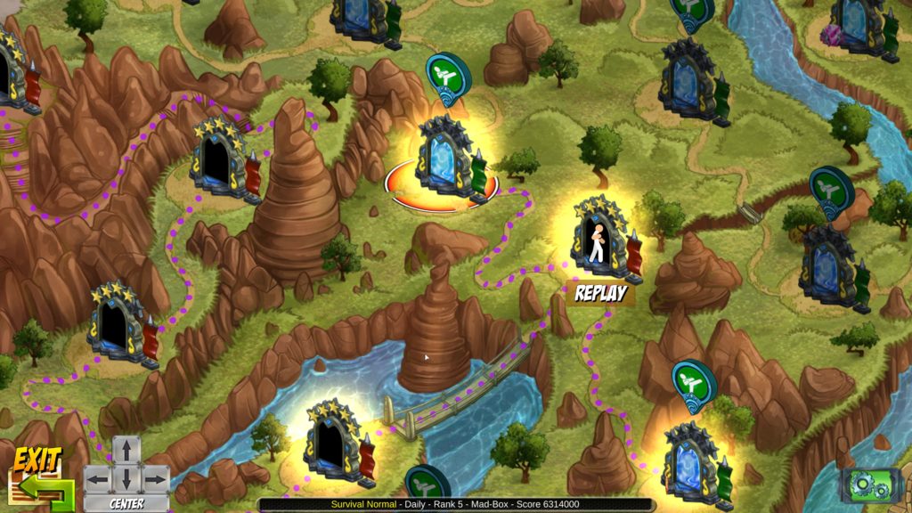
Thankfully, while the map is just as busy as the rest, it’s fairly easy to get your head round.

That may seem counterintuitive for a written review site, it’s true, but One Finger Death Punch 2, like its prequel, very much needs to be seen in motion. Personally, I love it.

The Mad Welshman fights using only the thumbs up and thumbs down. Alas, he does mash the review button.

Become a Patron!

Heaven’s Vault (Review)

Source: Cashmoneys
Price: £19.99 (£8 soundtrack)
Where To Get It: Steam

Time… Can erase a lot of things. We can’t be certain about the little things about a person’s life, from documentation, even thirty years ago. Time and time again, we’ve found we were wrong about societies from hundreds of years ago (And we may still be wrong), and as to the earliest stages of our world? Ha. Language, especially, can be tricksy. Lots of words look related, but these are just as often coincidence as actual linguistic relation.

Linguistic puzzles come in two flavours: Guessing the words by related form and context, and piecing together phrases, which allows you to confirm your guesses (or disprove them)

So imagine my pleasure when I came across Heaven’s Vault, where the obscurity (deliberate or otherwise) of the past is a core theme, and the tricksiness of deciphering a language from scratch… Ahhh, that’s a core mechanic. And, while the base of the story is nothing new in science fiction, the details? Ah, that’s where it becomes interesting, and cool.

So, let’s start with surface details. The setting: A nebula, through which rivers of ice wend their way, sometimes fast, sometimes slow, and both air and water are a premium. The society: Mostly under the rule of the Iox Protectorate, it is an Indian flavoured setting. It is by no means a nice place, but it’s what the main character, Aliya Alasra, calls home. She’s an archaeologist, and a request to find a professor leads to… Big consequences.

As an aside, if you’ve never thought Archaeology or Science have drama… I seriously suggest looking some of the drama up, because hot dang… Side note over, back to the game.

As with real rivers, there’s one heck of a rush to travelling rapids, thankfully without the risk involved (It is not, to my knowledge, possible to crash the ship)

More specifically, some crit I feel obliged to mention, before talking about why this is still interesting, and still recommended. The game is on a single save system. I can understand why, sort of… But it is annoying. The sound levels, at the time of review, don’t always take for the sailing segments. And the base text speed is a little fast (thankfully, it can be slowed down.) Toward the end of the game, the sailing, once joyful, becomes a bit of a chore. Okay, that’s the crit over with, now let’s get back to it.

The language in question, Ancient, plays a big role in the mystery Aliya gets involved in. Understanding of her situation requires exploring thoroughly, and understanding that you may not understand or have the tools to properly translate an inscription without context, or further pieces to work with. Thankfully, the hardest part (Discovering a few words) is already done, and you can infer some due to the fact the language is close to pictographic… Water, for example, looks like two waves, with two curved strokes to represent splashing. Nice. But since it’s also a compound language (Like German), you can also use that. Emperor, Holy, and God all have the same root symbols… And this, readers, is where the game does something clever that I appreciate.

The world doesn’t pretend to be a nice one. It’s grounded. Even if, sometimes, this involves delicate subjects (That it seems to handle quite maturely) such as slavery.

You see, it shows they understand that language doesn’t grow in isolation. It understands that words get tied to other words for reasons. And that Emperor/Empress, Holy, and God all have the same root deeply implies what the game then informs you… That the Emperors and Empresses were considered godlike. That’s a really nice touch.

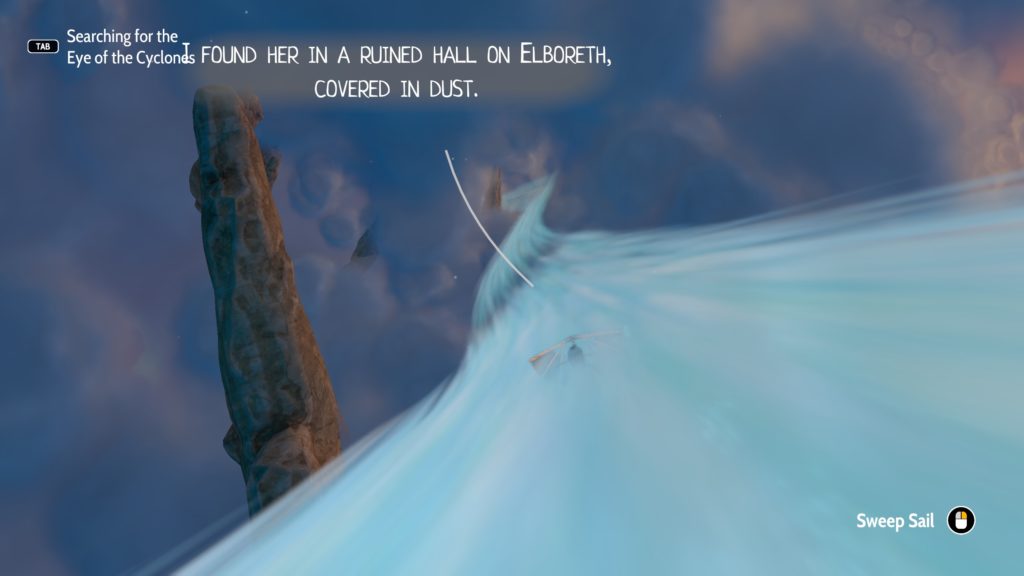
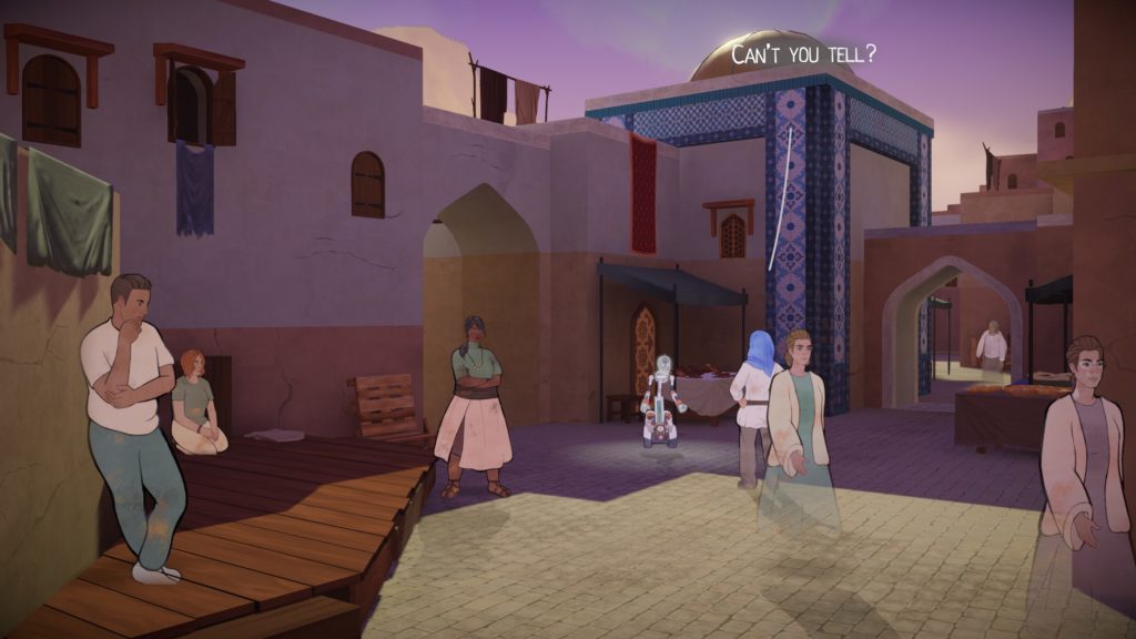
Visually, it’s an interesting blend of hand-drawn animation and 3D landscapes that works pretty well. It’s fluid, it’s pretty easy to get what to do, and it looks lovely. Every place feels different. Musically, it’s very much a dreamlike experience. Sweeping violins fit well with the nebula’s rivers, and the “rocks”, small planetoids on which people still live (or… Not, as the case often is with the archaeological sites.) Sailing, while it gets annoying due to having to travel further as the game progresses (Fast travel thankfully got introduced just before publishing, and at least one mysterious “And the robot sailed the ship directly to where I was because reasons.”) is, in the first two thirds of the game, an interesting experience. It hasn’t really palled on me except when I’ve been feeling pressed for time, because it’s a beautiful place and the music is nice, but I can see how it would wear for others.

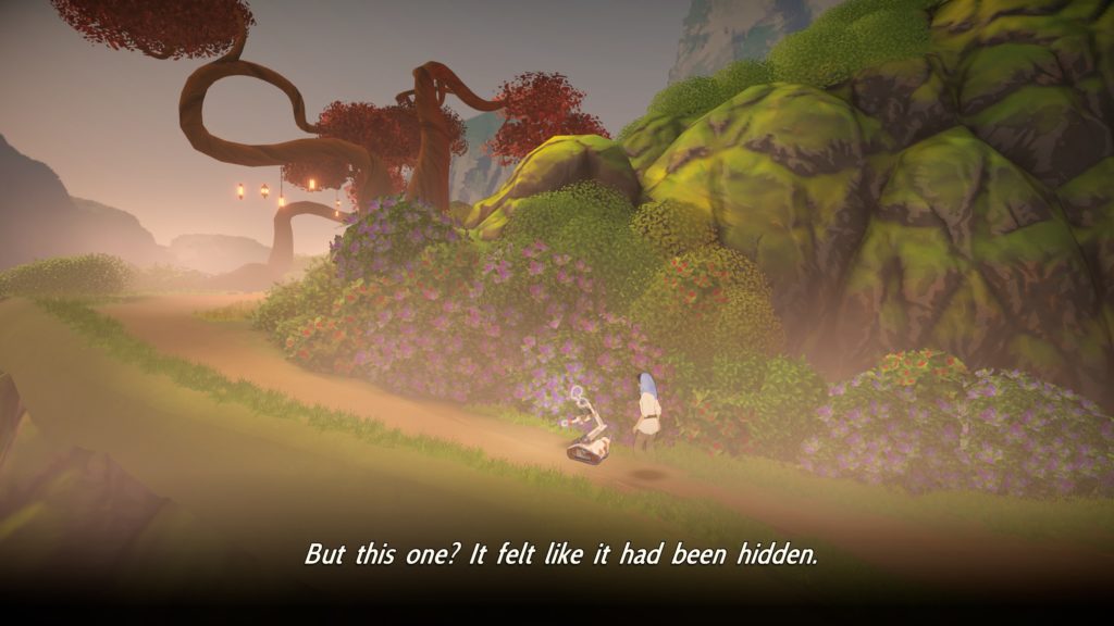
Oh, and what a hidden place it is. My favourite part of the early game…

In any case, interestingly written, with a core mechanic that is mostly unique (One of the few games to try and make linguistics core to its play, Captain Blood, does so in a different manner), and a story that kept me going, wanting to know exactly how things went as they did… Heaven’s Vault is definitely one of the most interesting adventure titles I’ve seen this year, and well worth a look.

The Mad Welshman loves exploring myth, and culture, and history. For a game to let him do this with a fictional one… Well, that’s the good stuff.

Become a Patron!

Goblin Shop (Review)

Source: Cashmoneys
Price: £7.59
Where To Get It: Steam

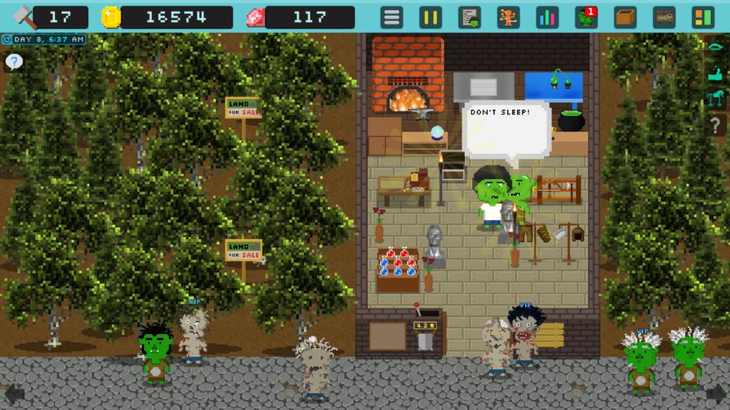
Running a shop is, barring the social aspects, mind numbingly dull. Customers come in, they look at things, maybe they try and steal things, and sometimes they buy things. Then they leave.

Times my “helpful” employee has fallen asleep today: 15.

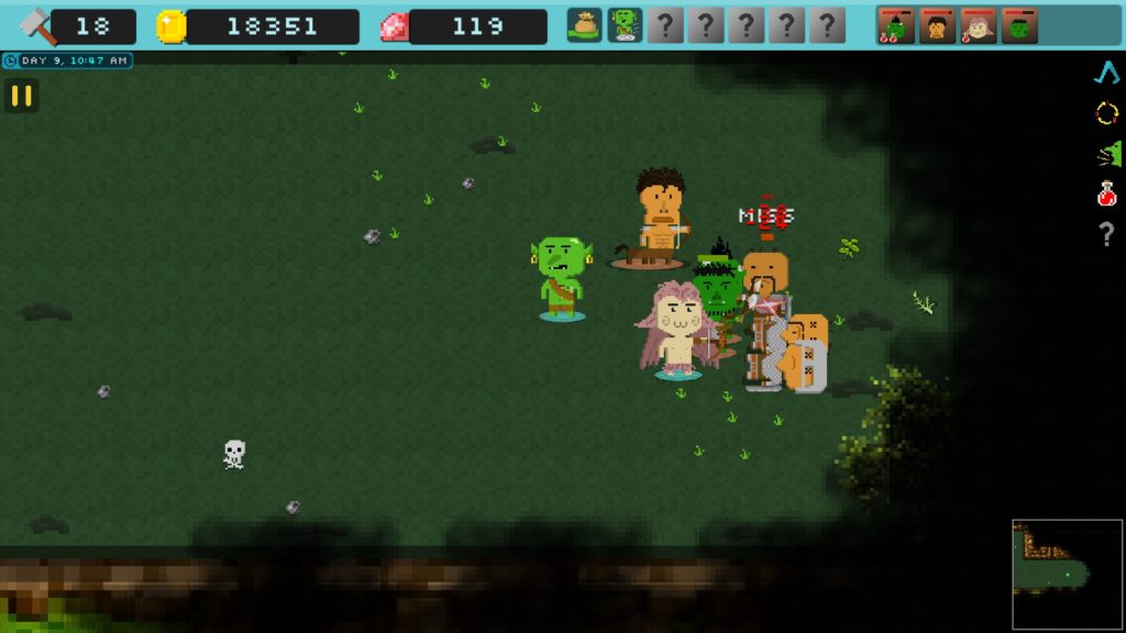
Goblin’s Shop tries to add things to this basic formula, in much the same vein as games like Recettear, Nono’s Magic Item Shop, or Moonlighter, but… A lot of what it seems to be adding is annoyance. Okay, yes, Employees potentially make things easier… But just as often, they’re going to fall asleep on the job, requiring you to punch them awake. The music is sparse chiptunes, and as such, they pall quickly. And adventuring… Well, have good enough folks, you can easily win through. Don’t, and you’re just leaving to come back later. There’s no real stakes to it, and…

…Well, it all ties into a core problem. Much like actual retail, a lot of this feels more like busywork. I don’t need every single material on the adventure map. I need newer ones. But it’s there, why not pick it up? Money? Money hasn’t been a problem the entire time. After a certain point, it just… Stops becoming important. Selling kit to adventurers to equip them seems like a good idea, until you realise that you have to solicit them, multiple times, to get the silly beggars into the shop to buy something basic like a potion. And the “multiple times” is there, not just due to failure chance, but because they may not actually buy a potion, despite you knowing that they’re going to need one, and soon.

This is about as exciting as adventuring gets.

There are some minor nice touches to Goblin’s Shop… Finding monsters is the way you both diversify your party and get more customers, and sometimes, when you sell a nice item to a customer, they’ll give you extra enchantments to work into your items (randomly.) When you defeat bosses, you actually have the chance to be merciful, which nets you kit, and can improve the humans’ opinions of you. But finding new recipes is slow and annoying, getting to new adventuring areas is a matter of going through adventuring again and again until you beat it… This is without getting into odd control decisions and hiccups, like WASD having menu functions in the shop, but not in adventuring, or the character stopping moving (Considering that your character’s only option when he doesn’t have backup is to run away… Not so good.)

In short, there’s a whole lotta grind here, not a lot of stakes, the music helps it feel grindy, and while there’s a lot in the game, there’s not a lot of cohesion to it. And that’s a big old shame.

The Mad Welshman takes no pleasure in being a downer on goblincraft. But sometimes, it just makes him too green.

Become a Patron!

Death Mark (Review)

Source: Cashmoneys
Price: £32.99
Where To Get It: Steam

Ghosts, it seems, are sexist. Either that, or they’re creeps. This is the impression I get from Death Mark, a visual novel/RPG with an interesting premise, but fanservicey art choices that don’t gel well with their horror narrative. So, more accurately speaking… Death Mark’s got a gender-bias problem.

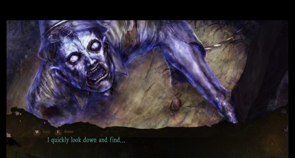
I wanted at least one male horror, for comparison’s sake.

Let’s back up a bit. Death Mark tells the tale of an amnesiac protagonist, where it’s quickly established that they are amnesiac because of a death curse from a vengeful ghost. And so, with a living doll, a mansion that belonged to one of the victims, and the help of other Marked individuals, you attempt to find the spirit that cursed you to die in terror, forgetting more and more.

Let’s appreciate what’s good. The soundtrack is atmospheric and tense, and the sound design is pretty good. The UI is clear, except for the character menu (Which, apart from the END that leaves the game, can be explored just fine.) The art is good, except for some of the ghosts. The story beats are interesting, and the game sells its odd, urban legend inspired world. Similarly, the characters are interesting, and each has something going for them, where even the unlikable ones have some sympathetic aspects to them.

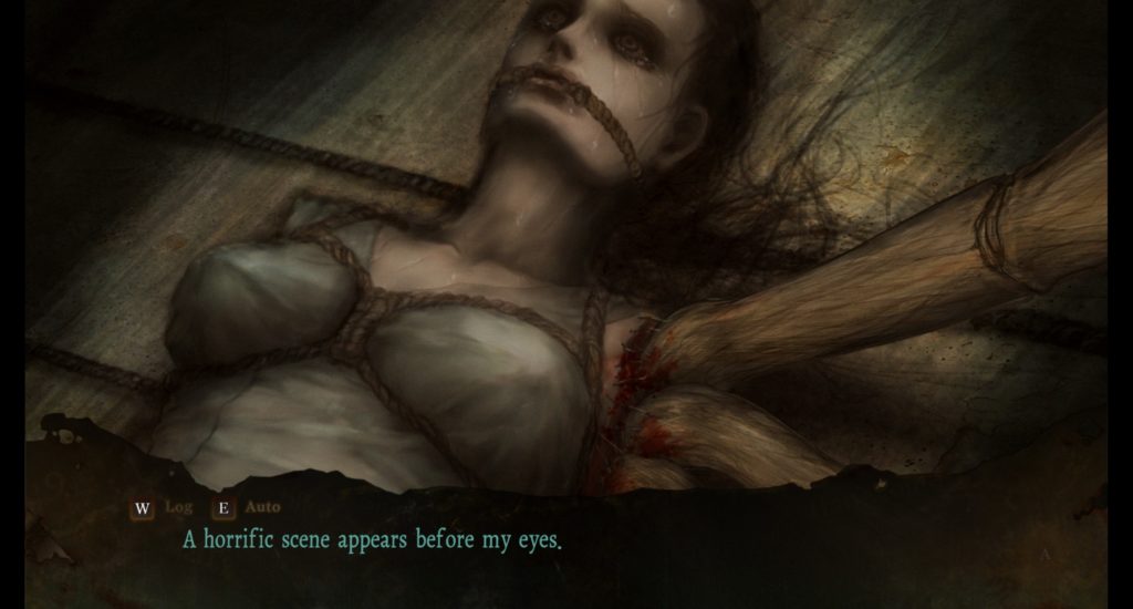
The most horrifying woman’s death CG in the game. And still shibari. SIIIIGH.

But, as mentioned, the game has a definite “Targeted toward the horny white male” vibe to it, as men are invariably murdered horribly, while the portrayal of women is… Well, this is the least sexy “Dead/about to be made dead” CG in the game apart from the intro. Inventory can be a bit of a pain, especially in Chapter 2, where the bottles of Nite Nite are not grouped, and yes, there are items of technically no use. Finally, while I could say the deaths/game overs for fuckups are annoying, the main reason this is so is because saves are restricted to the mansion, as, for the most part, puzzles do have clear hints (Sometimes in notes, sometimes inventory, sometimes conversation.) And finally, the monsters being in a different art style, while I can understand why (To emphasise their otherness), it doesn’t really land for me.

While Lee Chaolan has fallen on hard times, he’s still cheery as ever…

Nonetheless, overall, I enjoyed Death Mark, having completed the good route over the course of the weekend. I enjoyed its twist at the end of the main story, I somewhat enjoyed the DLC chapter, but would warn folks that the game contains mentions of abuse, child abuse, suicide, prostitution, rape… Heavy subjects. If that doesn’t turn you away, then Death Mark is pretty solid horror, and I do, overall, recommend it despite the reservations above.

The Mad Welshman says “Kill men sexily in horror games 2019!”

Become a Patron!

The 7th Guest: 25th Anniversary Edition (Review)

Source: Cashmoneys
Price: £7.19
Where To Get It: Steam

25 years it’s been, since we first visited the house of Stauf, the serial-killer toymaker who lived in a devilish House that Jack Built. A game that sold many a CD-ROM back in the day, but nowadays receives either quaint chuckling or ear-shattering rage, depending on when somebody experienced the dread Microscope Puzzle.

Oh, and anniversary editions that are actually ports of mobile editions. That too.

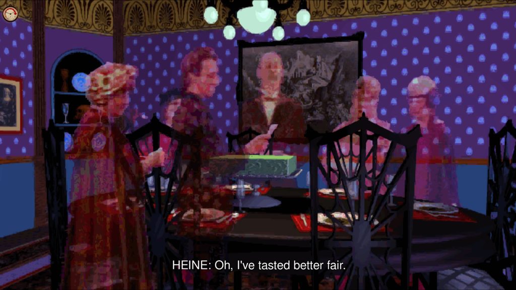
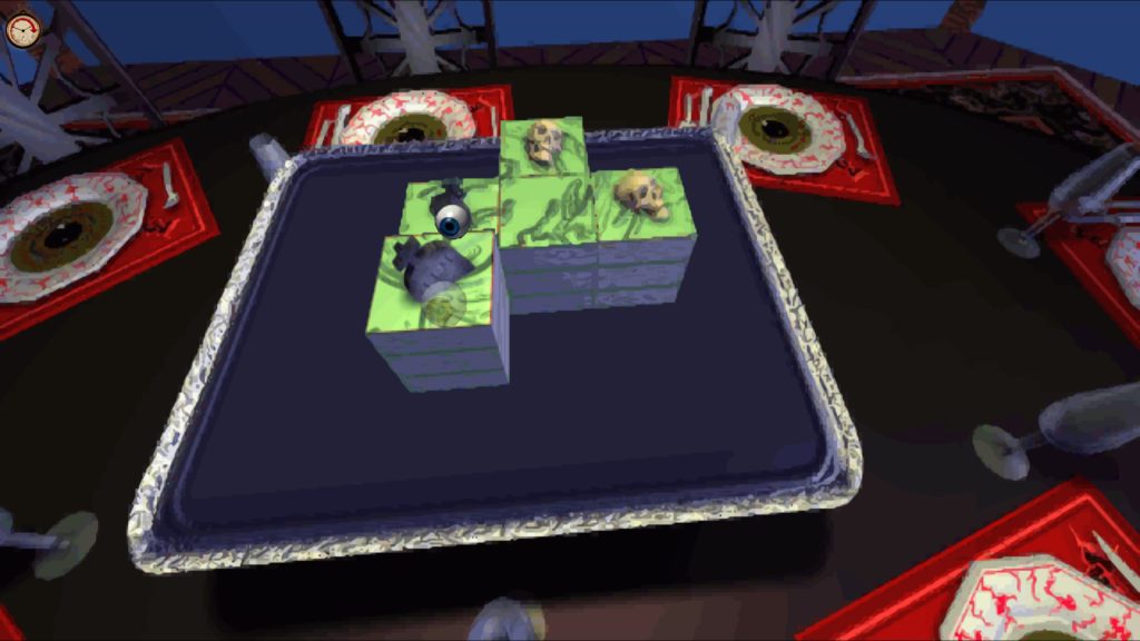
Complete with translation errors. Well, at least this one’s amusing. What, who HASN’T eaten at least one fair?

For those who haven’t seen The 7th Guest, it’s a spooky puzzle adventure in which six guests (that you know of) have been invited to the mansion of Stauf, a mysterious and murderous toymaker. They all vanished, long ago, but you see their ghosts as you, a man with no memory, explore the house, solve puzzles, are taunted by Stauf, and eventually discover the mysteries, like… What happened to the other 6, why children died when they bought Stauf toys, and… Who the 7th guest was… It was interesting stuff, and most of it’s aged fairly well. Normally, anyway.

In case that first pair of paragraphs hadn’t clued you in, The 7th Guest 25th Anniversary Edition’s value mostly lies in its extras. The rejiggered graphics are, indeed, rejiggered in the technical sense, but in the technical sense of “Upscale, smoothing filter applied.” The audio’s alright, but the “totally new” control scheme is… Well, it’s actually clunkier than the original, which is a thing to behold. Rather than smooth shifts between contextual controls, there’s a giant mouse cursor (For lo, the game has no windowed mode, and resolution changes happen twixt menu and game… Even menu to menu, in some cases) that shifts between “Big pointy thing” to the beckoning skeletal fingers and eyeballs we know and love (Some of which stay on screen blinking for a bit after you’ve moved selections.)

“Winking in and winking out… Hey Guest, don’t try this out!”

Sooo… In general, the nicest thing I can say is “The map looks a bit clearer, and the sound’s a little cleaner.” Not a good start. But how about the dread Microscope Puzzle?

Well, apparently that’s a third somewhat nice thing. It has been retooled, somewhat, to the point where opinions actually differ on whether the thing’s an utter bastard to finish. But that, essentially, is about it. A clunkier interface and smoothed upscale doesn’t make for a great experience, and, while those can be removed (Along with the nicer map, by choosing “Original” graphics), it ends up with either money I’ve already spent on The 7th Guest itself, or a port of a port that feels less pleasant to play.

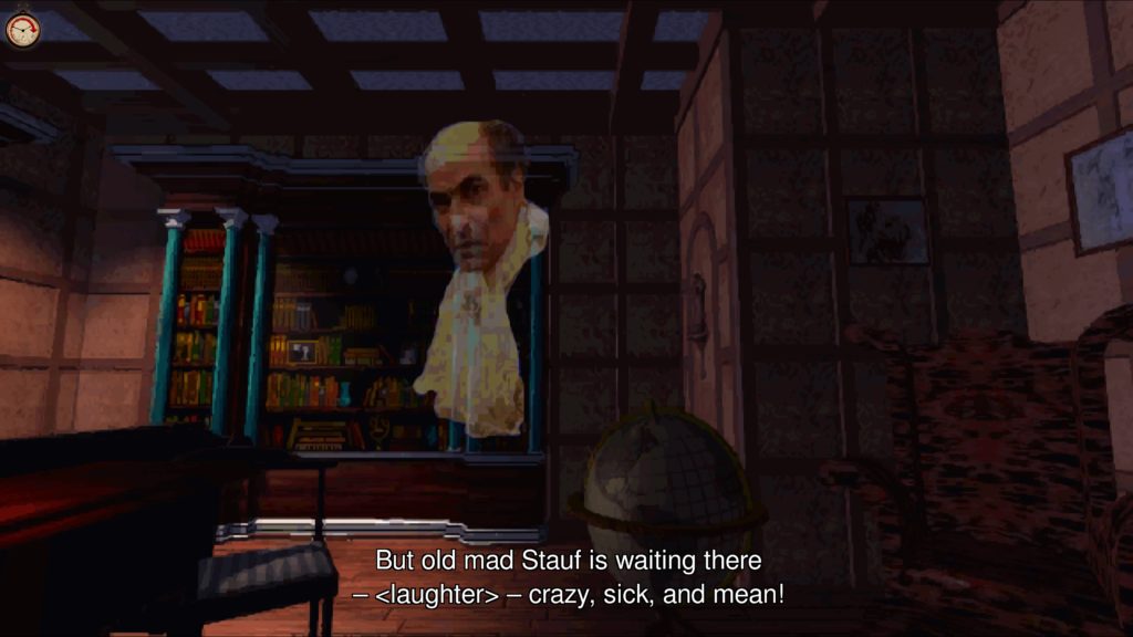
And he’s going to carry on waiting. The 1.04 version doesn’t even get past the menu for me, hence all these screenshots being early game…

Neither are a particularly pleasing choice to me, and so I leave by repeating what I said earlier: Unless the extras interest you, this is probably one to avoid.

The Mad Welshman normally doesn’t disapprove of ports. But, here’s the thing… They have to be decent ports.

Become a Patron!