History 2048 (Review)

Source: Cashmoneys
Price: £1.59
Where To Get It: Steam

Sometimes, it’s nice to take a break and look at a puzzle game. A nice, simple… Ah.

Oh, it *starts* so very simply indeed. So clear. And the concept is quickly grasped…

History2048 is, in a sense, nice and simple. It’s a sliding block puzzle, in which you move all the blocks in a 4×4 grid (appearing randomly on empty squares) in one of four directions, and if two tiles match, they form “better” tiles (Furthest row first.) It’s called History 2048 because the puzzle it’s based on, the 2048 puzzle, is based on 2’s complement counting. So the tiles are, technically, 1,2,4,8,16,32,64,128… So on up till the extremely difficult to reach 2048. And beyond.

But just numbers has been done before! It’s visually unappealing! So… History. From the discovery of fire (1), hunting of mammoth (2), up to things like the ride of Attila’s Mongol Horde (512) and the commonly attributed era to which Le Morte D’elle Arthur (King Arthur’s legends, 1024, and where my best-tile score sits), the game uses low poly 3d graphics fairly well to make a simple board that nonetheless is pleasing to the eyeballs. No music, but simple blips, blops, and splooshes, along with the occasional twinkle, mark the road onward.

…But, in the end, complexity wins over the old grey matter. Almost inevitably. *Almost*

So, you slide, and you slide, and the splooshy blops make it look like you’re winning, but… That campfire. Right in the corner. Behind the roman coliseum. To get it, you’re going to have to change the direction of your play, and that… Oh, damn, now there’s a mammoth blocking it!

In summary, History2048 is nice on the eyes, okay on the ears, less than 2 quid, and the only niggle I can think of is that you have to quit via the window button. Which is obviously an appaling pro- h, no it isn’t. So the game’s just fine. Give it a go if you like simple to play, hard to master puzzles.

…Even if, sometimes, I question why certain things have been chosen as historical landmarks.

The Mad Welshman now has a top score of 13440. Feel free to tweet at him if you top that or, even better, beat the game.

Become a Patron!

Dawn of Andromeda (Review)

Source: Review Copy
Price: £22.99
Where To Get It: Steam, Humble Store

Real Time Strategy in space has always been a tough proposition. Mainly because space is big, and the early game of any such endeavour can, done “realistically”, have all the fun of watching paint dry, while the mid to late game can be plagued with doing a thing wrong, then not realising for a good hour (or until it’s too late, whichever comes sooner.) Dawn of Andromeda, sadly, is no different in this, despite a potentially interesting main campaign.

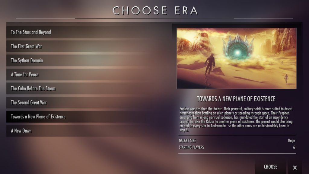
Pictured: an interesting *description*

Let’s talk about that campaign narrative a little, because honestly, it’s a feature I see very little of in the old 4X (eXpand, eXplore, eXploit, eXterminate) genre these days, and one involving multiple alien races in a grand tapestry of war, tragedy, and shenanigans? Sign me u-

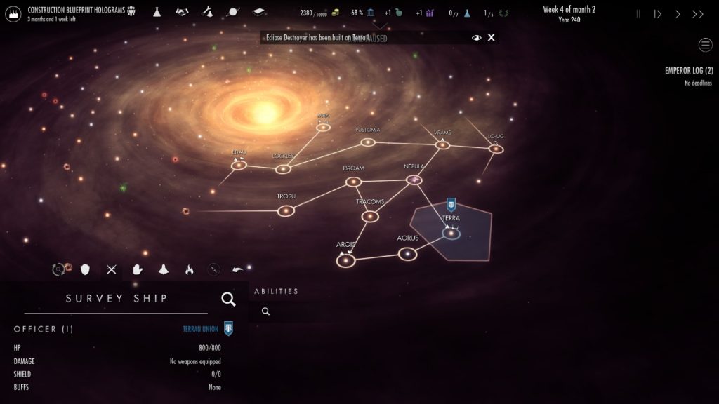
Oh. Oh wait. I can’t find that mercenary I just hired and sent to kill a bounty for my current best friends, the Sython (Who the Terran Empire totally isn’t going to go to a long, expensive war with several times over the next few millennia before somebody else screws it all up.) Wait, I found him again, and… Wait, I lost a survey ship? When did I? Oh, while I was watching this guy half a galaxy away. Meanwhile, I’m debating which of the more far flung colony worlds I should try expanding to, in the hope I can actually defend them.

Space is not only big, but also rather sparse. This is something I’m not actually that fond of being reminded of in space opera games, for some reason.

What I’m getting at here, folks, is that Dawn of Andromeda is not the friendliest of games. There are three game speeds (not counting pause), and while they’re marked “Slow”, “Normal”, and “Fast”, I have different names for them: “Can actually see a fight happening”, “Can watch bars slowly tick up”, and “The speed I go at while I’m waiting for things to happen.” Pause is pretty much my default state while I try to work out what the hell is going on with my scouts and survey ships and, in one particular case, watching a bounty slowly, but surely, escape the guy I’d just hired to take it.

Meanwhile, there’s a lot to take in, adding to the “A lot of the time you will be paused.” Understanding an alien race enough to talk to them is a research project, taking time away from your research. Adding to a world’s power requires an infrastructure investment, which will cost you some money a turn until it’s done. You have an approval rating, which will cause rebellions if it’s low, and goes up and down based on… Factors. Decent living conditions help, as does an assigned councillor who isn’t an asshole. It’s not very colour blind friendly, to the point where, zoomed in to a point where I have two ships chasing each other in my field of view, I can’t actually see the things without straining my eyes (Drag selecting will only select the ship I directly control.)

It tries to help, really it does. It has “Zoom in here” icons in the planet tables, fleet tables, anomaly tables… But the main screen is a mess. The UI isn’t the friendliest. Ships can chase each other for a long time without fights happening, and ships attacking from the front will move toward said fast ship, then tail along behind it, losing it like the other poor bastards chasing it in the first place. Providing you have the foresight (and opportunity) to pull such a maneuver off in the first place.

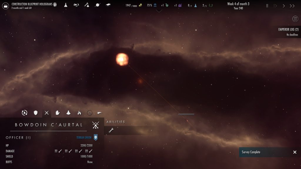
Gripping [YAWN] Space combat. [YAWN] Honest!

I’m sure the game has some interesting things in it. I’m sure it has something, some potential. But I’m finding frustration in even the easiest of scenarios (Where I am informed, and tentatively agree, that even finding the alien worlds may well eat up the whole 2 years allotted for “survival”), boredom from the sparse universe, and quickly realising that it amounts to “Build lots of ships, point them at whatever enemy while holding your own worlds safe”, despite its other trappings. As I am occasionally forced to say, the game resists being played.

The Mad Welshman accepts that Space is big. But surely it’s more interesting than this?

Become a Patron!

Hover: Revolt of Gamers (Review)

Source: Review Copy
Price: £14.99 (Soundtrack £4.99)
Where To Get It: Steam, Humble Store, Itch.IO

“I don’t get it”, I said as I stared at the screenshots. “What does this have to do with gaming, per se? It looks like it’s inspired by Jet Set Radio Future, but doesn’t have any visible rollerblades or anything.” HOVER: Revolt of Gamers is, it must be said, a game with a somewhat confusing title. And it doesn’t help that there’s a fair amount you have to do before anything more is mentioned beyond “The Great Admin have banned fun” , which, also, seems like a very silly thing to try and ban. I have fun walking, for example, and singing, and, of course, there are many co-operative activities that are fun, at least some of which fall under the umbrella of “Necessary Procreation.”
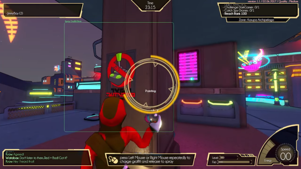
Yes, this most certainly looks like fun. I am feeling the rebellion.

“Jamie, stop worrying about the damn story. It’s not important! I want to know how it plays!”

Oh. Not so hot. I mean, the basics work alright, but when those basics get into the wild, it gets a little frustrating. The controls are, for the most part, pretty simple, even if non-french folk might want to be warned to check the control options, otherwise they’re using ZQSD for walking (AZERTY Keyboard is the default.) Jumping things are done with space, sneaky slidey grindy things are done with shift, and throwy scanny talky things are done with the left mouse button. Bam. The problem then arises when turning the mouse is how you turn, and A and D (on a UK keyboard, anyway) are more sort of… Tilts.

Air control, and indeed run control, then sort of depend on your mouse sensitivity being high, which doesn’t interact too well with, say, looking around, or if you get motion sick. Then again, the way the player created protagonists bounce around, I probably couldn’t recommend this to anyone with motion sickness anyway, especially with all the boost pads and bounce pads and grabbing onto things that maybe should not be grabbed onto. One example I noted while playing in the first area was clothes lines. Okay, I can sort of see you grinding on clothes lines… Sort of… But they are, last I checked, not reliable mantling points, per se. So in a sense, they get in the way of a clean line, which is, of course, the best way to do any sort of mission involving speed. Which many of the missions are, and indeed, keeping your speed high is the only way to destroy holosigns, which is a thing you have to do.
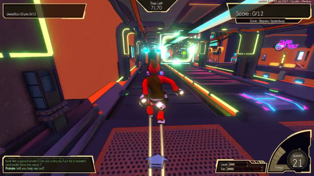
A pet. On a magrail. That I’m meant to take for a walk. On the magrail. Guess who missed the pet, then had to retry the mission three or four times?

It doesn’t exactly help that the cluttered landscape of the hub, combined with a somewhat odd UX design, means you don’t always know where you’re going or what the hell you’re doing. I’ve failed delivery and Fuzz-running missions (Themselves a bit silly, because at least one involves giving someone’s pet a good walkies… On a magnetic tramway) simply because I didn’t notice where the damn item to pick up was due to the confusion. There’s a lot of bright colours, and they often conflict, so poor colourblind me was often acutely lost, even with the Crazy Taxi style arrow that tells you whether something you need to do is in front of, behind, to one side, or up or down, and takes its context from whatever you seem to be doing at the present time (be that capturing spy drones that just seem to be minding their own business, graffiti spraying over the seemingly rare Admin Propaganda posters, or some other things), or racing. This lack of clarity sometimes extends to missions, as friends and I had an interesting time trying to work out what the criteria for the “Do 20 tricks in under a minute and a half” mission was. It seems to be trick combos of more than 75 points, so I filled it out by jumping in different directions, bouncing off the ground with my neon moon boots, and holding the trick key in combination with various directions to pull off tricks, ala Tony Hawks or any other tricking game I’ve encountered.

That tricking mission ranked me up by 5, the highest I’d seen. Shame I had to hit 100 ranks total to get more story, and in less than an hour, I’d started to have trouble finding things to do that weren’t fuzz missions… At least some of which have gruelling time standards, as do most of the requirements for the medals. “8 seconds for gold on mantling several rooftops to deliver a ball” sounds easy until you realise each mantle’s about a second, and each throw’s about a second, so it’s basically “Don’t fuck up at all.” My first, blind time was 19s. No, there isn’t adjustable difficulty, why would you want adjustable difficulty? Don’t answer that, we both probably know if the question even has to be asked.
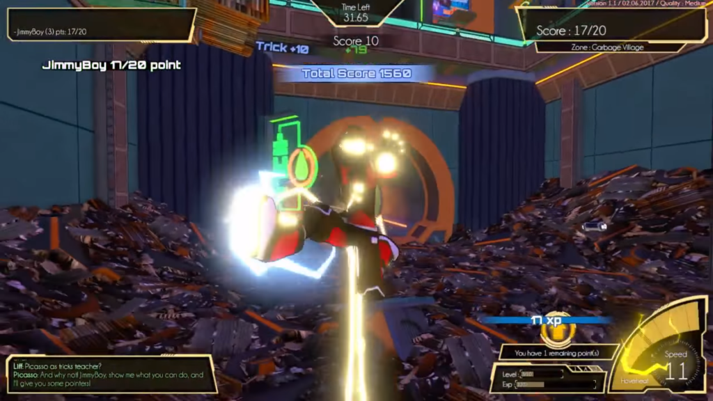
Tricking in trash… I’m sure there’s a metaphor in there somewhere. *Shrugs*

That isn’t to say that there isn’t good in the game, for, while the hub is extremely cluttered, I can’t really say it’s not pretty or aesthetically consistent. It is, in an anime-cyberpunk sort of way, and the character designs, similarly, are mostly kinda cool. The music is definitely a strong point, as Hideki Nakagama (yes, JSRF composer Hideki Nakagama) and Cédric Menendez bring some damn find beats. But the problem is that this is just two parts. The UX is cluttered, at least some of the missions amount to “Do it perfectly or fail”, even in the first part of the story, the missions lack variety, and the story is… Well, silly even for a videogame.

The Mad Welshman no Great Admin, out to ban fun (At least partly because such a thing would be extremely hard to enforce), but he sadly can’t recommend this game.

Become a Patron!

Syberia 3 (Review)

Source: Review Copy
Price: £29.99 (£39.99 deluxe, £9.99 deluxe upgrade)
Where To Get It: Steam, Humble Store

The Syberia series has always been interesting to me, with a charming alternate world, interesting art direction, and some haunting melodies. You may think this is a prelude to a positive review. Alas, it is mainly an informative review, because Syberia 3 is an example of how certain design choices should, perhaps, stay in the past.

Giant furry ostriches, somehow not knowing where their own ancestral mating ground is. Still charming as heck.

Syberia 3 is the continuing story of Kate Walker, a lawyer turned adventurer, and currently the White Saviour of the Youkol tribe, whose migrations are being disrupted by racists in the town of Valsembor. As such, it’s a bit of a mixed bag, writing wise, as the Youkols are very interesting, and the focus of the story is meant (As in the previous two games) to be on natural conservation, but, in adventure game fashion, they are oddly helpless. As, as it turns out, is Kate Walker, at the mercy of the adventure game protagonist’s natural enemy: Awkwardly placed objects.

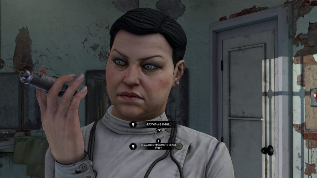
While there is no fail state for the game as far as I am aware (So no Sierra style deathtraps, or Dead Man Walking scenarios), there are puzzles that rely on finding things that are hard to spot, even with the addition of context sensitive dots that fade into existence when you are close to a thing you can interact with. Some of them, alas, also rely on adventurer kleptomania, and talking to the right individual to change the situation somehow. When the very first main puzzle (A shifty psychiatrist presents Kate with a key that’s meant to set her free, but it’s deliberately damaged… And no, there’s no way to see this beforehand that I know of) involves not only stealing a key from a sleeping patient, but to enter an area that it’s not that clear you can enter, take a mechanical parrot to lure a rather odd owl… It gets a bit nonsensical at times, and as such, you will sometimes find yourself more blundering on the solution than having thought of it.

You, er, don’t want to maybe close the door behind you, Kate?

The control scheme is mouse for interaction, keyboard for walking, although the controller is not only an option, the game recommends it, and it’s not hard to see why. While not actually tank controls, Kate Walker has a bit of a turning circle for a lithe adventurer, and it’s fairly clear that the game’s interface was designed with controller in mind first. This is a shame, as there’s elements to the controls I quite like, such as shifting objects or opening things (occasionally) by moving the mouse, but to page through the inventory for the one thing I can use on an item gets somewhat annoying.

This is a real shame, as the voice acting really isn’t bad, the music is still pretty damn good, and the aesthetics, if they cleared up some problems where consistency of location has overruled both the principle of leading the player’s eye to places they can go or things they can do, and the one where you might want to help colourblind folks see a little clearer. Yes, you can be stylish and still colourblind friendly, folks, there’s certainly enough games I’ve complimented on this in the past to see this.

Pictured: An obviously Not-Good Person.

In any case, while it definitely has some style going for it, the substance is somewhat wonky, and I would only really recommend this either to folks who really want to see where Kate Walker has ended up, or adventure gamers well used to the foibles of the genre.

The Mad Welshman, it should be mentioned, really likes that key at the beginning. It makes next to no sense, but it’s a very pretty key.

Become a Patron!

Drifting Lands (Review)

Source: Cashmoneys
Price: £13.99 (£18.78 with soundtrack)
Where To Get It: Steam

The continued existence of the scrolling shoot-em-up is a minor pleasure to me. There’s just something cathartic about holding down a button, and spaceships blow up. Obviously, there’s more to it than that, but blowing things up is definitely the most relaxing part of the experience. And, spoiled 30 something brat that I am, I sometimes think I want more ways of blowing people than I’ve gotten.

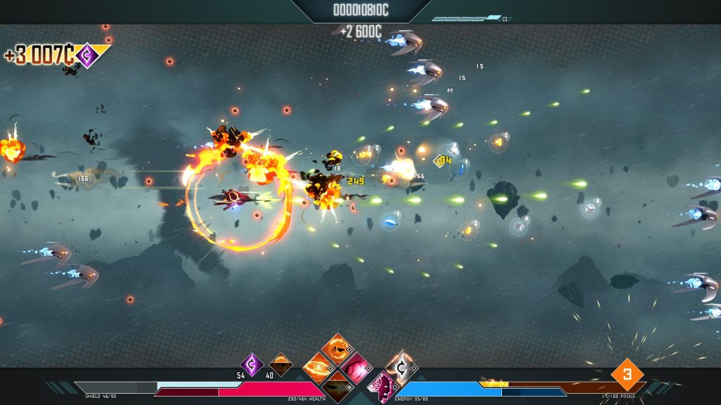
Pictured: A fairly killy, speedy ship, which certainly won’t get into trouble around Grade 3/10 with my fat fingers. Nope, definitely not…

This is definitely not to say that Drifting Lands is a bad game. It’s actually quite good. I just wish there was more to it in some places. So, what’s different about the game? Equipment slots on your ship, each of which have pretty numbers that may help or hinder you. You want most of those numbers to go up as you go along, such as more Damage Per Second on your guns, more Armour, Health, Shield and Health Regeneration, and other such things. And you want certain numbers, such as “Chance for [item] to Break on [Manual/Automatic] Retreat” or “Chance for Cargo to be Lost [even if you win the ‘mission’]” to stay low. It’s a credit to the game that this is nowhere near as intimidating as I perhaps make it sound. It’s not the only different thing about Drifting Lands compared to other shmup type experiences, but that, and the fact that waves of enemies are picked from a list for each level and area randomly, that the game helpfully tells you how many waves are left at the top, and that the difficulty slowly increases as the game goes on with the addition of mechanics like revenge bullets (The ship you shot releases bullets on exploding, usually straight at you), are all interesting features.

There’s quite a bit of variety in the kit, and while I’d like to say “Go for the weapon you like the pattern of, and stick with it”, the game disincentivises that by virtue of the fact that some weapons will always have a lower damage among peers of their respective levels (Shotguns and Lasers, for example, suffer, compared with the Trident and Double Cannon, which, relatively consistently, outdamage them.) Also, y’know, that weapon you want to get the next hotness of might not have your +X Navigation, meaning its Damage is even lower than you’d think.

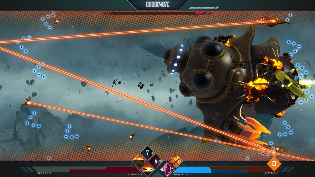
Pictured: Ignonimous defeat.

Still, once you get into the missions, it’s joyously simple again, although it becomes more bullet-hell like as you rank up in grades: Shoot things, use your special abilities to kill more things, dodge bullets, maybe fight a boss or a Convoy Mission (Kill X enemy type before the end), and don’t die. My current favourites, ability wise, are a ring of fire, a back and fore blast that kills things in a straight line, another kind of blast that kills things in a circle around me quicker than the fire ring will, healing, the chance to get more money the bigger the kill streak I can line up, and the thing I’ll probably never ditch, the Automatic Retreat, stopping you from losing your ship if you die, at the cost of the things you picked up during the mission, and maybe some of your niftier equipment.

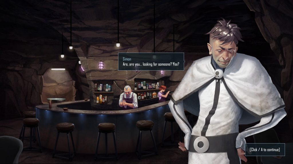
There’s also a story to the game, and while it’s a little cliché (The Ark, sole independent survivors, fight religious zealots, corporations, robots, etc, while their main pilot (that’s you) seem to make poor decisions), it’s fairly well written and characterfully voice acted cliché with a moderately diverse cast. The music’s good, the art is very good, so honestly…

You can almost *see* the slime dripping off this guy. You can definitely *hear* it when he talks.

…If you don’t mind twitch gameplay, where your reflexes will save the day, if you can get along with the fact that your favourite weapon types won’t always be available, if you can get along with the fact that the game’s enemies start throwing serious bullet, laser, and explosive shit at you by Grade 3 out of 10 (And it presumably gets nastier), then this might very well be a game you want to check out, for experimenting with the shmup formula in interesting, if not always fun ways. I still like it, flaws and all, so thumbs up from m-

EEEEEE, DAMN YOU, THIRD BOSS, DAMN YOU AND YOUR WAVES OF FURYYYY!

Become a Patron!