Pacman Championship Edition 2 (Review)

Source: Cashmoneys
Price: £9.99
Where To Get It: Steam

Pacman, it seems, has been refined down to a science. Somewhere, out there, a mathematician is looking at this latest offering from Namco Bandai, and doing complex equations to work out what the absolute maximum possible score is. And most likely, there’s also a competitive player who would beat that score.

If I could give one recommendation to Pacman: Championship Edition 2, it’s that it made me appreciate exactly how much calculation can go into a game. Let’s talk about why.

A simple starting layout: The path is clear.

A simple starting layout: The path is clear.

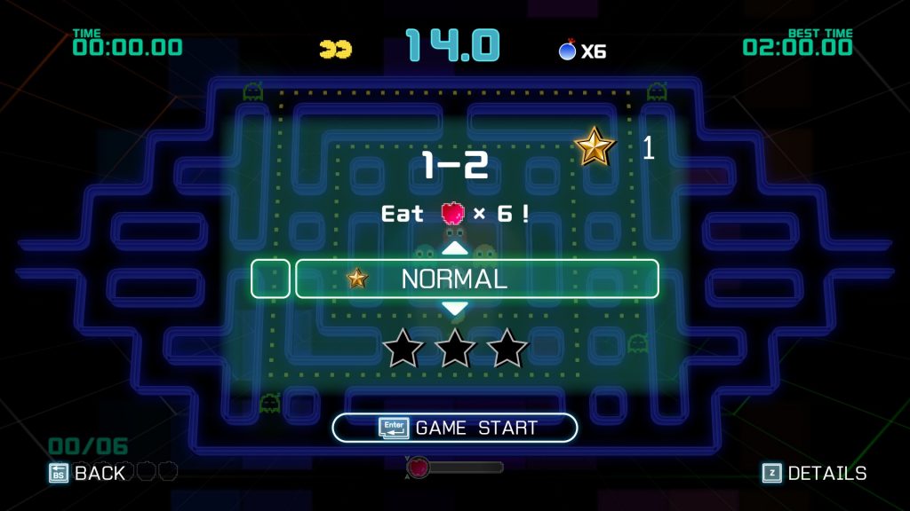
So, let’s start with the simplest layout. Nearly always, it’s something like this. A simple pattern. Following it through to the end, without backtracking, is nice and simple. It takes ten seconds. Each pellet gives you a small amount of points. Collect them all, get a fruit, which is more points, and the next pattern appears. Do that three times, and the fourth is a power pellet. Which lets you eat the ghosts, which bags you loads of points. Another four, and it’s a power pellet every round. So far, so simple.

Now add in a complication: You don’t have to get all the pellets to get the fruit, and thus the next pattern. You can move quicker, get to that endless power pellet stage a little earlier. But you still need more pellets each round, and, toward the end, you need more than you need for a power pellet to get a fruit.

Now add in another one: There are sleeping mini-ghosts. The more you pass close by, the more get added to the train of our old friends, Inky, Blinky, Pinky, and Clyde. They add even more points when you get to the power pellet stage, and long trains appear to give the most points… So pathing to achieve the maximum amount of mini-ghostage is a consideration. But of course, you still have a minimum pellet quota to consider, and you don’t want to be wasting time backtracking without picking up pellets.

Now add in a final base complication: If you know Pac-Man, you’d know that the ghosts run away from you, or try to, when you pick up a power pellet. They, quite sensibly, don’t want to get wakka’d , although it never permanently kills them. But they can only run along certain paths, which are, thankfully, made clear when you get a power pellet. So you have to path to catch the ghosts as quickly as possible.

You will probably never see me play in this style... But I do like to watch replays in it.

You will probably never see me play in this style… But I do like to watch replays in it.

Nine stages, three and a half versions (Single Train, Regular, and Extreme… Practice I guess too. ;P ), and the layout of each doesn’t change. Five minutes, with one time extension at a high score. And some have their own complications, such as jump-pads. But it starts with a simple path to follow, and slowly makes it more complex, makes the game a little bit quicker, until it’s just as much an exercise in reflex as in logic. The aim, of course, being to achieve the highest score in the time allotted.

Pacman, folks, is Newtonian Physics: The Game. And that Championship Edition 2 demonstrates this, this exercise in getting the most efficiency out of a system with predictable rules (The ghosts have set patterns, the pellets have set patterns, even the things that run away from you, such as later power pellets and fruit, follow set patterns… Including stopping when they’re not “threatened” to trick you) in play? Is to its credit.

Of course, I haven’t talked about the other aspects, because, let us not forget, Pacman is also a game with history. Visually, it makes reference to a lot of versions of the game, from the isometric view, lego bricks, and 3d ghosts of Pac-Mania (1987), to the emphasised pixels of cleaner versions, to the simple vector walls and flat ghosts of the originals, several camera angles (Including both isometric projections… Which I’ve always secretly hated), and the feature to either play with any of these visual styles, or, even better to my mind, play with a simple style, then watch an action replay in any of the others. Musically, it’s pumping beats, some remixes of older pacman tunes, but all delightful tunes, and fitting to the game.

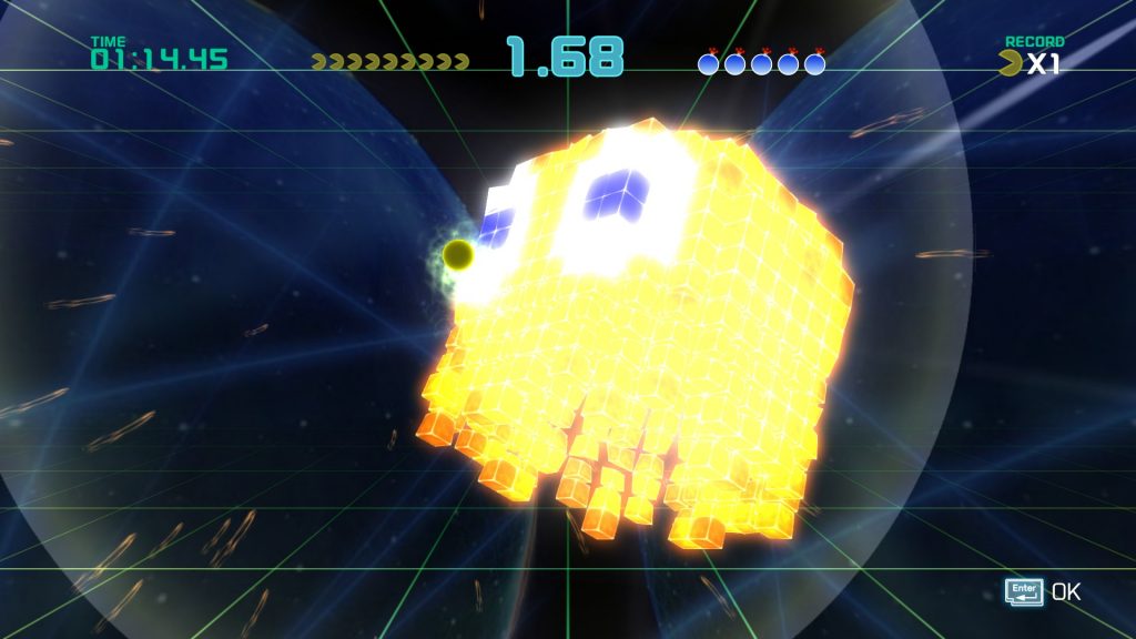
Adventure Mode: Eat Ghosts, Then Eat A Big Ghost Made of Little Ghosts. Just another day...

Adventure Mode: Eat Ghosts, Then Eat A Big Ghost Made of Little Ghosts. Just another day…

Then… There’s Adventure Mode. Unlocked, as most features are in this game, by doing well in Score Attack, adventure mode is basically themed challenges. Generally, that would be “Get X fruit.” Collect it quickly, the timer resets. Take too long, and you just lose. Beat enough of them, and you unlock a boss level. And those aren’t too different from normal play. Soooo… Adventure Mode is sort of the weakest part of the game.

What’s strong, however, is the tutorials section. Pacman is a relatively simple game. However, it does have some nuances, and this game? Kindly walks you through pretty much all of them. Which is a pleasure.

So… Apart from Adventure Mode, the game is tightly designed, visually appealing, and a good example of how yes, you can refine a concept that’s been played. Namco Bandai have been proving that with Pacman for some time, and, with Championship Edition 2, have shown that you can make a game with scientific precision.

While not normally a competitive person, it does feel good to see my name in a top 50. :D

While not normally a competitive person, it does feel good to see my name in a top 50. 😀

The Mad Welshman opened his mouth and popped in a tic-tac. Then another. Then another. Measured. One day, he too would eat a ghost. One day.

Become a Patron!

RedOut (Review)

Source: Cashmoneys
Price: £26.99
Where To Get It: Steam

There’s a fine line between challenging, and dickish design in Future Racing. And it depends upon a lot of factors, including handling, how responsive the controls are in the first place, track design, enemy AI… It’s a long list.

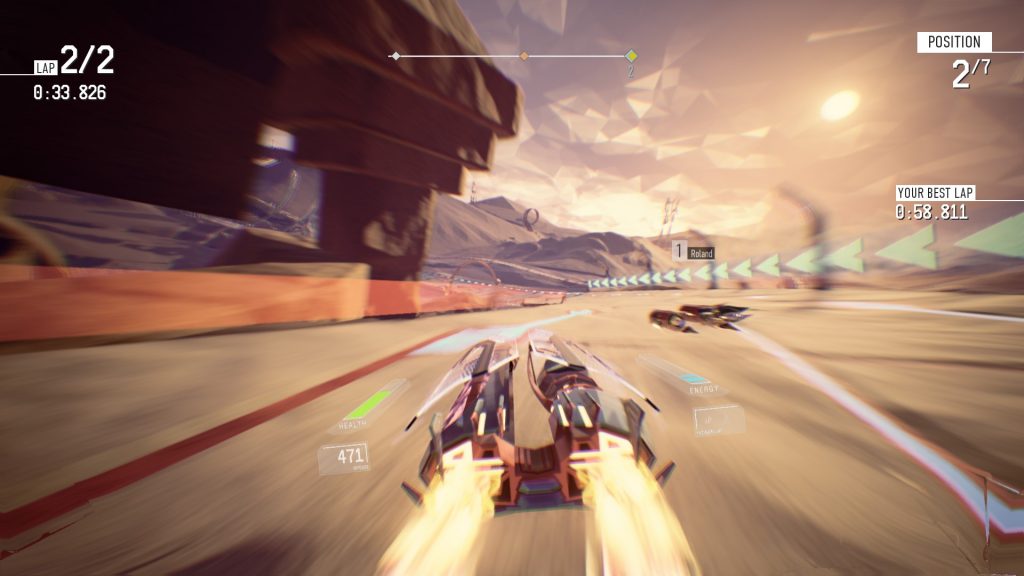
Sometimes, I scare myself. To be perfectly fair, the track helped scare me.

Sometimes, I scare myself. To be perfectly fair, the track helped scare me.

RedOut, I’m happy to say, definitely seems to be hitting the sweet spot for me where I’m earning my Gold medals, but not struggling for them. And good gosh, it feels good. It especially starts to feel good once you’ve got a feel for each vehicle. In fact, as the screenshot above shows, once you truly get a feel for a craft, it can get scary.

So, let’s get the bad out the way first… This is only just Future Racing newbie friendly. And I say that because, once it hits about the middle of the Class 2 events, the gloves really start to come off, and there are some bits of unclear track design. Looking at you, Abruzzo and your Tube of 50% Racer Survival Rate. Overall, though, despite speed filters, EMPs fuzzing up your view, all sorts of effects that serve to both pump up the adrenalin and make racing anything from the middle of Class 2 one long, extended cry of “OHHHHHSHIIIIIIIII-”, it’s fun, the difficulty curve isn’t too bad, and the AI rubberbands just enough that you can beat them with some moderate screwups, but you’re probably never going to lap them, and a major crash is going to set you back at least a couple of places… More usually 5 or 6.

Still, that aside, there is a lot to be said that’s positive about RedOut. The visual design is sumptuous, with high variation in the tracks (From Cairo’s deserts, to Alaska’s ice-floes, to Abruzzo’s forests), the craft (From the Sulha’s almost Pod-Racer like design, to the alien curves of the Asera, to the scrappy Jet-Junkers of Conqueror Technologies), and a UI that doesn’t distract from what you really should be paying attention to, the track. The tracks are, for the most part, highly readable (With the exception of a few tunnels like in Abruzzo), and the sound is equally variable and classy. Sometimes, there’s pumping beats, others, guitar riffs galore, and it’s very clear when someone’s nudged you, you’re scraping a wall, your turbo has fully charged, you’re using your turbo… It’s well planned, and I applaud it. I equally applaud the fact that 34 Big Things have gone for relatively low poly models for the craft, as… Well, it fits!

A good example of the gorgeous landscapes... You will mostly only see when you aren't paying *attention*

A good example of the gorgeous landscapes… You will mostly only see when you aren’t paying *attention*

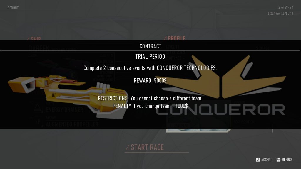
Now, while the game does have multiplayer, alas, it doesn’t seem to be terribly busy, so it’s very much a case of “Host your own when friends are around”, but the Campaign… Does interesting things. You can see it trying to engage you, and get you to experiment. Fly with this ship for two races, it will occasionally say, and we’ll give you money. Win a race with this one, with this loadout, and we’ll give you that powerup. Don’t change craft just yet, because you’ll lose out on the sweet thing. It’s seductive, and, as a method of engagement with a campaign that’s basically “Earn money, unlock ships and things”, it works… I keep accepting the contracts, because hey, a little extra never hurt, free powerups when unlocking them normally costs 4 grand never hurt, and all I have to do is… Try a different style of racing.

Because yes, each racer has a different style. The Asera is twitchy, turning rapidly, accelerating quickly, but relying more on its mobility than its top speed… Or even shields. The Sulha craft, by comparison, are also not very well shielded, but are decidedly drifty, and extremely fast. That first screenshot was a Class III Sulha with its speed boosted as far as I humanly could. I exploded an average of once a lap… And still beat Gold time. Because when I used full boost on a long straight… It wasn’t a long straight anymore, it was a brief prelude to another corner. Not even recharging shields would have saved me for long, because the shields recharge when you’re not hitting things.

It's surprisingly hard to get a good screenshot, because it isn't screwing around, motion wise...

It’s surprisingly hard to get a good screenshot, because it isn’t screwing around, motion wise…

As such, I have yet to truly win an Arena match (A race, but you don’t get respawns, so when you explode or miss the track? Game over, baby!) with a Sulha racer. Speaking of, events also have a fair bit of variety, with Races of various types (No Powerups, normal Race, Last Man Standing, and Arena), Time Trials and Speed Trials, Score Survivals, and… “Boss” Races. No, not as in “There is a boss racer, like in Quantum Rush Champions or Wipeout Fusion”, as in “Hey, did you know these tracks in an area are actually linked? Now race the whole thing.”

It is very rare that I’m enthusiastically for a game, much less in the Future Racing genre, which is very much my bailiwick… But RedOut is well crafted, well balanced, with a good difficulty curve, only one or two tracks I actively dislike (34 Big Things, please make Tubes more clear… Thank you), and design that shows some real love and attention.

G'wan, give us a goooo.... Try us outtt!

G’wan, give us a goooo…. Try us outtt!

The Mad Welshman smiled as he ran his hands over his new Koeniggswerth Yggdrasil. Then he grinned as his mechanics started hauling in the improved turbines. Ohhh yes. This was going to be good.

Become a Patron!

Clockwork Empires (Early Access Review)

Source: Early Access Purchase
Price: £22.99
Where To Get It: Steam, Official Page
Version: Beta 54.
Other Reviews: Release

I love me some Lovecraftian fiction. Yes, he was racist as hell, and a lot of his horror stories were based on that, but they’re enjoyable nonetheless. Similarly, I love me some fictional jingoism. Real life jingoism? Sucks. I mean, you only have to turn on the news to see sabers being rattled to see that. Finally, I love me some Steampunk, despite the fact that, often, it’s classist as hell. You rarely see the working man in such settings, only the rich idle going on adventures. But it’s an interesting aesthetic done right.

As such, your first instinct, considering Clockwork Empires contains all three, would be to say that I like this game. Eeeeeehhhhh…. Sort of. It’s like a banana-curry-chocolate cake, in that it contains things I like, but the whole? Not so much. Let’s start with the fact it’s somewhat unfriendly to new players.

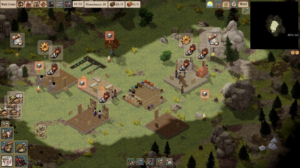
There's a lot going on here. Not a lot of it is explained well.

There’s a lot going on here. Not a lot of it is explained well.

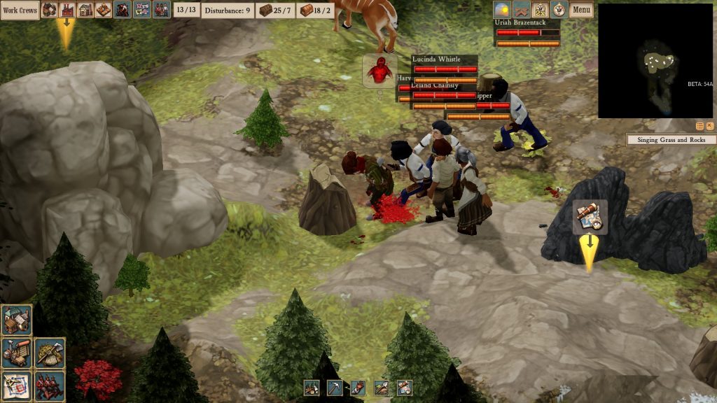
Now, yes, before you say anything, it’s a survival strategy game, those tend not to hold your hand, but while the tutorial does indeed teach well (This is your early game order, etc, etc), the UI… Needs work. For example, you may wonder, if you play the game, how to stop seeing a farm’s statbox. Farms are, apparently, offices… So it’s the office button next to “Work Crews.” Some things work just by mousing over, such as the population and food button, others stay up until you left click the “Cancel” button that appears at the top, and there don’t appear to be keybindings in the Beta of Clockwork Empires.

Basically, it’s busy, it’s not very well explained, and as such, it makes a game in a genre that’s already quite slow even slower with all the pausing I’m doing. On the upside, the people are fairly readable. If they’re clomping around, they’re particularly annoyed. If they’re doin’ the Strut, they’re happy, if their heads and arms are down, they’re sad, and if their arms are waving and they’re on fire, something has probably gone wrong. Y’know, as it often does in such games. Of course, all that stops when they actually start a job, which is a shame… But at least you have some warning.

Visually, it’s much like the UI: Busy, lovely to look at in places, but not overly readable as a result. This, by the way, is nothing to do with the colourblind function (Which is a nice touch), but just the sheer amount of things and textures on view, and how a fair amount of it actually is useless. Add in the houses and workshops, and the fact that you can’t click on colonists “behind” them even if you have the walls off, and you start to have problems. Happily though, the music is fairly calming, and helps lower the irritation factor. Somewhat.

"We need Graveyard Space [But we decided to stop flattening terrain because we're workshoppers now...]"

“We need Graveyard Space [But we decided to stop flattening terrain because we’re workshoppers now…]”

In any case, as you might have guessed, the game is all about tough choices. Day 4 of my colony saw a bandit group incoming, and I was several days away from a Barracks for soldiery. I was a few weeks away from giving them decent weaponry. So I decided to let them raid a little. In other games, I made friends with fishmen (Which is bound not to go sour when home finds out, eh?), discovered an ancient idol, and had a meteor from the moon disgorge… Something. Which thankfully, was beaten off by a warlike Overseer with a stick.

Of course, being a complex game in Early Access, bugs are bound to happen. One to watch out for currently is the infinite workshop job bug, where having more than one workstation in your workshop with the same job can mean that one job correctly registers the job being done, while the other… Doesn’t. In the case of “Minimum X of items”, this can mean you’re building planks forever and ever, whether you need them or not.

I feel kind of sad, actually, because there’s a lot of interesting events, and yet… Bureaucratic bumf and a flawed system bar me from getting to those interesting things. For example, I currently have a bandit corpse lying in my kitchen (Most unsanitary, I think you’ll agree), and yet… I can’t build a graveyard because it has a set space requirement, and nobody seems to want to flatten the terrain. Being a pastiche of Victorian Brits, the workers take a break at tea-time, do not burn the candle at both ends, and, once assigned a job, seem to pursue it with a single mindedness that bars common sense. And, of course, when it rains, it pours, as a day later (Corpse still there, ground un-flattened), the grass and rocks start singing eerily, which may have nasty effects if I don’t clear the ground nearby (A different job in and of itself.) This, basically, is to do with the Overseer system. Rather than have jobs be individually between workers, there are Overseers (Who pick what job there is) and Labourers (Who are assigned to Overseers.)

Bandits and Selenians. The only time I've ever seen a colonist attack something rather than gesture angrily at it.

Bandits and Selenians. The only time I’ve ever seen a colonist attack something rather than gesture angrily at it.

It’s a very management heavy game, even for a strategy survival game, and, honestly? It’s leaving a bit of a sour taste in my mouth, as everything appears to be going wrong. A little late, I realise… Oh, yes, becoming a Workshop Overseer disables all other jobs. A rhythmic “Whud… Whud… Whud…” floats across the colony, mixing with the sound of flies buzzing around a corpse, and the eerie singing of rocks and grass. It’s the morning of Day 8.

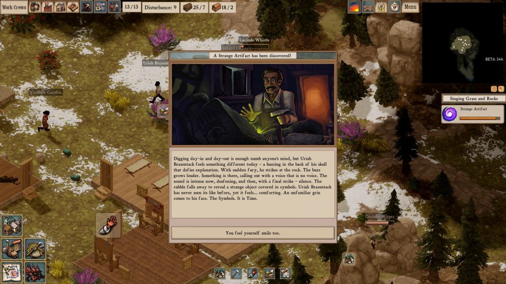
In the afternoon, a bandit raid occurs. In the evening, a grimoire is uncovered while trying to make room for the graveyard. Ohhhh boy…

Right now, Clockwork Empires, sadly, feels clunky, unintuitive, and unfriendly rather than challenging. Which is a shame, because I’d like to see more of these strange events and cool things, but the game itself seems to be resisting any pace above plodding with some very hard limits on what can be done, and a lack of useful explanation for many of its systems and trees. It doesn’t help that some systems appear to have more than one “method”, and it’s unclear which works (Is hunting via the Naturalists’ Office, or via the Hunting labour? And are we not able to hunt before we achieve some sort of iron ranged weapon and the ammunition at all? I wasn’t able to find a clear answer.)

Cue nothing happening as a result of this. No, really, it's still there, in the graveyard, an in-game fortnight later.

Cue nothing happening as a result of this. No, really, it’s still there, in the graveyard, an in-game fortnight later.

The Mad Welshman sighed, understanding why the jolly old bureaucrat at the Foreign Office was so delighted to send him on this job. He whiled away his time thinking of synonyms for “Feckless”, “Moaning”, and “Children of Low Breeding” these days…

Become a Patron!

Joana’s Life (Review)

Source: Cashmoneys
Price: £4.99
Where To (Not) Get It: Steam

Horror protagonists can sometimes be the worst. But they’re not really to be blamed, when we put them in silly situations. In the world of horror, perfectly ordinary things can be filled with unseen menace. Mirrors, thankfully, are a pretty common one. A gateway to other places, usually where things are just slightly off.

It’s unfortunate then, that the design of Joana’s Life is more than “just slightly off.” In fact, its offputting. Because it has an interesting idea, but it’s not allowed to run free because… Well, let’s talk about the first ten minutes, shall we?

Oh no, it's... A Bathtub. How Spoopy.

Oh no, it’s… A Bathtub. How Spoopy.

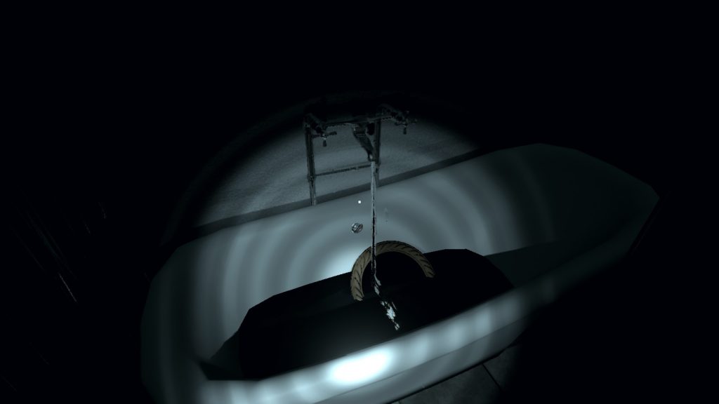
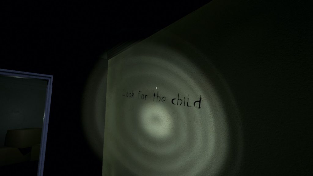
I’m a man of indeterminate age who’s moving (In? Out? We don’t seem to know), and I cannot pick my front door keys up. Not, at least, until I’ve gone downstairs, at which point someone rings a doorbell, leaves just before I can see the front door, and leaves the broken mirror that’s going to be the focus of things. A broken mirror we throw away. No, we’re not given a choice here, just as we aren’t with the front door keys (And I know the first thing I do when waking up is make sure I have my keys with me!) or the fact that, when we go upstairs to get our keys, we need to answer a phone and oh noes, the lights went out and the bathtub (Which our phone was near because…?) suddenly has water running over that mirror, and there’s writing on the wall, and…

…Look, long story short, there is one path through this beginning segment, you’re not told anything about it, and it can only be done in a specific order. Also, the creepypasta moments are mandatory. And without context. No, there’s no real guidance. No, it’s not telling you why you can’t pick up the keys yet. In fact, all it does is let you look at them until you’ve grabbed and thrown away the mirror. Which, as a core gameplay mechanic, comes back like the proverbial bad penny. At which point, I had to find a video walkthrough, because it’s that unclear what the hell you’re meant to do with this mirror, or indeed anything, to progress.

Pictured: An entire block, in the first of its three flavours, in which you will hunt for the thing you actually need to see.

Pictured: An entire block, in the first of its three flavours, in which you will hunt for the thing you actually need to see.

Needless to say, there is also a creepy possibly male figure that threatens you and you faint in the first ten minutes. Day and night change with seemingly no rhyme or reason. So does location.

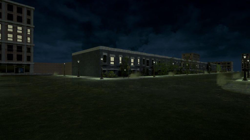
So… Let’s talk about guidance, and flow, and direction… And how the lack of it makes Joana’s Life… Not so good. I had to look for a video walkthrough in the first ten minutes. Turns out, to progress the story, I had to look out of a window on the ground floor, to the top left, and wait until small girl ghost blinked away, and my front door inexplicably opened. Then, of course, I had to go to said house… From the front, in what appears to be an entire block. In what, after checking, is an entire block, strangely walled off from the rest of the world. And it’s the only door that’ll open at that point that isn’t your house (Largely pointless now) in the entire block.

Cue the only real document in the game (A newspaper article written in bad english), and the collectathon that forms the majority of the game. Narrative? Nope. There’s some smoke monster, a little girl who is creepy yet helpful, and the only thematic linkings are that mirror textures appear when you enter a world, and broken mirror people constantly try and kill you while creepy ghost girl occasionally helps you find one of the eight total items you need to… Er… Be slowly guided to a basement where a fire happens around spoopy untextured guy, and you choose to run or stay.

That’s right, I just spoiled the whole damn game. All 25 decidedly unscary and frustrating minutes of it (Plus the hour of occasional retries, wondering what the hell “Explore the house” actually means or where the heck you’re meant to go next.) It doesn’t work as a haunted house experience because there’s no guidance. It doesn’t work as a horror game because creepy noises and monsters thrown together with no explanation or coherency isn’t scary, just cheap. It doesn’t work as a horror story because there’s no thought to a single, cohesive narrative. Heck, even the title’s somewhat misleading, as we know nothing of Joana (Spoopy girl) or her life.

The entire point of the game. No, you do not get to know about Joana. No, she has no "Life." Nor does the nameless protagonist.

The entire point of the game. No, you do not get to know about Joana. No, she has no “Life.” Nor does the nameless protagonist.

Want to learn why guidance in horror is important, or why not having your horror game just be a series of only loosely connected incidents is a good idea? Yup, prime candidate. Want to spend £5 on being confused for however long it takes you to work out what the heck you’re meant to do, or is going on? Prime candidate. Want a good horror game? Go elsewhere.

The Mad Welshman has screenshotted precisely all of the spoopy monsters in this game that actually spooped him. This, in and of itself, is somewhat damning.

Become a Patron!

On Games Journalism: Why Even Review A Bad Game?

So you might get the feeling, sometimes, that games reviewing is all about hyping up games. I certainly do, whenever I see some poor developer selected for the Hype Train (Making all stops to Consumerist Oblivion! Thanks to Katherine Cross for that one. ;D )

However, there are several reasons to review a game you either don’t know about, or have a distinct feeling, beforehand, is going to be bad. By the title, we are, obviously, concentrating on games that make you sigh gustily once you’ve realised what you’re in for.

Improving Your Craft

Yes, you can tell what’s good about a game. But all of a sudden, you’re having difficulty, because… You’re not enjoying whatever’s on your review docket, but you don’t know why. Sometimes, this is because you’re writing while depressed, or angry, or otherwise in less than tiptop critical shape (I’ve written about this before, when talking about the process of reviewing.) Other times, it’s because a game has something off about it, and you haven’t trained yourself to see it.

Sometimes, a game is bad because of something obvious, like conflicting art styles, bad UI, or a difficulty cliff that somehow manages to wing Icarus as it shoots on by. Sometimes, however, it’s more subtle. The pacing is off on the story (Something I now keep a hawk’s eye on.) A core mechanic is conflicting with another core mechanic (Example: If your game emphasises speed and agility, why’s all this armour here?) The sound design is dull (Not outright awful, just ho-hum or boring.) There’s a lot going on in a game, and even if you’re not necessarily going to write about it, it’s good practice to spot it. Repeated vehicles. Plodding game progression in an otherwise quickly paced game. Because, all too often, those little things can pile up to turn something okay… Into something thoroughly unenjoyable.

Also, it makes you appreciate the good more. I appreciate MoO2016 that little bit more because, hot damn, I’ve played some garbage 4X games in the past. And space games. It helps keep you critical, and honest. Similarly, you can never have enough learning. The more you understand of a particular genre, its history, its limitations, its follies and greatnesses, the better you can criticise it. This includes seeing what good there is in a bad game, because this is just as helpful as being able to understand why you’re wanting to play something, anything else.

Improving Their Craft

Two things can safely be assumed with developers, with a third being “Until proven otherwise.” That they are fellow human beings, and should be treated as such (A given.) That they want to make money from their craft (A given.) And finally, that they wish to improve their craft (Until proven otherwise.)

Written well, your critique is helpful. And your critique will get better if you understand why a game isn’t all it could be. Just as importantly, it’s important to know when something is definitely beyond a developer’s reach. Let’s take first person horror games, a genre that seems, at first glance, saturated with cash-in merchants, and treat it as if it were a genuine genre that deserves critique. Because, despite this perception, there are very few genres out there that don’t deserve critique.

Many first person horror games follow one of a few formulae. The two most common ones you see are your “You are alone in a creepy, seemingly endless place, collecting things”, and “You are alone, something strange begins happening, and SUDDENLY HORROR AND INVENTORY PUZZLES.”

Both of those formulae, done well, can be entertaining. No, really, they can! The main problem, though, is that making them entertaining, or even unsettling, requires an understanding of horror, as a genre, and how much it relies on two things: Pacing, and engaging the senses. While engaging the senses can be expensive in terms of sound design, visual design, modelling, and the like, it brings good returns to indie horror devs because nobody is laughing at whatever gribbley or Dark Force they’ve picked. This is a stumbling block surprisingly many folks don’t get… If you’re going to have a monster, take your time with it. It’s the real star of the show.

Pacing, in terms of equipment, is the least expensive of all. And, in terms of time? Research, and taking time to edit your own work. Does it add more assets? Not necessarily. Paranormal, by Matt Cohen, is at least okay despite its flaws and slow dev time, starting relatively normal (A lonely house that people claim is haunted), then building up over time, from things moving when you’re not looking, to being shoved back from some stairs, to fire and death. It’s by no means a great game, but it understands that you don’t need to show anything immediately. Similarly, Oxenfree, while not a first person horror, starts with utter normality, wrenches you suddenly into weirdness, and then sustains the pace. Of course, it’s very difficult to describe good pacing, because it’s very much an art, not a science. I didn’t think Oxenfree could keep creeping me out… But it does, and at least part of that is the moments of relative normality. That’s right, sometimes dialling it back, even for a short while, can benefit your horror game. Who’d have thought it, huh? If I wanted to use a first person example, look no further than The Vanishing of Ethan Carter. The pacing is pretty damn good most of the way through on that one, and it engages the senses wonderfully.

Meanwhile, I took a break from playing Joana’s Life about five or ten minutes in, firstly because the monster gets revealed, just a few minutes after oh noes creepy small child laugh from nowhere and oh noes the lights have gone out… So, pretty damn predictable, and I was pretty much waiting for something truly scary at that point (Needless to say, I wasn’t terribly impressed at that point) , but secondly, because the game had items that I knew I would need (Front door keys that inexplicably won’t work the first time round. A flashlight because yes, the power’s going to go out, of course it will. Little things) , and then kept too tight a rein on its story by not letting me deal with these things until I’d touched the broken mirror that kickstarts all the horror and please, can I play a protagonist that’s not a bloody fool who’s going to do the obviously bad thing? While lack of control over the situation is a common theme in horror, lack of control in a game is something to be handled carefully, lest you irritate the player unduly.

Understanding what makes something badly designed can help a developer who hasn’t learned these things that yes, this is where they might do better. Everything mentioned here is potentially helpful to someone who wants to make an indie horror game.

There Are, Obviously, Limits

This does need to be said. Sometimes, a developer really is a shovelware merchant, cynically trying to cash in on some internet meme, or monetisation method. And many of them use exactly the same methods, much like the fifty or so spam emails I have about Search Engine Optimisation and Brand Marketing in my inboxes today. Thankfully, much like those spam emails, many of these are obvious, and you don’t need a whole lot of critical training to spot one from its video footage. Do yourself a favour, and limit your exposure to these. Examine them a few times, by all means. But once you’ve spotted the tricks of the trade (Asset Flipping, largely empty worlds, obvious signs of bad world modelling, and the like), stop. You’re only going to make yourself angry and depressed.

Similarly, if you find yourself getting angry and depressed about a game with a good idea, but some godawful or tedious execution, stop. Take a break. This is the point at which you have understood that the game is bad, and it’s time to think about why. Don’t go back until you’re calm again, don’t go back once you’ve understood, don’t go back unless you want to examine things further. Yes, you’re learning, but pace yourself. Learn what you can, then move on. Yes, if you’re reading this, you’re interested in games writing, which involves a lot more reviewing bad things than you’d at first think. But you’re not going to be writing well from a place of ennui and frustration.

Improving your critique is no different from improving any other art form. Knowing where the mistakes lie is useful. So please don’t disregard them. But also, please don’t disregard your health. Hope this helps prospective writers some.


Become a Patron!