Gremlins, Inc (Early Access Review)

Source: Cashmoneys
Price: £10.99
Where To Get It: Steam
Other Reviews: Release

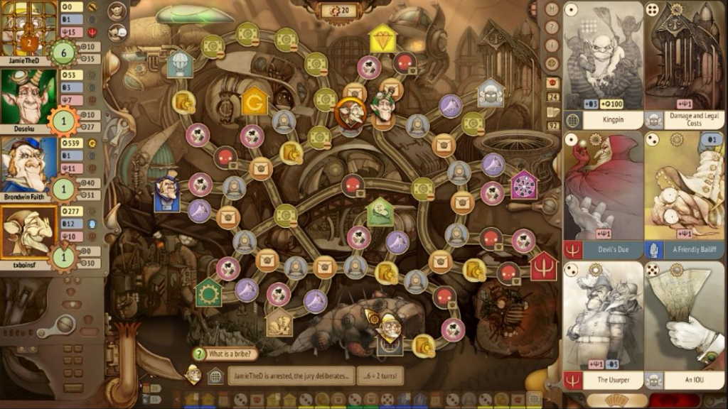
Capitalism sucks. There’s really no easy way around it. It’s biased, it’s unfair, and it promotes shitty attitudes that make everyone’s life a misery. Which is, in its way, a good segue into talking about Gremlins Inc, a computer board game about a steampunk capitalist society of Gremlins being dicks to each other. It’s a game that needs a little polish, a little toning down of the single player AI, and a somewhat more clear tutorial and UI… But it’s also got the same ingredients that give certain well known board games their rep as awesome games that destroy friendships.

A little hard to read parts of the UI at times, but the art style is *gorgeous*

A little hard to read parts of the UI at times, but the art style is *gorgeous*

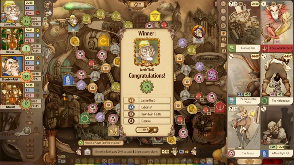
Ruleswise, there’s a lot to go into, so I’m just going to sum it up: You have to achieve X victory points (With 20 being average), while stopping anyone else from doing the same, and you do it by moving around a board (using cards), and playing events when you’re able to (using the same cards). Sometimes bad things happen to you, and there doesn’t appear to be any single “OP Strat”, as it were, because everything is out to get you, including large portions of the board. It’s a little more complicated than that, and the tutorial doesn’t cover everything (Like the existence of a collective pool of “EEEEVIL” cards, as a prime example I wish I’d known about), but it’s effectively in a very solid beta (Meaning there are bugs, but not as many as a release would have, and nothing that appears game breaking), and board game afficianados would definitely enjoy it. Why?

Let’s start with how it encourages a wide spectrum of good, strategic thinking. I have three cards. One can be used relatively nearby, but I can’t afford it. Yet. One can be used right across the board, and one can be used back the way I’d already come. All of these options are technically viable, but to play any of them well, I have to think. The first option just requires both time and not being dicked over. It’s do-able, but requires me to either not be seen as a threat, or to pre-empt the threat from whichever player I think is going to threaten me. The risk there is that I’m either wrong about which player is the threat, or don’t keep a low enough profile. There are shortcuts I could use, but they have a chance of screwing me over just by taking them, especially on the shortcut through the middle of the map. I have to be adaptable. I have to play the players as well as the game. I have to risk assess. And I have to be lucky.

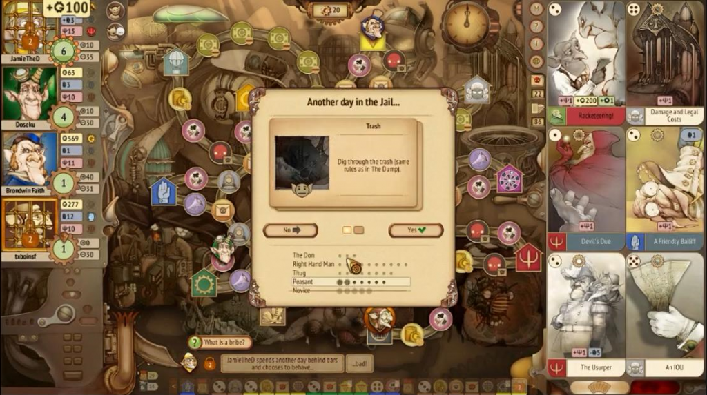
Even Jail can be used to win the game, if you're clever about it...

Even Jail can be used to win the game, if you’re clever about it…

This turn, I am not lucky. “Who rolls a 1?” I ask jokingly, as I refuse to bribe my local policeman so as to stop any searches without risk. After all, if I do that, another player gets to profit off my loss. And I roll a 1, immediately being sent to jail, and watching one of those options evaporate. But that’s okay. Even jail can be used to better my circumstances. In the long term.

Secret and Criminal cards. Evil cards. Elections. Bribes and Searches, and the role of the buildings… The game has somewhat of a learning curve problem, which means the tutorial has to be spot on (And currently, doesn’t show off everything you might need to know). A good system of tooltips somewhat helps, but new players will want to invest time in the single player to get a feel for things, and those of us who can’t invest an hour or so into a game? Probably shouldn’t get this, as a 20 point game might take as long as 4 hours, and the first single player challenge is 30 points to victory.

Similarly, the aesthetic is both a good and a bad point with this game. I love the art style, having always been a sucker for some good ink and pencil work… But the UI suffers in readability because some of the parts of it are small and relatively unhelpful (The turn log, for example), and the board looks busy because light value contrast isn’t as clear as it could be (Although, again, the tooltips help somewhat with “Where can I go?” and “What does this do?”) The music is pretty good, just the right, farcical feel for a farcical fantasy dystopia.

I am a moustache twirler. This is a moustache twirler's game. QED. :V

I am a moustache twirler. This is a moustache twirler’s game. QED. :V

However, when all’s said and done, I look at this game, think “This cost me as much as Dr. Lucky did, back in the day”, and smile. It’s a fairly well crafted, competitive game, and the devs know exactly what they have on their hands, with a tournament already having been started in the Early Access phase. If you want a competitive, multiplayer computer board-game, and have the time to spare, I really don’t think you could go wrong with Gremlins Inc. I would, however, mention one final thing in regards to the multiplayer… Er… How do you make a game friends-only again? Wasn’t a problem right now, but best to nip it in the bud if that hasn’t been thought of. I had a lot of fun with this, and expect to have more fun in the future.

The Mad Welshman cackled with glee as he dipped freely into the Widows and Orphans Fund for Disenfranchised Gremlins. Campaign Contributions, it seems, were always there if you knew how…

Become a Patron!

Cosplay Maker (Review)

Source: Cashmoneys
Price: £10.99
Where To Get It: Steam

I’m genuinely conflicted about this one. Mainly because I can’t understand why it looks the way it does. This isn’t Melissa Royall’s first art gig, nor is it Richard Perrin’s first outing. Both of them made Journal, and Richard Perrin helped make The White Chamber and Kairo. And yet… I’m faced with an art style that wouldn’t look out of place in one of those low effort “Girl Games” (The quote marks are there for a reason), and UI placement weirdness that I’d expect from worse games than this.

The opening is highly artistic, and seems inspired by games like Persona, but the game itself...

The opening is highly artistic, and seems inspired by games like Persona, but the game itself…

Make no mistake, it isn’t a bad game, per se… But it definitely makes some strange decisions. Like adding quicker week timers as a thing you buy in game (No, it’s not using microtransactions), or an unlockable “comedy ending” to the game’s story, which is about harassment in cosplay… Admittedly, it’s hard to unlock, and considering the non-sequitur that was the “Comedy ending” in The White Chamber, I’m not really sure I want to bother.

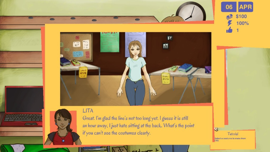
So, er… The game, yes. It’s essentially a life sim, like Princess Maker or Academagia, where you want to become the very best cosplayer there is, so you can be flown to Japan for the International Cosplay Championship and be feted as being awesome. You plan your… Wait, more odd decisions. The week’s divided into weekdays (All of them), weeknights (All of them), and weekends? But what if I finish a costume early, do I…? Yes. Yes I do waste the rest of the week. And I’m not entirely sure researching to raise skills works. Or if it does, how it works. The game isn’t very communicative, even for a life sim. Finally, considering actual events happen pretty slowly, as opposed to the normal kind of “While you’re doing this thing, one of your stats was changed by something happening”? I haven’t gotten amazingly far in the story, I certainly haven’t gotten toward relationships, and I’m not entirely sure I want to put in the effort. Because it means watching the protagonist (Who is the worst drawn of the characters, some of whom are moderately well drawn, others… Not so much) stand in a relatively static image, while one of something like four jazzy tunes plays.

...This is our protagonist. Compare the two portraits.. And that pose... o.O

…This is our protagonist. Compare the two portraits.. And that pose… o.O

Okay, they’re good tunes, but hearing them for the hundredth time in a row is starting to get wearing. As are the work images. And the dissatisfaction I’m feeling is really awkward, because I’m pretty sure there’s some happy endings in there, the characters talk about cosplay fairly realistically (Even if the jobs in the work system… Er… Aren’t depicted as anything but gamified “Get money and stress” options that you usually see in life sims), and the intro (Which looks inspired by Persona) shows signs of quality that… Aren’t as obvious when you get to the actual game.

And this makes me very sad, because I want to like this game. I like the idea. I like that it’s trying for social commentary on a scene that definitely has its ups and downs, not to mention a bit of wider social commentary. I like that it apparently has same sex relationships. But I’m struggling uphill against a game that lacks some necessary transparency, has a blank-slate protagonist that creeps me out a little every time I see her vapid stare and odd poses, and whose UI and controls make decisions that constantly make me think “What the hell? How was this not spotted, when it’s that obvious?”

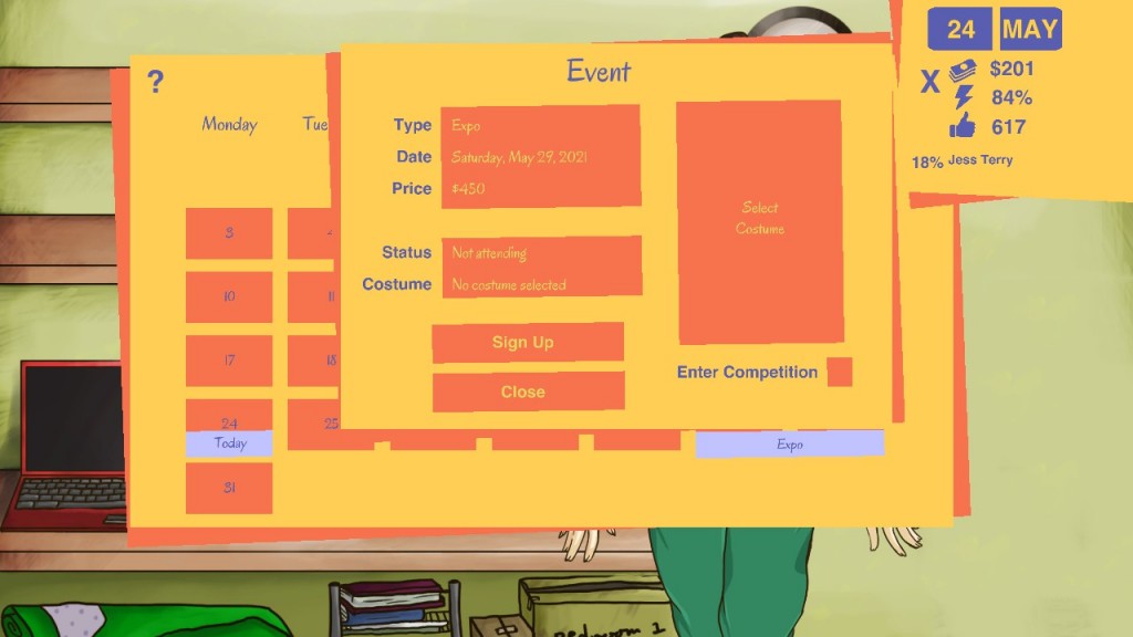
...This is what I mean about the UI. The windows blur into one another, making a hot mess...

…This is what I mean about the UI. The windows blur into one another, making a hot mess…

There’s more content coming, and the game is being updated at a rate of knots right now, but… I’m extremely conflicted about this damn game. It has its pros, but right now, they’re outweighed by strange design decisions, a UI that hurts my eyes if I stare at it too long, and that protag…

The Mad Welshman, eventually, will achieve his dream of cosplaying Elijah Snow from Planetary. But until then, he will wait.

Become a Patron!

Cityconomy: Service For Your City (Review)

Source: Review Copy
Price: £18.99
Where To Get It: Steam

I will say this much about Cityconomy from the get-go… It made me truly understand those robotic spies pretending to be human in Psychonauts. “Greetings, fellow hu-mans. I am a Garbage Collector. Watch as I go on my rounds. Boy, these garbage trolleys sure are heavy.” I never though I would see a game from their viewpoint, but Cityconomy… Cityconomy somewhat takes the cake, in many ways…

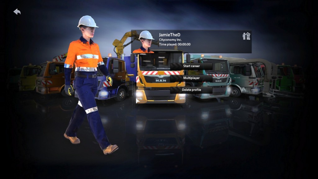
Now, while *this* looks like a no-nonsense professional...

Now, while *this* looks like a no-nonsense professional…

Now, before we begin, let’s say the idea is cool: Service Vehicle Business Simulator 2015, essentially… Drive garbage trucks! Sewage trucks! Tow-Trucks! Hedge Trimmers and those big lawnmowers and street sweepers! Keep Insert European City Here Tidy! But, while the idea is great… The execution is lacking in several ways.

Let’s start with how it runs. Poorly. On my current, quite nifty system. Loading screens flash in and out of existence, the game’s screen blacks out or vanishes entirely when loading, and even when playing, there are moments of frame drop. The city doesn’t look terrible, but every now and again, it will make my GPU make alarming noises. Not a pleasant point.

Equally not a pleasant point is the difference between the genders, and the fact that it is white folk central. You have two choices of white fake human to drive your garbage trucks, and one of them, I would swear, is more fake than the other. I would give props to any women garbage truck workers, but you cannot make me believe that they sashay while walking. I wish I was kidding, but no, the walk cycle for women involves some hella hip movement, and I’m genuinely confused why that needed to be in there. Is there some fetish I’m not aware of?

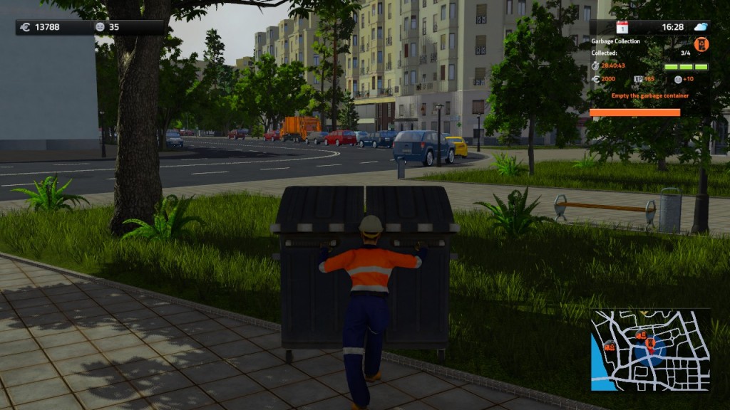
*This* highlights something, er… Well, something. Umm…

It is also, it must be said, a grindy game, and for the first few hours, you’re going to be driving either a garbage truck… or a recycling truck. That’s all you can start with… You have to work up to sewage, my friends, and god forbid you have the cojones to cut grass or tow trucks… Your insolence is astounding, asking to do these things from the beginning! And this would be fine, if any of the vehicles handled well… But they don’t. The poor turning radius, I sort of expected. I know that garbage trucks aren’t exactly known for turning on a dime. What I didn’t expect, however, was the myriad of other problems. I can turn turning signals on… But I can’t seem to turn them off. Accelerating and decelerating involves either lots of waiting, or frustrated waits for the hiss of whatever piston based machinery your engines run on, as a signal you can finally move.

I have to take my delight where I can, sometimes...

I have to take my delight where I can, sometimes…

And then there’s the city, and the soundwork, and the skill tree. All three are somewhat empty. No radio, that I can see. The vehicles sound… Well, very canned. The city is nearly empty, except for the occasional (Mostly White) person walking around, and the myriad of vehicles with barely seen drivers, all of whom have the intelligence to understand a stop signal, but not slightly more subtle things like “If there is a garbage truck in the way of you leaving your turn, do not attempt to leave your intersection, thus parking your arse less than five feet from the garbage truck’s arms” or “There is a garbage truck turning here… It is bigger than you, and has legal right of way. Please do not ram it as it is leaving.” One thing I won’t complain about is the placement of your job requirements… While I obviously can’t be sure it’s intentional, yes, real human beings leave their junk boxes, of various sizes, on awkward street corners and alleys, requiring real garbage folk to stop their trucks in awkward places once a week, and take five to ten minutes wheeling things as safely as possible while being honked at by irate drivers.

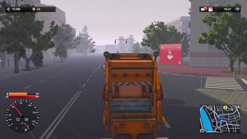
The fog and night effects can... Sometimes be a little odd.

The fog and night effects can… Sometimes be a little odd. Y’know, in the distance…

…There is no irritated honking by the city’s drivers, only yourself… If you really want. The problem is: You don’t. Now, this is by no means the worst simulator. The devs are patching things, but… I honestly don’t have much confidence, considering that it is entirely possible to buy some trucks, hire and “send” workers (By which they mean “The worker sits in the truck and rakes in money from the garage”), and earn millions this way. The multiplayer is limited, the game is poorly optimised, there doesn’t appear to be a windowed mode I can find (Making streaming awkward), and the only thing recommending it is that not many, if any, have tried this specific kind of Sim before. Which, when you get down to it, isn’t really much of a recommendation.

The Mad Welshman must collect the Garbage. That is his function.

Become a Patron!

Nuclear Throne (Release Review)

Source: Early Access Backer
Price: £8.99
Where To Get It: Steam

Vlambeer are very good at shooters. This much was evident when they released Luftrausers, and we’ve been seeing this for some time now with the Early Access progress of Nuclear Throne. Now that the game’s released? I’m feeling kind of childish about skill gates.

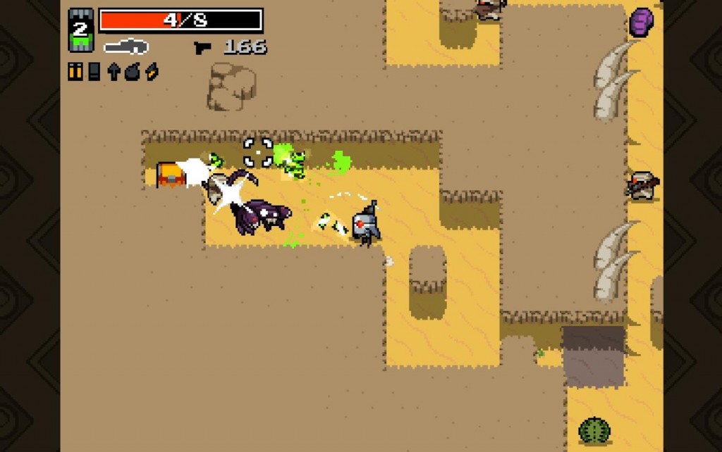
There is a feather and muscle shaped hole in my heart, Vlambeer... But I won't rest until it's filled!

There is a feather and muscle shaped hole in my heart, Vlambeer… But I won’t rest until it’s filled!

See, for most of the game’s long Early Access period, you could unlock most of the characters fairly quickly, which meant someone like me could get everything except the kitchen sink early on, and then enjoy testing characters, and Attachments Were Formed. If you guessed that both of my favourite characters require getting further in the game than I’ve gotten, you would be 100% correct. And I am annoyed.

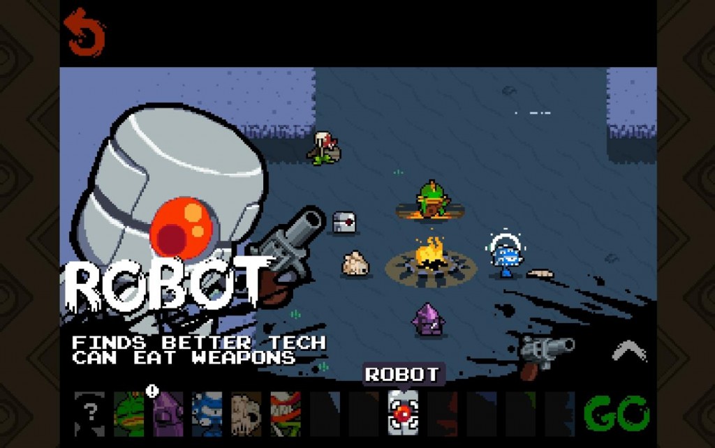
But I’m perfectly willing to admit that it’s a childish annoyance. After all, once I get them, I’ll know I’ve earned them, because Nuclear Throne is not an easy game. It is a game requiring a fair amount of skill, and my skill with it… Is not so hot. Essentially, each character you can play, unlocked at the beginning or not, has special abilities, that, combined with the sometimes silly weapons you find in the weird wastelands, can either help or hinder you. For example, although Melting is fragile enough to die in one hit, he can make all the corpses he’s made on the screen explode. If you’re clever about this, you can set up quite a chain of death and explosions. Adding to this already amusing mix, you have skills and Crowns, the latter of which can only be found in certain areas, and the former gained by collecting Rads. Yes, you’re mutating to be strong enough for the Nuclear Throne… And the mutations are kind of random, picking from four each level.

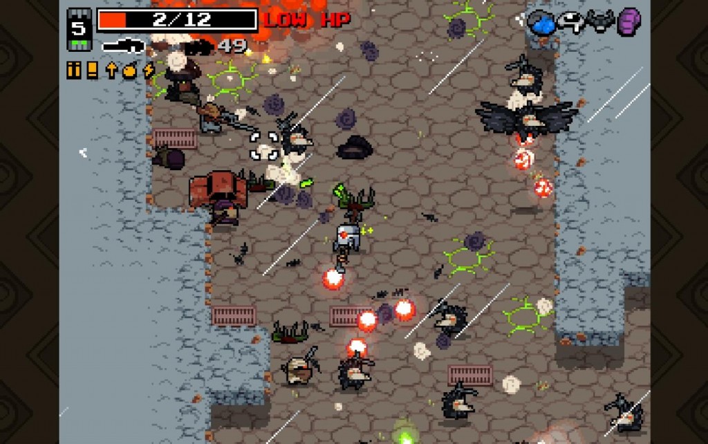
The majesty of certain mutations can't be captured in a screenshot. In less than 0.2 seconds, all the things shown except me are going to die, because I hit someone so hard their corpse killed everyone else.

The majesty of certain mutations can’t be captured in a screenshot. In less than 0.2 seconds, all the things shown except me are going to die, because I hit someone so hard their corpse killed everyone else.

Another reason I haven’t gotten amazingly far is because I’m overfond of melee weapons, preferring to build toward the idea of getting them… Which won’t always happen. And even when it does, it’s a risky proposition, as, while most melee weapons don’t use ammo, and most can also bat projectiles away, the most damaging melee weapons have long cooldown times that abilities can only go so far to fixing. Nonetheless, under the right situation, and with the right character (Steroids, unlocked by reaching Area 6 of the game), I could be dual wielding shovels that not only murder people left and right (And forward!), I swing them faster the harder I get hurt, and I don’t get much cooldown on them so long as the death keeps coming. Of course, both mutations and weapons are luck based, so the game is more about adapting to your situation than what I do, which is aim toward a build and pray it comes through.

Aesthetically, it’s pretty cool. The soundwork is pretty darn good, with explosions, the meaty sounds of bullets hitting flesh and shovels hollowly whunking through the air, hisses, and the dramatic music, courtesy of [insert]. Meanwhile, the pixel graphics are simple, easily read in most places in the game, and you can quickly identify your immediate threats, which is bloody useful, because this game does somewhat depend on memorisation. Take a grenade launcher into the sewers, for example, and you’re probably in trouble. There’s a hell of a variety in weapons, and later tiers can get really powerful, like the flame shotgun (Spread shot that sets enemies on fire), the Splinter Gun (Fires three mini crossbow bolts in a shotgun like spread), or the Plasma Gun (Not only kills pretty much anything it hits, it explodes, too!) Of course, the more powerful the weapon, the more ammo or time it’s going to take to use… So you have to be tactical.

It is often hard to see the real threat in crowded situations. I thought I'd killed the ninja. I was wrong.

It is often hard to see the real threat in crowded situations. I thought I’d killed the ninja. I was wrong.

If I had one big criticism, it’s that sometimes, the situations are hellishly difficult. A personal pet-hate of mine is the Room ‘O’ Scorpions, a spawn pattern that sometimes appears, where five or more scorpions (Who fire a wide spread of shots) are all in the same area, and running into that is either going to be a time consuming exercise of “Back the hell away before any of them see you, take pot shots until the room’s thinned out”, or “Don’t see them in time, die horribly to an unavoidable spread of deadly globs that fills the area.” There are many deaths I’ll own up to as Yet Another Stupid Death in Nuclear Throne. Room ‘O’ Scorpions? I don’t count. There are others, but I won’t bore you with them. For all that restarting with the same character is quick, some of the generated seeds are made of bullshit, and that annoys me. There are also a couple of post release bugs, such as level teleports not appearing where they’re meant to (The location of the last enemy killed), which has cost me in some runs (For reasons I’ll not spoil.)

Overall, though, if you like mouse and keyboard or twin-stick shooters, Nuclear Throne is definitely worth the price. Of course, a lot of you knew that already, but for those who didn’t? Nuclear Throne is fun. And you can adjust the screen shake to whatever you prefer.

The Mad Welshman grimaced as he looked down at his form. He needed to glow harder. His quest demanded it.

Become a Patron!

Going Back: Quantum Rush – Champions

As you may have noticed, Future Racing games are sort of a passion of mine. Which made Quantum Rush: Champions (Previously Quantum Rush Online) such a disappointment. In discussing why, we have to compare it to a close cousin, Wipeout Fusion, one of the more divisive games in possibly the biggest ex future racing franchise out there (Apart from F-Zero, yes, I know F-Zero exists, shush.)

Weaponry, How Not To Do It

This is how quickly you can die in Fusion. On the first track.

Both Wipeout Fusion and Quantum Rush: Champions erred in dealing with weaponry, albeit in different ways. In Wipeout Fusion’s case, the weapons were, in many cases, too good. Many weapons, including missiles, fired both backwards and forwards, and, throughout the game, it’s perfectly possible to explode (losing you the race) in the first fifteen seconds. Not helping is the fact that, due to sloppy coding, some of the weapons appear to work both ways, but… Actually don’t. And it’s somewhat difficult to tell. But one thing that Fusion did relatively well was that weapon placement was considered. Some tracks didn’t have as many missiles (Which do not corner well), some don’t have many plasma bolts (Which can be murderous when used in the right way)… There’s a sort of balance, although it’s not obvious. Challenges and deathmatch further refined this. Can you score enough kills using only rockets and missiles? How about quakes and shields alone?

Quantum Rush, however, has the same weapon placement for all its game modes, which doesn’t actually work. If you want someone dead in a “kill target” mission, I can guarantee you that over two thirds of the pickups still on the track are largely useless. Not helping are Quantum Rush’s own bugs, which include a weapon that, for the most part, just doesn’t seem to work: The gravity shockwave. How it’s meant to work is that it shoves racers away from the vehicle… But 95% of the time, it doesn’t do a damn thing, taking up valuable space that another weapon could use.

Track Design

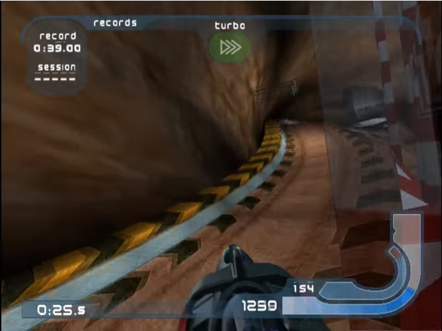
TemteshBay1

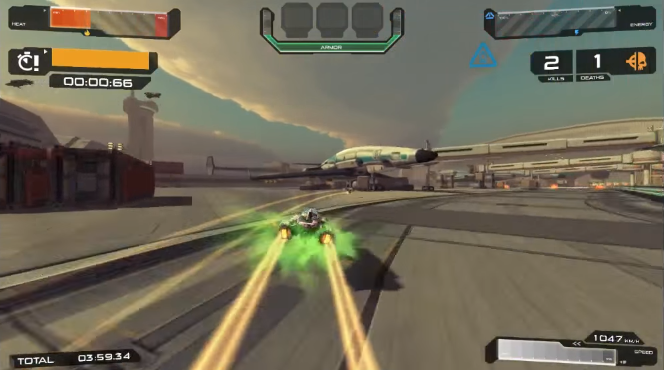
Both Fusion and Quantum Rush, in slightly different ways, suffer from the same problems, and the same good ideas let down by poor execution. Both, for example, have multiple potential paths through the track, and, unlike some Future Racers I could name, none of these paths are technically bad. But in both games, some of these paths are poorly signposted visually, and some of these paths are cluttered to the point of frustration. In Fusion, this is most seen in Temtesh Bay, a track which has bulkhead doors that open microseconds before you actually hit them, a cave segment with hard to navigate rock formations, and some frankly silly track narrowing. In Quantum Rush: Champions, you see similar design flaws in the Airport, with a side path filled with obstructions and narrowings in the form of cargo-plane bays and large shipping crates. Worse, the part that isn’t a shortcut is a hard right where your eyes are telling you to go ahead.

AirportQRC

This is approximately a third of a second before I end up going to the left, the alternate path. A second before that, you can’t see that turnoff.

Unlike Quantum Rush: Champions, however, the AI in Fusion will generally split their efforts between paths… While the QRC craft will, most of the time, stick to the main path. As already mentioned, tracks are used with no changes for other game modes, and this can hurt in the case of, say, boss battles, where the AI will always take a path, and you taking the other will lose you valuable time. More on time in QRC in a short while…

Upgrades

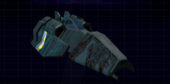
Courtesy of Wipeout Central, this is the top tier FEISAR. Like many of its compatriots, it is 90% gunmetal grey and grunge.

Courtesy of Wipeout Central, this is the top tier FEISAR. Like many of its compatriots, it is 90% gunmetal grey and grunge.

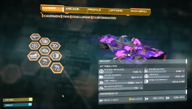
Wipeout Fusion, it must be said, mostly sinned in this category due to visual design and grind. Upgrading craft in Fusion requires money, which requires racing tracks over… And over… And over again (Although not necessarily in the craft you want to upgrade), started as somewhat crappy versions of what they were meant to be, and, eventually, went from not-so-great craft with some interesting designs, to at least fairly average craft with some interesting designs, to good craft with some mind-bendingly dull designs, usually involving gunmetal grey. Quantum Rush: Champions, however, does… Odd things. Upgrades are rewards for earning medals… But even in higher tiers, there just aren’t that many upgrades, and they become progressively harder to unlock as you go on. What are you mostly unlocking? Customisation options, only one half of which (The colours) stay between “Tiers” of craft. And they, also, require unlocking through medals.

It took something like 12 medals to get even this far. The pattern was in Tier 1, but had to be re-earned for Tier 2. The colour is the only one I have been able to unlock to this day.

It took something like 12 medals to get even this far. The pattern was in Tier 1, but had to be re-earned for Tier 2. The colour is the only one I have been able to unlock to this day.

For context, originally, QRC was Quantum Rush: Online, and was going to be a purely multiplayer Future Racer with an F2P model. It had a somewhat nice garage. It had the customisation be unlocked by buying it, rather than medals, although you earned money, obviously, by racing. Upgrades, similarly, were on a monetary basis. And all of this, along with the multiplayer (Which had mostly been going alright) was thrown out when Quantum Rush: Champions was announced. This was a mind blowing decision, to throw the baby out with the bath water, and the game suffered for it, as, since unlocks appear to be based on number of medals, you can find yourself being rewarded for slogging through a difficult challenge and getting gold with… Er… Blue #3. Thanks for the socks, Grandma QRC, but I really wanted that better armour, y’know? It doesn’t help that the customisation options, in a strange funhouse-mirror fashion to Fusion, start dull. Three shades of gray, in one colour. And every Tier, you have to unlock skin patterns all over again.

Difficulty

Difficulty is somewhat erratic in both QRC and Fusion, but in Fusion, at least, the main causes are obvious: The tracks and the weapons. For your first track in a tournament, you could be driving through the icy Mandrashee, a relatively simple track with some quirks, and the very next track is… The dreaded Alca Vexus, home of narrow tracks, multiple chicanes and hidden corners, and, in at least one case, a broken track.

But Wipeout Fusion didn’t require you to have a perfect racing line to get gold. Nor a good enough computer. By contrast, Quantum Rush: Champions gets harder if your computer isn’t recommended specs, and Time Trial… Requires an almost perfect line to get gold. Yes, I would like a challenge. I do not, however, want to be locked out of content because you decided “Perfect line or go home” is a good idea in the first tier of gameplay. And then there are the boss fights and “Target Enemy” modes. Target Enemy is bad enough, because it generally requires a kill a minute of (by Tier 2) up to 3 specific enemies, with, er… The same power up locations as a race would have. Now imagine that, while it’s only one specific target, it’s a vehicle of your class from the next tier up, with special abilities such as being able to drain shields from fellow racers, or leaving a burning trail behind them that makes them overheat. Then give it similar harsh timing (1 minute 30 is silver to kill the Tier 1 boss for NMW)

There’s a lot more I could say about Quantum Rush: Champions, and how GameArt Studio have dealt with the situation, or, more accurately, haven’t… But instead, I’m just going to mention two things. Firstly, Quantum Rush: Champions was ported to the XBOne moderately recently, and from what I can gather, critical reception was no less frosty than on the PC. Secondly, and I want developers to note this one…

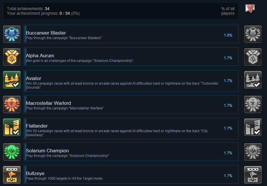
MaaaaaybeAProblem

…Global achievement stats like this… This is a warning sign. This is a warning sign that either you have done something wrong with achievements and unlocks, or you have done something wrong with playability and/or difficulty.

Listen to said warning signs.

Become a Patron!